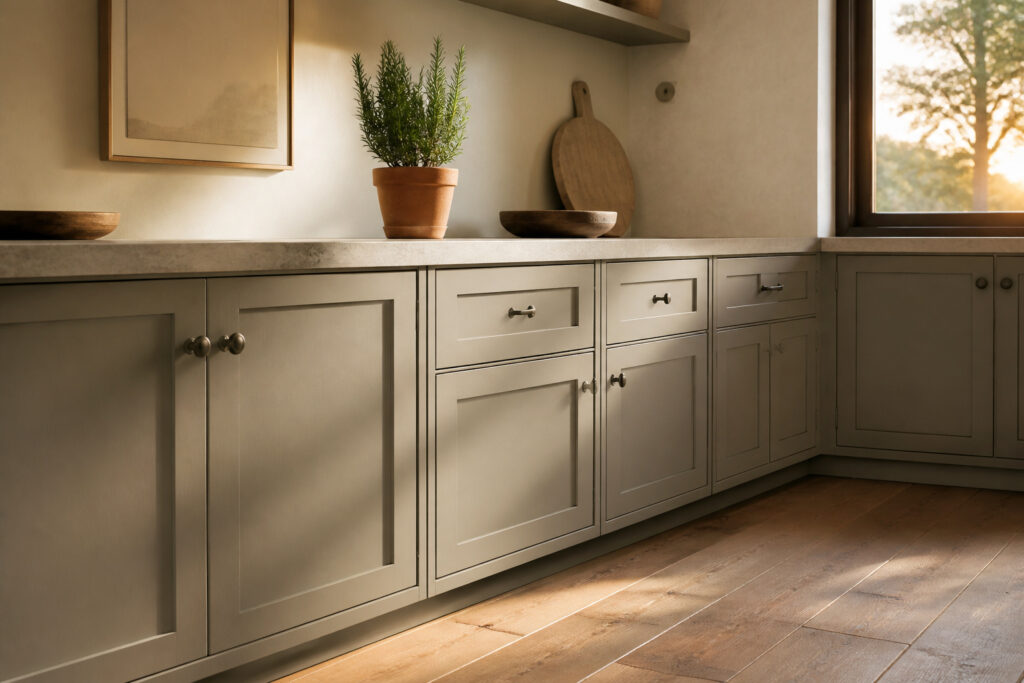
Revere Pewter is a greige paint color that works best on kitchen cabinets rather than walls. Its olive undertone shifts dramatically under different light, reading warm beige in south-facing afternoon sun and cooler stone gray on northern mornings.
At LRV 55.51, it hides cabinet scuffs without darkening the room, but that same mid-range value turns muddy across full wall surfaces in dim kitchens.
The revival is real, and it is happening on cabinetry, not as the room-filling gray wash that dominated 2014.
Kitchen Cabinets
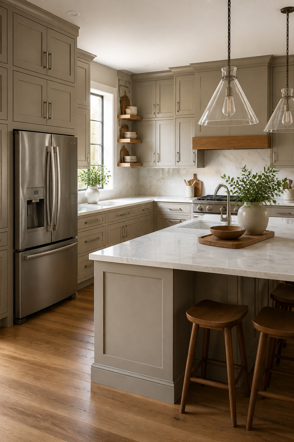
Revere Pewter (HC-172) lands on cabinets better than it lands on walls, and that surprised me after watching it dominate real-estate gray for a decade.
The greige reads warmer and more intentional on vertical kitchen surfaces than as a room-filling wall color, especially now that the 2010s cool-gray fatigue has set in and the #GreigeRevival is showing up in new-build model homes again.
At LRV 55.51, it sits in that useful middle ground where it lightens enough to keep a kitchen from feeling cave-like, but carries enough pigment to hide the scuffs and fingerprints that collect on base cabinets and islands.
I have seen it read almost beige under warm afternoon light and shift toward a cooler stone gray on north-facing mornings, so the undertone flexibility is a real asset for cabinetry that catches light differently throughout the day.
The style range is wider than I expected.
It pairs with curved traditional moldings and rich wood tones without fighting them, works for modern farmhouse when you set it against crisp white walls and brass hardware, and holds its own in transitional kitchens that split the difference.
One combination that keeps showing up: Revere Pewter lowers with Simply White uppers and trim, which keeps the greige from going muddy. Marble countertops pull it toward the sophisticated side; butcher block warms it up for a more casual kitchen.
The revival is real, but the trick is using it as a cabinet color rather than a wall wash. That is where it looks current instead of like a leftover from 2014.
Recommended Products

Hearthstone is a warm greige, satin finish cabinet paint - part of our Rustic Collection.
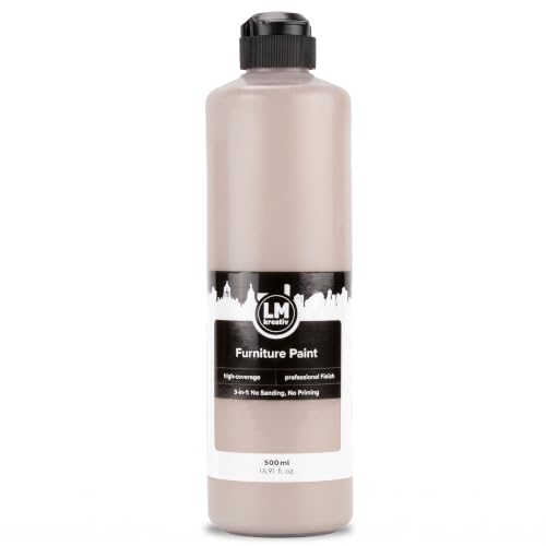
Exceptional Coverage & Lasting Durability: Achieve vibrant, rich color with fewer coats. Our durable finish withstands everyday wear and tear, making it ideal for busy households and frequently used furniture pieces indoors and outdoors.

Includes Three Shades to Match 90% of Surfaces: We offer two color shades of Matte Beige and one Matte White to instantly achieve the perfect color match. Eliminating the need for color charts, returns, and waiting for the right color to arrive. Instead, match to one of the two beige colors or mix colors and match to your desired shade.
Walls
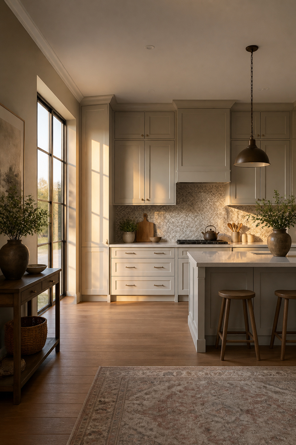
Revere Pewter on walls shows its inconstant nature more dramatically than on cabinets because there is simply more surface catching the light.
The same paint that reads as a warm, creamy greige on bright south-facing cabinetry can shift toward olive green across an entire wall in a dimmer room.
That green undertone, comparable to a warm olive, needs balanced light to stay neutral; without it, the color turns muddy and overbearing.
I would not use this shade on walls in a darker kitchen or one with limited natural light.
The LRV of 55.51 is mid-range, so the color neither bounces light around nor absorbs it deeply, which means the room’s existing light quality controls everything. Cool light sources pull out the blue-green; warmer light keeps it in greige territory.
On cabinets, you see this shift in small doses. On walls, you live inside it.
If your room already has pink-toned tile or flooring, the complementary contrast will push Revere Pewter even greener than it already leans. Test it on the wall, not the cabinet door, and watch it across a full day before committing.
Recommended Products
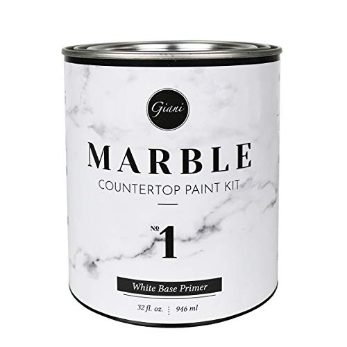
The 32 oz. white based primer is the standard base coat included in the Gianni Marble Countertop Paint Kit


PRIMER | SEALER | STAINBLOCKER: KILZ KITCHEN and BATH is a water-based primer-sealer-stainblocker that has biocides to prevent mildew growth on the primed surface. It offers excellent adhesion to most interior surfaces and provides a sound anchor for paints.
Trim and Doors
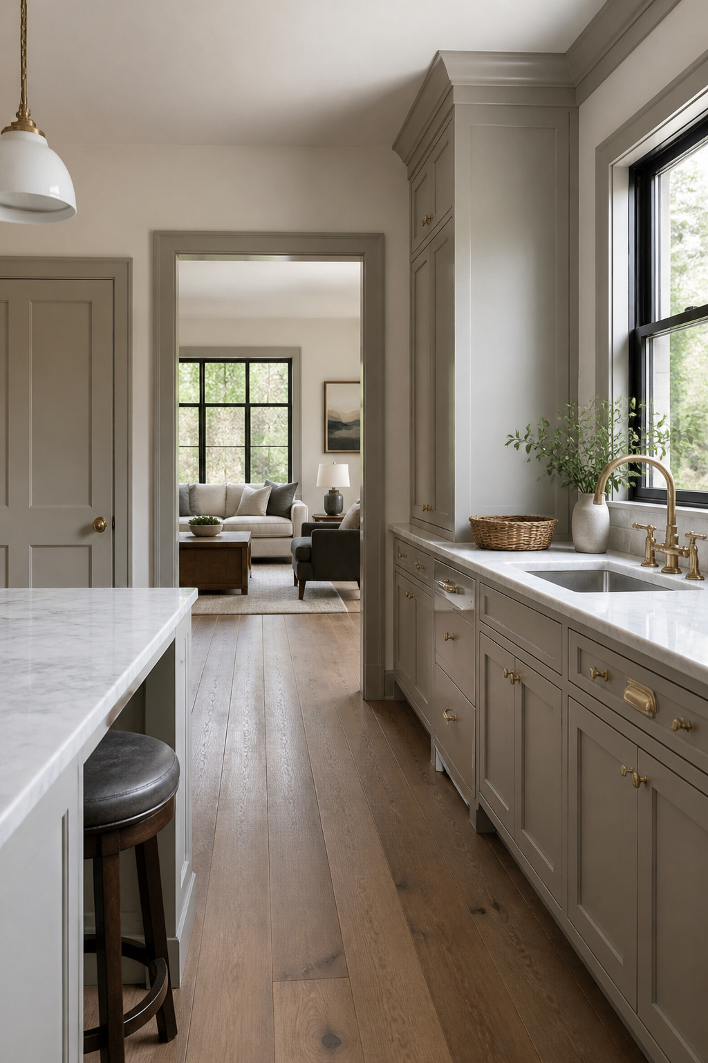
Running Revere Pewter on trim and interior doors flips the usual formula. Most kitchens live with white trim against colored walls; reversing that puts the warmer gray on the woodwork and keeps the walls light.
The effect is more connected than dramatic, which matters in open plans where the kitchen spills into hallways or living areas without a real break.
The risk is sameness. Revere Pewter has an LRV of 55.51, high enough to reflect light rather than swallow it, but spread across cabinets, trim, and doors in the same view and the space can flatten out.
It works best when the trim carries the color into an adjacent room that has something else going on, or when the kitchen itself has strong material contrast, like natural wood floors or a stone counter with some movement.
On interior doors specifically, the color reads as intentional in a way that white trim rarely does.
One approach pairs Revere Pewter doors with a warm white close to Sherwin-Williams Into the Gloaming on surrounding trim, similar to what some designers have used. That combination gives you the cohesion without the uniform wash.
If your kitchen already has Revere Pewter cabinets, paint the doors to match but keep the trim one step lighter, or the room starts to feel like a single gray box.
Recommended Products
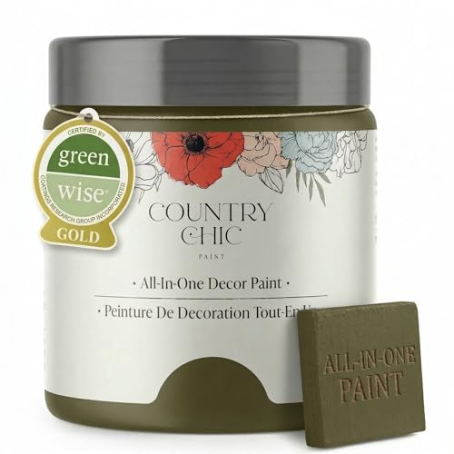
All-in-One Formula: This furniture paint includes a built-in primer and top coat, providing seamless application on wood, metal, laminate, and more surfaces for a hassle-free painting experience.
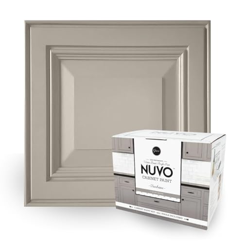
Versatile Greige Charm: Hearthstone, a soft, warm greige, adapts to grey or beige depending on its surroundings, echoing the natural stone fireplaces of the Irish countryside.

Model color has been formulated with permanent pigments for fine arts; all colors are completely lightfast and opaque
Exteriors
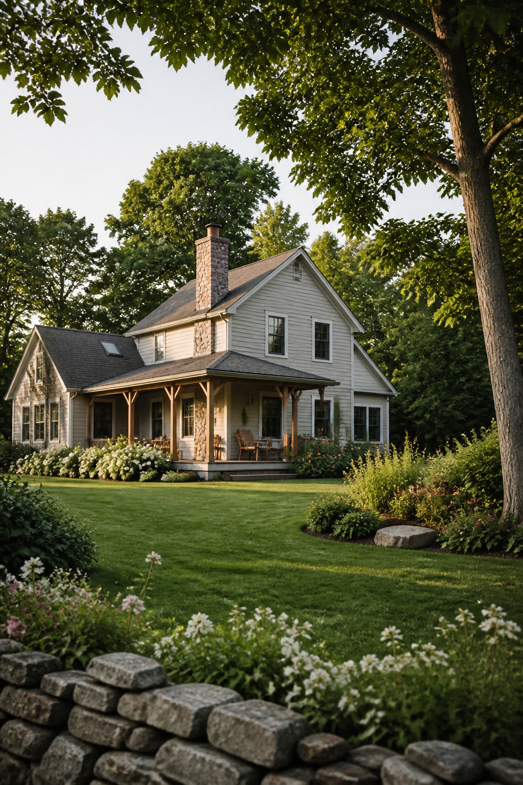
Revere Pewter on an exterior reads as a quiet, deliberate choice rather than a default. The color carries enough gray to look intentional in sunlight, enough warmth to avoid that flat concrete effect that cool neutrals often suffer outdoors.
On clapboard or shingles, it sits somewhere between stone and weathered wood, which makes it a natural extension if you have already used it inside.
I would not paint kitchen cabinets one week and the siding the next without a pause. The eye needs variation, and a house that reads as one continuous swatch loses its architecture.
But on a porch ceiling, a garden shed, or a detached garage that faces the kitchen window, Revere Pewter creates a conversation between indoors and out without demanding matching trim.
Exterior paint takes a harder beating than anything inside.
The same batch will look lighter and slightly chalkier after two summers of UV, so order a shade deeper if you are set on the interior-exterior match, or accept that the outside version will live as a weathered cousin rather than a twin.
For a weekend project, the garage door or a small outbuilding is the safer test than the whole facade.
Recommended Products

Includes 30 featured and newest released color card. Sprayed on color to see our colors in your homes lighting for more accurate color choices.

CABINET TRANSFORMATION: Refresh outdated cabinets, vanities, furniture and trim with rich Cadet Gray color and a smooth semi-gloss finish

Includes 30 featured and newest released color card. Sprayed on color to see our colors in your homes lighting for more accurate color choices.
Accent Colors
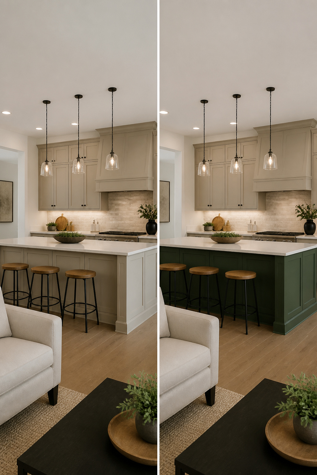
Revere Pewter carries enough warmth that white trim needs to be chosen with its undertone in mind, not treated as a generic default.
Benjamin Moore White Dove and Simply White both work because they lean warm rather than stark, so the transition from cabinet to crown molding stays gentle rather than jarring.
White Dove reads slightly creamier, Simply White a touch cleaner; either keeps the ceiling from feeling like a hole punched through gray.
For color that actually moves the eye, the deeper accents are where Revere Pewter earns its keep.
Hale Navy on a kitchen island gives the gray something to push against, and deep greens do the same work with a different mood.
The trick is letting Revere Pewter’s earthy warmth absorb some of that saturation so the bold color reads intentional, not random.
Ten years ago the pairing was sage and brown, which now feels period-specific in a way these deeper tones don’t.
If the backsplash or an accent wall is where you’re adding that contrast, keep the surrounding surfaces quiet so one bold choice does the job.
Recommended Products

Perfectly matched OEM quality paint using the latest state-of-the-art computerized technology and production equipment

Perfectly matched OEM quality paint using the latest state-of-the-art computerized technology and production equipment

Perfectly matched OEM quality paint using the latest state-of-the-art computerized technology and production equipment
Light Reflectance Value
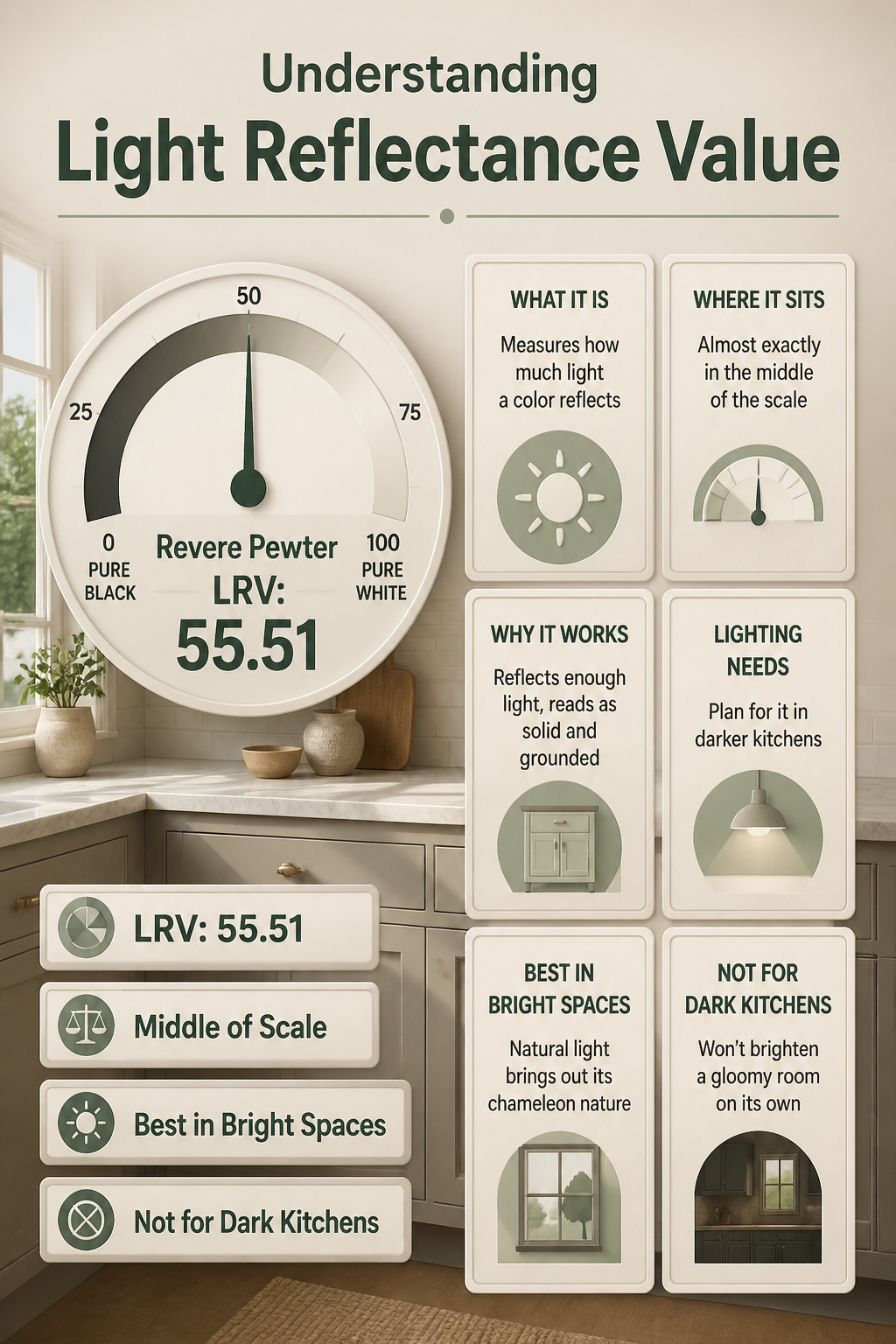
Revere Pewter’s LRV of 55.51 lands it almost exactly in the middle of the scale, where 0 is pure black and 100 is pure white.
That middle position matters more for cabinets than it does for walls, and it took me a while to understand why.
Walls are just a backdrop; cabinets are furniture you stand next to, work beside, and open and close all day.
At 55.51, the color reflects enough light to keep a kitchen from feeling heavy, but it absorbs enough to read as a solid, grounded presence rather than floating away.
For lighting decisions, that 55.51 means you will want to plan for it. In a darker kitchen with limited windows, Revere Pewter won’t bounce enough light around to compensate; you will need under-cabinet lighting or a brighter overhead plan.
But in a space with decent natural light, it behaves almost like a chameleon: morning sun pulls it lighter, afternoon shade gives it more weight.
The color reads as substantial without being dark, which is exactly what most people want from a kitchen cabinet. It feels built-in, permanent, intentional.
If you were hoping for something that brightens a gloomy room on its own, this is not that paint. Save it for kitchens that already have light to work with, and let the 55.51 do what it does best: balance.
Recommended Products
Ideal for wood melamine metal and laminat cabinetry

CABINET TRANSFORMATION: Refresh outdated cabinets, vanities, furniture and trim with rich Dark Gray color and a smooth semi-gloss finish

CABINET TRANSFORMATION: Refresh outdated cabinets, vanities, furniture and trim with rich Pure White color and a smooth semi-gloss finish
Color Undertones
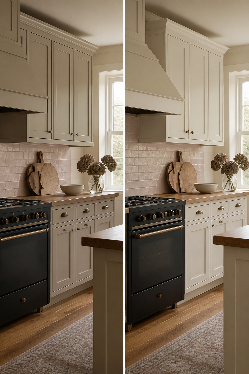
Revere Pewter reads as a warm greige because of what sits underneath the gray: an olive green undertone that keeps it earthy rather than cool.
About 85% of the time, that green tinge shows up, giving the color its muted, grounded quality. The catch is that this same undertone can jump forward or fade back depending on what you put next to it.
In a kitchen, the surrounding colors rewrite the paint in real time. Pair Revere Pewter with anything carrying a pink undertone, think rose-tinted tile or certain warm-toned stones, and the complementary color relationship will push both hues toward their extremes.
The cabinets look more green; the flooring reads more pink. Nobody wins.
Cool light sources, heavy on blue or green wavelengths, pull the same shift. Under balanced, full-spectrum light, Revere Pewter settles into the neutral warm gray most people expect.
Sampling on your actual cabinets, at different times of day, is the only way to know which version of this color your kitchen will grow. A swatch on the wall is not enough.
Cabinet faces catch light differently than vertical drywall, and the horizontal planes of uppers and lowers bounce color between them.
Paint a door or a drawer front, live with it for two days of natural light and one evening under your fixtures, then decide whether that earthy warmth is what you wanted or something that turns too tan, too green, too fast.
Current Trends
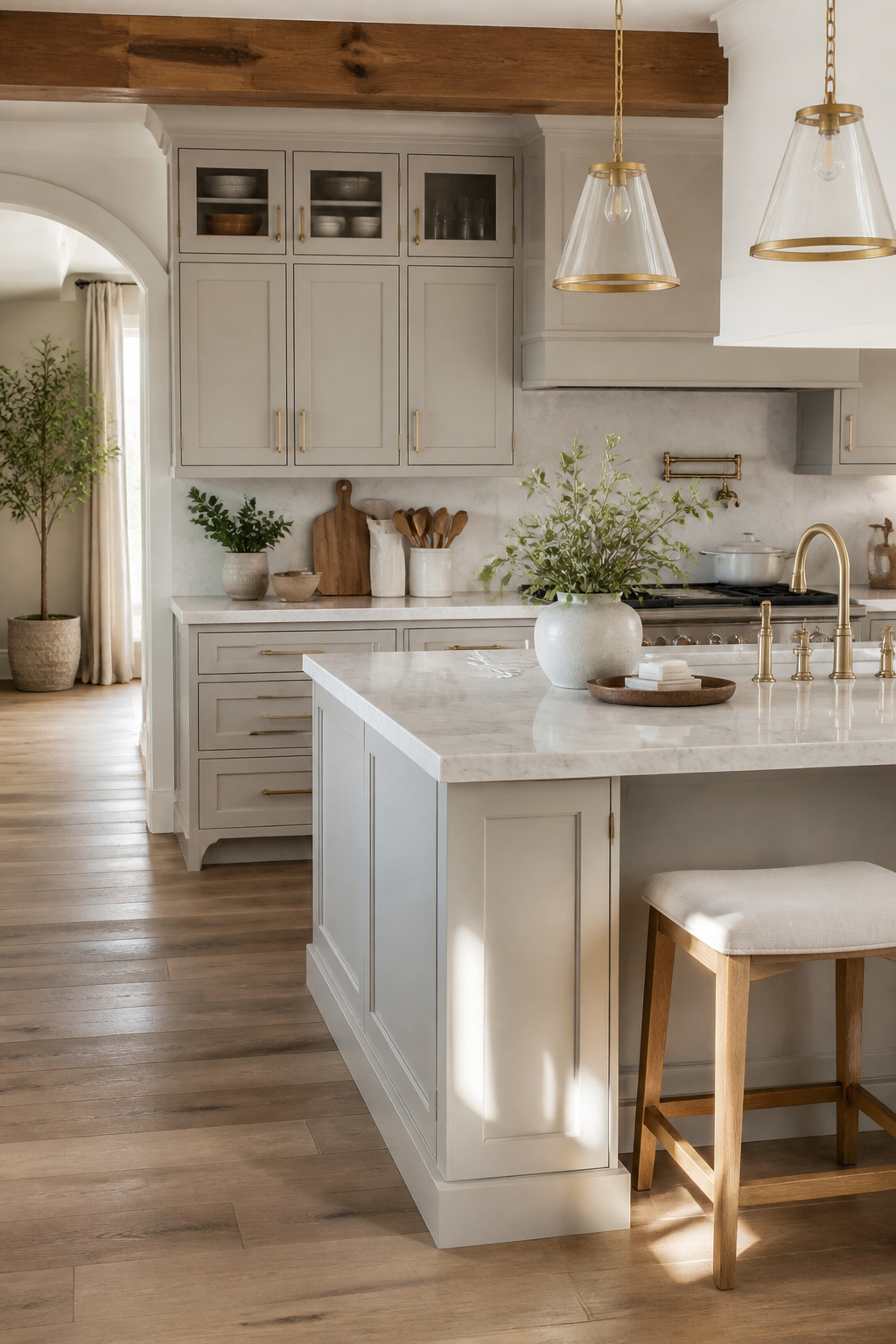
Revere Pewter spent a few years in the "dated" bin, right alongside chevron patterns and mason-jar everything.
The gray wave that flooded Instagram around 2016 treated every wall like a blank slate, but that cool, flat tone turned sterile fast in kitchens with northern light.
What brought Revere Pewter back is exactly what made it easy to dismiss: it is not a true gray.
The warm, earthy undertone reads closer to greige, and in a kitchen with traditional moldings or modern farmhouse shiplap, it cooperates with wood tones instead of fighting them.
The shift happened as people moved off walls and onto cabinets. On cabinetry, Revere Pewter behaves like a neutral with memory.
It holds enough depth to avoid washing out under bright kitchen windows, yet it stays soft against marble counters or brass hardware.
Curved furniture profiles and rich wood tones pull the warmth forward; pair it with crisp white walls and black window frames, and the same color reads almost traditional. That flexibility is the difference.
The earlier gray trend demanded an all-over commitment. Revere Pewter lets the room keep some variation.
Recommended Products

𝐍𝐎 𝐏𝐑𝐈𝐌𝐄𝐑 𝐍𝐄𝐄𝐃𝐄𝐃:Our wood furniture paint sticks well to wood without a primer, forming a protective film. No varnish needed for low traffic areas, but add a coat for high traffic spots

CHALK MINERAL PAINT - Our chalk mineral paint is ideal for wood, metal, plastics, brick, stone, glass, concrete, and so much more. With over 80 colors to choose from, you'll find the perfect shade for any project. An 8oz container of this paint should cover about 38 sq. ft.

Vibrant Color Selection: Available in multiple stunning shades to match any style or decor, perfect for giving your furniture a personalized touch.
Best Pairing Colors
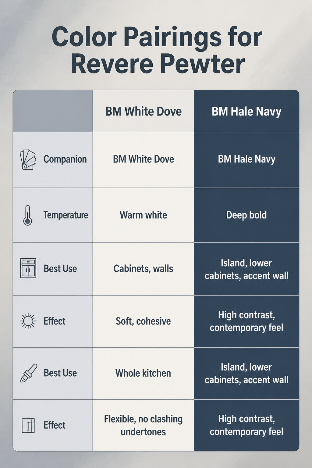
Revere Pewter needs a white that leans warm, not stark, or it can turn muddy fast.
The pairings that keep working are BM White Dove for a soft, lived-in kitchen, BM Simply White as the all-rounder that handles cabinets, walls and trim without fighting the gray, and BM Chantilly Lace when you want the white to read truly neutral, neither warm nor cool.
A decade back, sage green and brown pairings dominated; they feel dated now. For something current, deep bolds like BM Hale Navy give Revere Pewter a completely different personality, the contrast snapping the gray out of beige territory.
| Companion | Temperature | Best Use | Effect |
|---|---|---|---|
| BM White Dove | Warm white | Cabinets, walls | Soft, cohesive, avoids starkness |
| BM Simply White | Multi-purpose white | Whole kitchen | Flexible, no clashing undertones |
| BM Chantilly Lace | Neutral white | Trim, ceilings | Clean edge without coldness |
| BM Hale Navy | Deep bold | Island, lower cabinets, accent wall | High contrast, contemporary feel |
Recommended Products

Extremely durable interior paint ideal for use on properly prepared interior walls, ceilings or trim composed of new or previously painted drywall, plaster, masonry, wood and metal

Includes Three Shades to Match 90% of Surfaces: We offer two color shades of Matte Green and one Matte White to instantly achieve the perfect color match. Eliminating the need for color charts, returns, and waiting for the right color to arrive. Instead, match to one of the two beige colors or mix colors and match to your desired shade.

DURABLE FINISH: Ensures a long-lasting finish that stands the test of time. Ideal for interior walls, ceilings, bedrooms, dining rooms, family rooms, bathrooms, kitchens, hallways and offices.
Frequently Asked Questions
Is Revere Pewter too dark?
u003cpu003eWhether Revere Pewter feels too dark depends on your kitchen’s light. At LRV 55.51, it sits right in the middle of the scale, so it neither bounces light around nor absorbs it deeply.u003c/pu003e u003cpu003eIn a darker kitchen with limited windows, it can feel heavy and you will need under-cabinet or brighter overhead lighting to compensate. Save it for kitchens that already have decent natural light to work with.u003c/pu003e
What colors go well with Revere Pewter kitchen cabinets?
u003cpu003eWarm whites work best: Benjamin Moore White Dove gives a soft, lived-in feel, Simply White handles cabinets, walls and trim without clashing, and Chantilly Lace keeps trim clean without coldness.u003c/pu003e u003cpu003eFor contrast, deep bolds like Hale Navy on an island snap the gray out of beige territory. Avoid the sage-and-brown pairings that dominated a decade ago; they read dated now.u003c/pu003e
How does lighting affect Revere Pewter?
u003cpu003eLight quality controls everything with this color. Warm afternoon light pulls it toward beige; north-facing morning light shifts it cooler and more stone gray.u003c/pu003e u003cpu003eCool light sources draw out blue-green undertones, while balanced, full-spectrum light keeps it in neutral greige territory.u003c/pu003e u003cpu003eThat olive-green undertone can jump forward in dim rooms, so sample on an actual cabinet face and watch it across a full day before committing.u003c/pu003e