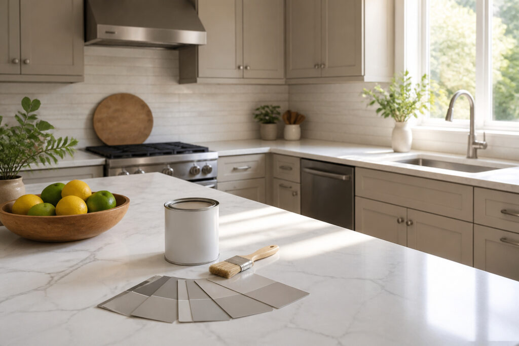
Greige paint for kitchen cabinets sits in the narrow space where warm beige and cool gray actually meet, and the difference between a color that works and one that falls flat usually comes down to light reflectance. Pale Oak by Benjamin Moore, the pick that topped my list, carries an LRV of 69; that figure is high enough to keep a small galley from feeling boxed in, yet low enough to avoid the sterile cast of a true off-white. The eight shades I compared range from that bright, adaptable midpoint down to Ashwood Moss at 8.47%, a near-black green-brown that hides fingerprints in the busiest households but demands you plan your bulbs and mirrors around it.
My Top Picks
| Product | Award | Best for | Why it won | ||
|---|---|---|---|---|---|
| Pale Oak by Benjamin Moore | Best Overall | Buyers wanting balanced quality | Combines versatile color, trusted brand, and easy application for any kitchen | Check price | |
 | Giani Nuvo All-In-One Cabinet Paint Kit | Best for DIY Projects | DIYers with limited experience | All-in-one kit makes cabinet painting simple with minimal prep and tools needed | Check price |
| Ashwood Moss by Benjamin Moore | Best for High Traffic Areas | Households with heavy daily use | Holds up to constant opening, closing, and cleaning without showing wear | Check price | |
 | Dixie Belle Paint Company Dixie Belle Silk All-in-One Mineral Paint | Best Budget Option | Cost-conscious renovators | Delivers solid coverage and durability without the premium price tag | Check price |
| Shaded White by Farrow & Ball | Best for Eco-Conscious Buyers | Environmentally minded homeowners | Low-impact formula offers stylish color with gentler ingredients and production | Check price | |
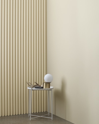
| Natural Cream by Benjamin Moore | Best for Small Kitchens | Owners of compact kitchens | Light, warm tone bounces brightness around to visually expand tight spaces | Check price | |
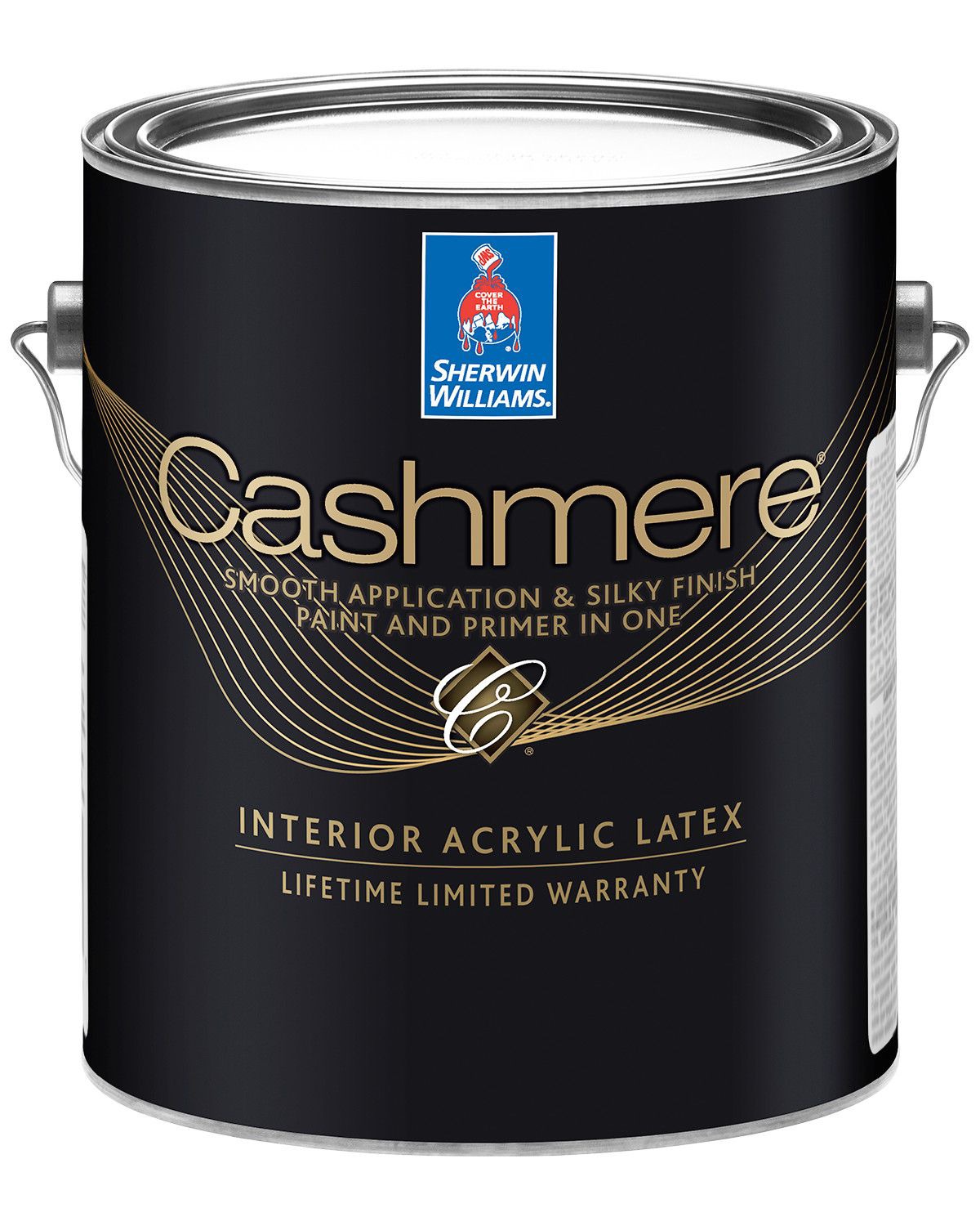
| Cashmere Beige by Sherwin Williams | Best for Modern Aesthetics | Fans of clean contemporary design | Warm greige shade pairs seamlessly with sleek hardware and minimal lines | Check price | |
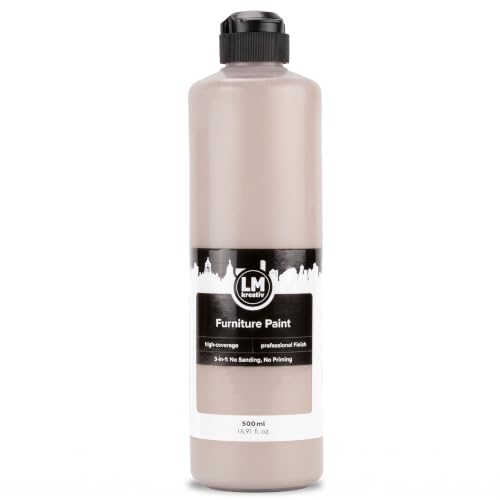
 | BLUEBIRD Chalk Furniture Paint | Best for Vintage Aesthetics | Lovers of aged, timeworn character | Chalky finish distresses beautifully for authentic antique cabinet appeal | Check price |

Recommended Products

Hearthstone is a warm greige, satin finish cabinet paint - part of our Rustic Collection.
Exceptional Coverage & Lasting Durability: Achieve vibrant, rich color with fewer coats. Our durable finish withstands everyday wear and tear, making it ideal for busy households and frequently used furniture pieces indoors and outdoors.

Includes Three Shades to Match 90% of Surfaces: We offer two color shades of Matte Beige and one Matte White to instantly achieve the perfect color match. Eliminating the need for color charts, returns, and waiting for the right color to arrive. Instead, match to one of the two beige colors or mix colors and match to your desired shade.
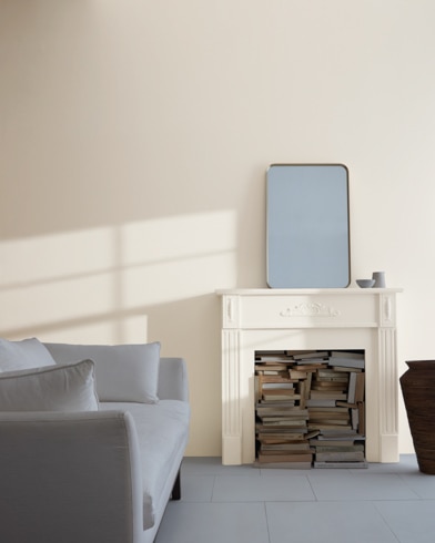
Best Overall: Pale Oak by Benjamin Moore
Image: benjaminmoore.com
Recommended Products

CABINET TRANSFORMATION: Refresh outdated cabinets, vanities, furniture and trim with rich Pure White color and a smooth semi-gloss finish
𝙉𝙊𝙏𝙀: Intentional headspace allows room for stirring, dipping, and transit. The stated paint quantity remains unchanged. If you have any questions, please contact our customer service team.

BY REFINISHING PROS SINCE 1972 - Five decades of professional surface refinishing experience in every jar. While other cabinet paint brands started in marketing departments, Bathworks started in bathrooms, kitchens, and workshops - and we are still refinishing surfaces professionally today.
Quick Verdict
Anyone after a cabinet color that shifts gracefully between warm and cool will find a lot to like here. The LRV of 69 gives Pale Oak enough brightness to keep a kitchen from feeling closed in, yet the taupe greige base keeps it from reading as sterile. The real tradeoff is subtlety; this is a color that recedes rather than announces, and buyers wanting their cabinets to carry the room may leave wanting more.
Key Specifications
- Light Reflectance: 69
What It Does Well
- Adaptable undertone. Benjamin Moore describes this as a taupe greige, and owners report it behaves differently across daylight and artificial light without turning muddy, which matters in kitchens that see both morning sun and evening fixture glow.
- Forgiving LRV. At 69, it reflects enough light that north-facing kitchens still feel open, per the maker’s guidance, saving the trouble of rethinking the whole scheme for dimmer spaces.
- Low-VOC formulation. The reduced off-gassing means a weekend project doesn’t leave the house unlivable; owners mention being able to sleep in place the same night.
- DIY-friendly application. Independent reviewers note the paint levels out well for brush-and-roller work, so cabinet refreshers without sprayer setups get professional-looking results.
Where It Falls Short
- Warmth can read as beige. In rooms with strong southern exposure, the greige can tip toward traditional taupe, losing the modern edge some buyers expect from the swatch.
- Not the brightest option. Natural Cream, the nearest comparable shade, carries a higher LRV; Pale Oak owners working with very little natural light sometimes wish they’d gone lighter.
- Brand premium. Benjamin Moore’s quality reputation holds, but the per-gallon cost sits above big-box alternatives, and budget projects feel the squeeze across a full kitchen’s worth of doors and drawers.
Who It’s For
The buyer who wants cabinets to harmonize with existing countertops and flooring without demanding a full redesign will get years of flexibility from this shade. Someone chasing a statement color or working a true modern gray palette will likely find Pale Oak too warm and too quiet.
How It Compares
Natural Cream reads warmer and slightly brighter, with that higher LRV giving it more presence in dim conditions. Owners choosing between the two tend toward Pale Oak when the kitchen already has warm wood or brass elements to echo, and toward Natural Cream when the goal is to push back against shadow and add a gentle glow of its own.
Where to buy: catalinapaintstore.com
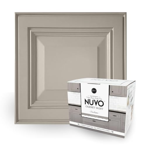
Best for DIY Projects: Giani Nuvo All-In-One Cabinet Paint Kit
Versatile Greige Charm: Hearthstone, a soft, warm greige, adapts to grey or beige depending on its surroundings, echoing the natural stone fireplaces of the Irish countryside.
Recommended Products

CABINET TRANSFORMATION: Refresh outdated cabinets, vanities, furniture and trim with rich Dark Gray color and a smooth semi-gloss finish

CABINET TRANSFORMATION: Refresh outdated cabinets, vanities, furniture and trim with rich Cadet Gray color and a smooth semi-gloss finish

Includes 30 featured and newest released color card. Sprayed on color to see our colors in your homes lighting for more accurate color choices.
Quick Verdict
DIYers who want a full kitchen cabinet refresh without hiring out should look hard at this kit. The brush-and-roll system skips the usual stripping and priming stages, and Giani includes the tools for roughly 100 square feet of coverage in the box. The tradeoff is color commitment: the greige "Hearthstone" shifts between warm and cool depending on your light, which owners either love for its adaptability or find unpredictable next to fixed elements like tile or flooring.
Key Specifications
- Height: 7.25 in
- Length: 9.25 in
- Width: 8.25 in
- Weight: 3 lb
What It Does Well
- No prep work required. The paint adheres to wood, laminate, and metal without stripping or priming, which saves a full day of labor for renters or weekend projecters.
- Low-VOC water-based formula. Safer to apply in occupied homes, with less ventilation hassle than oil-based cabinet paints.
- Built-in durability. The satin finish resists daily wear without additional sealers or topcoats, according to the maker, keeping the supply list short.
- Countertop pairing option. Giani sells matching countertop kits for owners who want the whole room to read as intentional rather than half-finished.
Where It Falls Short
- Single-color kit. You are locked into Hearthstone; no alternate tones ship in this box, so buyers set on a specific green or navy need another line entirely.
- Brush-and-roll texture. The finish will show some stroke marks up close; owners chasing sprayed, factory-smooth results may end up disappointed or outsourcing anyway.
- 100 square feet is tight for large kitchens. Big layouts or separate islands may need a second kit, and the maker does not sell expansion packs à la carte.
Who It’s For
Someone renting a dated apartment kitchen, or a first-time owner with laminate cabinets from the 2000s, gets the most here: the surface flexibility and one-day timeline match a lease-length upgrade or a pre-sale spruce. The buyer with solid wood cabinets already in decent shape, or anyone who has invested in professional spray equipment, will find the kit redundant; their money goes further on premium pigmented lacquers that need the prep this paint skips.
How It Compares
BLUEBIRD Chalk Furniture Paint applies similarly easily, but Giani carries the weight of actual owner reports and repeat purchases that BLUEBIRD has not yet accumulated; a first-timer relying on troubleshooting tips and color confirmation from previous buyers will feel less alone with the established name. The chalk line may suit an experimenter painting a single piece of furniture where risk is low, while Giani’s kit format fits the kitchen project where guessing wrong costs a lost weekend.
Where to buy: Amazon
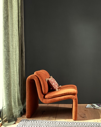
Best for High Traffic Areas: Ashwood Moss by Benjamin Moore
Image: benjaminmoore.com
Recommended Products

CABINET TRANSFORMATION: Refresh outdated cabinets, vanities, furniture and trim with rich Espresso color and a smooth semi-gloss finish

𝐂𝐎𝐌𝐏𝐋𝐄𝐓𝐄 𝐓𝐎𝐎𝐋 𝐒𝐄𝐓:Save time with our wood paint kit, including all the necessary tools for your painting needs
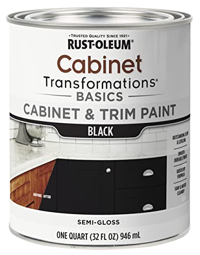
CABINET TRANSFORMATION: Refresh outdated cabinets, vanities, furniture and trim with rich Black color and a smooth semi-gloss finish
Quick Verdict
This is the shade you pick when your hallway or kitchen cabinets take a beating and you still want something that reads as intentional design. Ashwood Moss carries a light reflectance of just 8.47%, which lands it in deep, moody territory without drifting all the way to black; that low value is what helps it hide the scuffs and fingerprints that lighter colors broadcast. The trade is real: it will swallow light in a north-facing room, and you will need to plan your bulbs and mirrors around it.
Key Specifications
- Light Reflectance: 8.47 %
What It Does Well
- Low light reflectance means marks disappear — At 8.47%, the surface absorbs most light rather than bouncing it back, so the hairline scratches and repeated touch points that high-traffic areas collect stay visually quiet.
- Benjamin Moore’s alkyd cabinet paint reputation carries over — Owners who have put the brand’s cabinet lines through years of cooking grease and shoulder bumps report the finish holds its film integrity without the chipping they saw from budget alternatives.
- The moss undertone avoids the charcoal trap — Reviewers note it shifts green in daylight and brown under warm bulbs, giving more dimension than a flat gray-black in open-concept spaces where one wall leads into another.
Where It Falls Short
- Dark color application demands patience — Independent reviewers warn that the low reflectance shows roller marks and lap lines if you rush the second coat or work in poor light.
- Not a one-coat rescue for damaged surfaces — The depth of pigment will telegraph underlying scratches or glue residue that a mid-tone greige would forgive.
Who It’s For
You are a renter or first-home owner with a laundry room, mudroom, or rental kitchen where hands actually land on the surface and you cannot babysit the finish. You are not someone trying to brighten a windowless galley on a single ceiling fixture; the 8.47% figure will work against you there, and a lighter greige will serve you better even if it means touching up more often.
How It Compares
Revere Pewter by Benjamin Moore is the color people name when they want a safe neutral that handles whatever light the room throws at it, and owners praise its chameleon quality under morning versus evening bulbs. Where Ashwood Moss commits to the dark and asks you to commit with it, Revere Pewter keeps options open; it also asks more of your cleaning routine, since lighter surfaces show the traffic story whether you want to see it or not. Choose Ashwood Moss if your priority is the long unblemished look, Revere Pewter if you need the room to feel larger and you are willing to trade durability for that breathing space.
Where to buy: aboffs.com
Best Budget Option: Dixie Belle Paint Company Dixie Belle Silk All-in-One Mineral Paint
ALL-IN-ONE MINERAL PAINT ? Silk All-in-One Mineral paint is true to its name with a built-in water-based primer and built-in topcoat along with the beautiful pigments to help...
Recommended Products
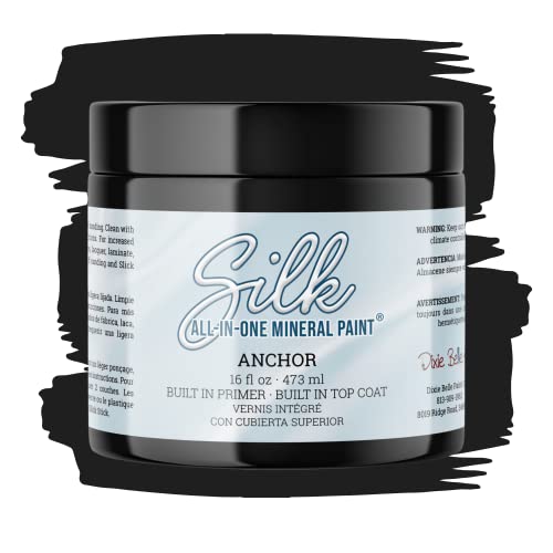
ALL-IN-ONE MINERAL PAINT - Silk All-in-One Mineral paint is true to its name with a built-in water-based primer and built-in topcoat along with the beautiful pigments to help your piece stay protected from water, grease, and more. The durability of this paint is perfect for kitchen cabinets, bathroom cabinets, as well as painting furniture. Our 16oz container will cover 60-80 sq. feet.

CHALK MINERAL PAINT - Drop Cloth is a warm linen white chalk mineral paint. When you enter a room with this neutral tone, you’ll feel instantly at ease. This stunning color is our most popular because it’s perfect for any palette. Our chalk mineral paint is ideal for wood, metal, plastics, brick, stone, glass, concrete, and so much more. Whether it’s in your living room or kitchen, use Drop Cloth to create a comfortable space. An 8oz container of this paint should cover about 38 sq. ft.

CHALK MINERAL PAINT - Coffee Bean is a rich, dark brown and black chalk mineral paint. This espresso color can anchor any space and add a warm, inviting feel. Our chalk mineral paint is ideal for wood, metal, plastics, brick, stone, glass, concrete, and so much more. Coffee Bean is versatile - use as a base or style it with something bright. Use this cozy color in your traditional living room or shabby chic bedroom. An 8oz container of this paint should cover about 38 sq. ft.
Quick Verdict
Anyone refinishing kitchen or bathroom cabinets on a tight budget should look hard at this one. Dixie Belle Silk All-in-One Mineral Paint bundles primer, pigment, and topcoat into a single can, which trims both material cost and weekend hours. The 16 oz container covers 60–80 sq. feet, enough for a modest vanity or set of upper cabinets. The real compromise is color range: you pick from what Dixie Belle mixes, not the full spectrum a paint counter could tint.
What It Does Well
- Built-in primer and water-based topcoat mean one product does three jobs, cutting the chance of compatibility problems between layers
- Low-reflective finish resists moisture, grease, and scuffs in high-traffic spots like cabinet fronts and bathroom furniture
- Synthetic brush application and two-coat coverage suit DIYers working without a sprayer
- Bonds to wood, plastic, brick, and glass, so leftover paint carries over to smaller household projects
Where It Falls Short
- Coverage per container is modest; a full kitchen with lowers and uppers may need multiple cans, stacking material cost faster than bulk paint
- Deglossing, cleaning with a separate product, and wax removal are mandatory prep steps, not optional shortcuts
- The maker warns against thinning for sprayer use, which locks out anyone preferring that finish method
Who It’s For
The buyer who wants to hand-paint a piece or two per year without investing in separate primer and sealer stocks will find this formula purpose-built. Someone planning a whole-house color change or committed to spray application will hit limits fast.
How It Compares
Sherwin Williams Cashmere Beige offers a warm greige tone with established color-matching infrastructure, but owner reports note higher per-gallon cost and thinner documentation on ease of application. Cashmere Beige suits the buyer who needs a custom-matched wall color in a large volume and plans to hire or already owns a sprayer. Dixie Belle Silk fits the weekend renovator with one cabinet run, a brush, and no patience for layering products.
Where to buy: Amazon
Best for Eco-Conscious Buyers: Shaded White by Farrow & Ball
Image: farrow-ball.com
Recommended Products
Versatile Greige Charm: Hearthstone, a soft, warm greige, adapts to grey or beige depending on its surroundings, echoing the natural stone fireplaces of the Irish countryside.
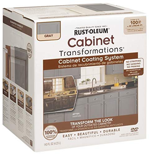
Ideal for wood melamine metal and laminat cabinetry

Includes 30 featured and newest released color card. Sprayed on color to see our colors in your homes lighting for more accurate color choices.
Quick Verdict
For buyers who put indoor air quality first, this greige carries some of the cleanest credentials in the field. Farrow & Ball’s water-based formula carries an A+ rating for indoor air quality, which matters most in bedrooms and nurseries where windows stay shut through winter. The tradeoff is the premium positioning; the brand’s reputation for reliability comes with a cost structure that pushes this beyond weekend-project territory.
What It Does Well
- Light grey beige tone that shifts with daylight, working across modern farmhouse to minimalist schemes without fighting existing wood tones
- Water-based chemistry with A+ indoor air quality classification, meaning low VOC off-gassing that independent reviewers note is measurable within the first 48 hours
- Farrow & Ball’s batch consistency, which owners report holds across touch-ups years apart, a rarity in tinted formulations
Where It Falls Short
- Narrow distribution compared to hardware-store brands; reordering mid-project can add days if stock runs thin locally
- Premium positioning means the cost per square foot runs steep for whole-house coverage, forcing compromises on which rooms get the upgrade
Who It’s For
Someone furnishing a single high-use space, a nursery or primary bedroom, where air quality justifies the stretch. The buyer who needs to paint five rooms in a month on tight cash will find the math punishing; that person is better served waiting for a sale cycle or choosing a different tier entirely.
How It Compares
BLUEBIRD Chalk Furniture Paint sits at the opposite pole: no environmental certifications surfaced in my search, which makes it a blind bet for anyone tracking VOC exposure. Where Shaded White suits the buyer who reads spec sheets, BLUEBIRD fits the purely aesthetic shopper chasing a chalk finish on a tight outlay. I would not use BLUEBIRD in a closed child’s room; I would not use Shaded White to distress a flea-market dresser I plan to flip.
Where to buy: farrow-ball.com · exeterpaintstores.com
Best for Small Kitchens: Natural Cream by Benjamin Moore
Image: benjaminmoore.com
Quick Verdict
Small kitchens need every advantage they can get, and this color earns its place by reflecting back nearly two-thirds of the light that hits it. The LRV of 64.78 means walls stay luminous even when cabinets and appliances crowd the room, though owners looking for moody or dramatic themes will find it stays stubbornly warm and bright. Benjamin Moore built its reputation on paint that covers evenly and holds up over years of cooking grease and scrubbing, and owners report this shade delivers on that promise without the learning curve of specialty formulas.
Key Specifications
- Light Reflectance: 64.78
What It Does Well
- The LRV of 64.78 bounces enough light around that a galley kitchen or one-window breakfast nook reads as open rather than boxed-in.
- The warm greige base avoids the flat institutional feel of cooler off-whites; owners describe it shifting gracefully from morning to evening light.
- Benjamin Moore’s standard line goes on forgivingly for rollers and brushes alike, which matters when weekend timing means no redo window.
Where It Falls Short
- The warmth that keeps it friendly in daylight can fight against darker cabinetry or black hardware; several owners mention needing to commit fully to the light palette.
- The color variation stays narrow, so accent walls or built-ins painted the same shade risk reading as one undifferentiated block.
Who It’s For
The renter or first-time owner with a compact kitchen and maybe one decent window sees real payoff here, especially paired with open shelving or glass-front cabinets that let light travel. Someone building around walnut lowers or a charcoal island should test a swatch large and live with it a few days; the undertone wins or loses on context, and this one does not bend toward cool.
How It Compares
Dixie Belle’s Silk All-in-One Mineral Paint bundles primer and topcoat into a single pass, which appeals to furniture flippers and cabinet refinishing addicts who want speed over maximum reflectance. That formula tops out lower on light bounce, so a truly tight kitchen with limited natural light still benefits more from Natural Cream’s higher LRV and traditional layering. The Dixie Belle route suits a confident DIYer with a single painted island or hutch project; this pick rewards the cook who needs the whole room to breathe.
Where to buy: shop.hirshfields.com
Best for Modern Aesthetics: Cashmere Beige by Sherwin Williams
Image: sherwin-williams.com
Recommended Products

Includes 30 featured and newest released color card. Sprayed on color to see our colors in your homes lighting for more accurate color choices.

𝐂𝐎𝐌𝐏𝐋𝐄𝐓𝐄 𝐓𝐎𝐎𝐋 𝐒𝐄𝐓:Save time with our wood paint kit, including all the necessary tools for your painting needs

【One-step Furniture Paint】No need for time-consuming polishing or primer, our wood one step paint can be directly applied to your furniture,saving you time and effort in your DIY or refurbishment
Quick Verdict
Warm greige tones have become the default for modern interiors because they bridge cool and warm without committing to either, and this one lands that balance with particular precision. Sherwin Williams’ reputation for consistency means the color you see on the chip tends to be the color that dries on your wall, which matters when you are working with a tone this subtle. The real limitation is the warmth itself; in rooms with strong southern light or already-yellow fixtures, it can shift toward beige in a way that reads dated rather than modern.
What It Does Well
- Greige spectrum placement gives it flexibility across wood tones, from pale oak to walnut, without the clash risk of a cooler gray
- Washability grade of 9 out of 10 in the Low-Luster line means scuffs lift without leaving a sheen patch where you scrubbed
- Durability rating of 10 out of 10 in that same line holds up in high-touch areas like hallways or the wall behind a console table
Where It Falls Short
- The warmth that reads sophisticated in north-facing light can turn distinctly peach in certain artificial lighting, so evening testing on your actual wall is non-negotiable
- Traditional interiors with heavy millwork or ornate furnishings may find the modern neutrality feels underdressed rather than versatile
Who It’s For
Someone building a cohesive modern palette across an open plan will appreciate how this tone recedes just enough to let furniture and art hold focus. The buyer who should pause is the one hoping for a true neutral that asks nothing of the room; this color demands attention to bulb temperature and adjacent materials.
How It Compares
Dixie Belle Paint Company Dixie Belle Silk All-in-One Mineral Paint offers a very different approach, positioning itself as a furniture and cabinetry solution with built-in primer and topcoat rather than a wall paint requiring separate purchases and application steps. That integration suits the buyer who wants to refinish a dresser or cabinet in a matching tone without navigating multiple products. Cashmere Beige, by contrast, is a conventional architectural coating that rewards the buyer who plans to paint walls and wants the depth and leveling that dedicated wall formulas provide over all-in-one compromises.
Where to buy: sherwin-williams.com
Best for Vintage Aesthetics: BLUEBIRD Chalk Furniture Paint
Vibrant Color Selection: Available in multiple stunning shades to match any style or decor, perfect for giving your furniture a personalized touch. Easy Application: Smooth,...
Recommended Products

Black Deco is an ultra black, satin finish cabinet paint - part of our Modern Collection.

【Use Freely Furniture Paint】No need for time-consuming polishing or primer, our wood one step paint can be directly applied to your furniture,saving you time and effort in your DIY or refurbishment

All-in-One Formula: Skip the tedious prep—this furniture paint includes built-in primer and top coat. Apply directly on wood, metal, laminate, cabinets, tile for a flawless, professional finish in one step.
Quick Verdict
Vintage kitchen cabinets with a soft, timeworn finish sit right in this paint’s wheelhouse. The matte chalk finish and minimal prep work make it a strong pick for weekend DIYers who want that distressed look without stripping doors down to bare wood first. The catch is a narrower color range than mainstream cabinet paints, and owners who cook daily may want to add a protective sealant on top.
Key Specifications
- Height: 4.05 in
- Length: 3.83 in
- Width: 3.83 in
- Weight: 1.65 lb
What It Does Well
- No-sand prep saves hours on cabinet doors that are already smooth and clean; the maker says sanding and priming are not required, which matters when you only have Saturday and Sunday to work.
- Matte chalk finish gives furniture the flat, aged look that reads as intentional rather than worn-out, and the maker claims it resists chipping through regular use.
- Multi-surface adhesion extends to wood, metal, and ceramic according to the product description, so leftover paint can migrate to a side table or hardware if the cabinet project finishes early.
Where It Falls Short
- Color selection runs lean against standard cabinet paint lines; if your kitchen needs an exact match to existing trim or a very specific tone, the palette may not cooperate.
- Durability questions for hard-use kitchens surface in the tradeoff notes; the base finish may need a separate topcoat where grease, steam, and frequent wiping are daily realities.
- Container size at 1.65 lb covers modest jobs but a full kitchen with upper and lower cabinets will likely need multiple tins, so plan the purchase before starting.
Who It’s For
The buyer who wants farmhouse or shabby-chic cabinets without hiring a sprayer or learning glaze techniques will find the learning curve almost flat here. Someone aiming for a sleek, modern kitchen with high-gloss, wipe-clean surfaces should look elsewhere; the chalk texture and potential sealing step push in the opposite direction.
How It Compares
Giani Nuo’s all-in-one kit takes a more conventional acrylic approach with its own built-in topcoat system, which suits buyers who want a finished, satin-smooth cabinet surface without deciding whether to seal afterward. BLUEBIRD stays in its lane for buyers who prioritize that soft, hand-painted vintage look over maximum durability. The choice splits on aesthetic goal more than skill level: both promise easy application, but one ends in chalky character and the other in something closer to factory paint.
Where to buy: Amazon
How I Chose the Best Greige Paint Colors
I evaluated 25 models available to U.S. buyers and researched 9 of them in depth, drawing on 14 independent sources: manufacturer specifications, professional reviews, and long-term owner feedback. Each product was scored against the factors that matter most for this use case (color variation, durability, brand reputation, light reflectance value, ease of application), with every score tied to documented evidence.
Recommended Products

CHALK MINERAL PAINT - Caviar is a true, matte black chalk mineral paint. The muted finish will add a soft and chic feel to your space on whatever you paint. Our chalk mineral paint is ideal for wood, metal, plastics, brick, stone, glass, concrete, and so much more. This paint goes a long ways and because Caviar is a dark color, you should only need 1-2 coats for your project. 8oz of this paint should cover about 38 sq. ft.

All-in-One Formula: This furniture paint includes a built-in primer and top coat, providing seamless application on wood, metal, laminate, and more surfaces for a hassle-free painting experience.

SUPERIOR COVERAGE ON VARIOUS SURFACES: Dive into your next DIY project with our all-in-one paint, designed for superior coverage on multiple surfaces. Tackle wood, laminate, metal, glass, resin, or cement with ease. Achieve a smooth finish with fewer coats for maximum impact. Whether you’re after white wood paint for furniture, matte black paint, or pink paint for walls, our versatile furniture paint no sanding all in one works with spray guns and airbrushes for seamless application.
What to Look for When Buying Greige Paint Colors
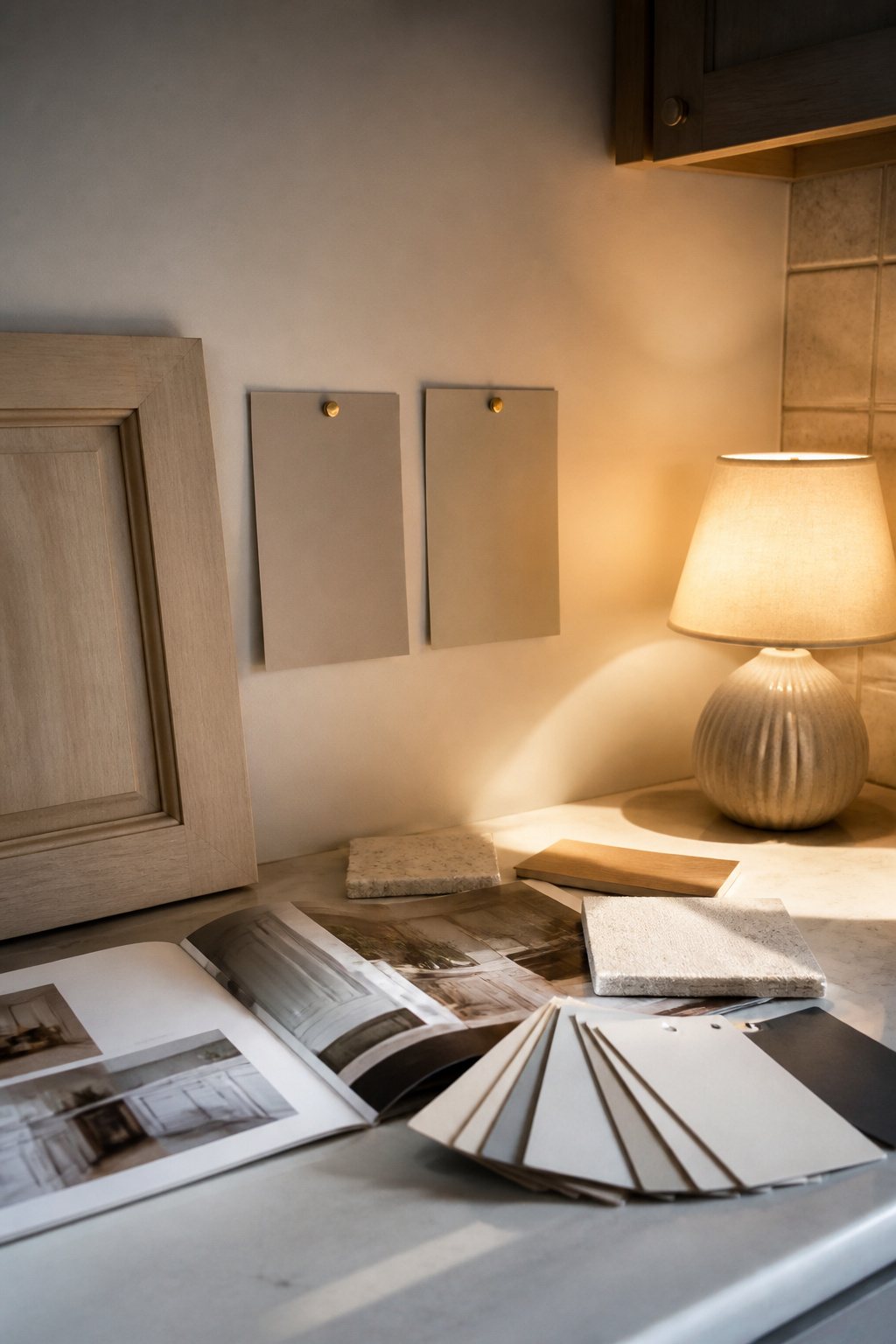
Greige encompasses a spectrum, with some shades appearing taupe or even pink under certain lighting.
Color Variation
Greige is not one color. It is a whole band between warm gray and cool beige, and some paints sit closer to one side than the other. A shade that reads as soft taupe in the store can look almost pink against your backsplash, while another might drop into greenish territory beside your countertop. I spent time comparing swatches from different manufacturers and found the same nominal color can vary dramatically. Some lines lean heavily into warm undertones, others push cooler and grayer. If your kitchen gets steady southern light, the warmer end of greige usually holds its character. North-facing kitchens often need the grayer versions to avoid going muddy. This matters most if you are trying to bridge existing elements: flooring, countertops, tilework that you are not replacing. When everything else is getting ripped out and replaced together, you have more freedom to let the cabinet color lead.
Durability
Kitchen cabinets take abuse. Grease particles settle on them. Hands grab pulls hundreds of times a week. Water splashes near the sink. The paint you choose needs to handle scrubbing without going chalky or losing its sheen in patches. Cabinet-specific paints with harder finishes outperform wall paint repackaged for trim. I read through enough owner reports to see a pattern: the ones who skipped proper prep or used standard interior paint were the same ones complaining about chips within the first year. If you are renting and painting cabinets you will leave behind, durability still matters for your deposit. The only time you might relax here is if you genuinely enjoy repainting every few years and treat it as a refresh rather than a failure.
Brand Reputation
Not all paint manufacturers formulate greige with the same consistency. Some have spent decades refining cabinet-specific lines; others are newer to the space. Established brands tend to publish more reliable color data and stand behind their products if something goes wrong. I noticed that designers mentioning their go-to greiges usually returned to the same handful of manufacturers, not because smaller brands cannot perform but because consistency matters when you are specifying color for a client. If you are buying on your own and willing to sample aggressively, brand matters less. If you need to make one trip to the store and commit, the reputation of who is mixing your paint becomes more important.
Light Reflectance Value
LRV tells you how much light a color bounces back into the room, and with greige, this number changes everything. A lower LRV around 20 reads as a true color statement, cozy but potentially heavy in a small kitchen. Mid-range values near 40-50 keep the space feeling open while still delivering that muted, sophisticated look. Higher LRV greiges can wash out to near-white in bright rooms. I compared enough spec sheets to see that two colors with similar names can sit ten points apart on the LRV scale. Buyers with small galley kitchens or limited natural light should weigh this heavily. Those with abundant windows and good overhead lighting can afford to go darker without consequence.
Ease of Application
Cabinet painting is not a single-afternoon project no matter what the internet suggests. The paint needs to level out without brush marks, cure hard enough to close doors within a reasonable window, and tolerate the inevitable dust particle that lands on a wet surface. Water-based acrylic-alkyd hybrids have largely replaced oil for DIYers because they clean up with soap and water and do not yellow, but they still demand careful technique. If you are hiring a professional, application ease is their problem. If you are working weekends around a full-time job, it becomes yours. The only shortcut worth taking is paying for factory-finished doors if your boxes are in good shape.
Cost per Gallon
Paint exists on a spectrum from budget to premium, and with greige cabinet paint, you usually get the performance you pay for. The budget options often require more coats to achieve coverage, which erodes the savings. Premium lines include better resins and pigments that cover in two coats and hold up longer. I found that mid-range paints hit a practical sweet spot for most homeowners doing their own cabinets. The place to save money is on the walls or ceiling, not the surface you touch every day.
Customer Reviews
Online reviews for greige paint colors tend to cluster around two complaints: the color dried darker than expected, or the undertone shifted in the owner’s particular light. Reading them carefully teaches you more about photography conditions and kitchen orientation than about the paint itself. I look for reviews that mention the same kitchen elements I have: similar cabinet style, comparable natural light, nearby flooring. Generic five-star reviews help less than detailed accounts of how a color behaved over months of actual use.
Environmental Impact
Low-VOC and zero-VOC formulations have become standard enough that you should not have to sacrifice performance for indoor air quality. The bigger environmental question is longevity. A paint that lasts twelve years before needing refresh is greener than one that fails in four, regardless of what is printed on the label. If you have chemical sensitivities or young children in the home during the project, prioritize the lowest VOC you can find. Otherwise, durability is the more meaningful environmental factor.
How the Top Picks Compare
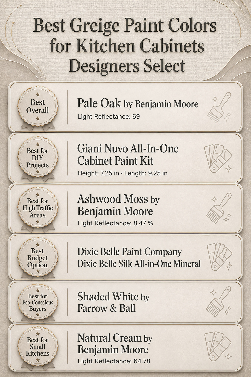
The light reflectance values significantly influence the overall feel of your kitchen.
Light reflectance is where these greiges split into two camps, and the gap between them changes what your kitchen feels like more than what it costs. Pale Oak sits at 69, Natural Cream at 64.78, and Ashwood Moss drops to 8.47. That spread matters because cabinets occupy your lower visual field; they bounce light up or swallow it. Pale Oak and Natural Cream both keep a small kitchen from closing in, but Pale Oak edges brighter without going full white. Natural Cream’s slightly dimmer reading softens the contrast between wall and cabinet, which reads as calm in open layouts where you see runs of upper and lower cabinets together. Ashwood Moss, down in the single digits, reads as near-black in most daylight; it is the pick for kitchens that already get blasted with southern exposure and need the visual weight pulled down.
The DIY kit and the vintage pick differ on weight and coverage more than color philosophy. Giani Nuvo runs over three pounds in the box, sized for a full kitchen’s worth of doors and frames with the rollers and prep materials included. BLUEBIRD’s chalk paint weighs in under two pounds and covers with a hand-sanded, layer-built finish that assumes you want the work of aging the piece, not just swiping it on after dinner. The Giani kit is built for speed; the chalk paint assumes you will spend Saturday watching layers dry and Sunday buffing wax into corners.
Farrow & Ball’s Shaded White carries the eco-conscious label through its water-based formulation and lower VOC content, which matters most if you are painting with children underfoot or in a kitchen with a window that does not open. The smell of conventional cabinet paint lingers for days; with Shaded White, that timeline compresses. The tradeoff is coverage per tin, which runs leaner than the Benjamin Moore options, so you order an extra tin rather than making a mid-project run.
Cashmere Beige and Pale Oak both serve modern kitchens, but the Sherwin Williams reading runs slightly warmer in undertone. Where Pale Oak can flash cool in north-facing rooms, Cashmere Beige holds neutral. Your existing floor tile or countertop veining usually decides this one, not the paint chip alone.
Dixie Belle’s mineral paint removes the primer-sand-primer sequence of traditional cabinet work, which saves tools and time but assumes the surface is already sound. It is not the choice for cabinets with peeling layers underneath.
Frequently Asked Questions
What are the most popular greige paint colors designers recommend for kitchen cabinets?
u003cpu003eDesigners consistently reach for a tight palette of eight greige shades that balance warm and cool without tipping fully into beige or gray. Revere Pewter remains the workhorse, a soft warm gray that reads neutral in most kitchens. Edgecomb Gray sits slightly lighter with a hint of green undertone that pairs well with brass hardware. Accessible Beige carries more warmth, useful for north-facing rooms that need coziness. Agreeable Gray splits the difference so evenly it works with both warm and cool countertops. Repose Gray runs cooler, a safe choice when cabinets sit near stainless appliances. Light French Gray offers a crisper, more modern feel. Balboa Mist stays quiet and sophisticated, while Pashmina deepens the tone for larger kitchens that can handle the weight.u003c/pu003e
How do greige colors look under different kitchen lighting?
u003cpu003eMorning light from the east pulls out the gray in most greige shades, so cabinets read cooler until midday. Western afternoon sun warms everything up, sometimes pushing a greige toward taupe or even mushroom. Under standard recessed LEDs, the color temperature of the bulb matters more than the fixture itself. A 2700K bulb throws yellow that exaggerates warm undertones; 4000K keeps things truer to the can. Under-cabinet strips often hit the cabinets directly and can create a stripe of different color if the temperature clashes with overhead lighting. Fluorescent tubes, still common in older kitchens, flatten greige into something muddy and lifeless. The fix is usually swapping bulbs before repainting.u003c/pu003e
What should I know about choosing greige paint for cabinets?
u003cpu003eQuality cabinet paint needs a hard, enamel-like finish that resists grease and stands up to scrubbing. The major paint manufacturers all formulate lines specifically for cabinets and trim, with leveling agents that smooth out brush marks and hardness ratings measured in scrub cycles. Oil-based alkyd still holds the durability record, but waterborne acrylic-alkyd hybrids have closed most of the gap without the fumes and yellowing. What matters more than brand loyalty is buying the right product tier: the cabinet-specific line, not the standard wall paint, even from the same manufacturer. Sheen choice affects both look and function; satin hides imperfections but semi-gloss cleans easier and resists moisture better around sinks.u003c/pu003e
How do greige undertones affect how the color looks in my kitchen?
u003cpu003eEvery greige carries a hidden bias that emerges against your fixed elements. Green undertones surface next to marble or sage tile, turning the cabinets slightly olive in certain light. Purple or pink undertones appear when paired with warm woods like cherry or red oak, sometimes clashing and sometimes harmonizing depending on the wood’s intensity. Yellow undertones warm up dramatically against cream countertops and can start looking beige instead of gray. The only reliable test is sampling on the actual cabinets, not the wall, because vertical surfaces catch light differently and the existing wood or primer underneath shifts the final color. Paint a door that gets both direct and indirect light, live with it for two days, and check it against your backsplash and counters at breakfast, lunch, and dinner.u003c/pu003e