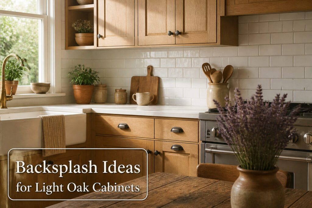
White backsplash is the fastest way to brighten light oak cabinets without touching the wood itself, but the finish matters more than the color.
Glossy ceramic or glass throws the most light around a dim kitchen; matte subway tile softens glare if your afternoon sun already hits hard. Skip anything creamy, though.
Off-white drifts toward yellow and amplifies the orange undertone you are trying to quiet.
1. White Backsplash
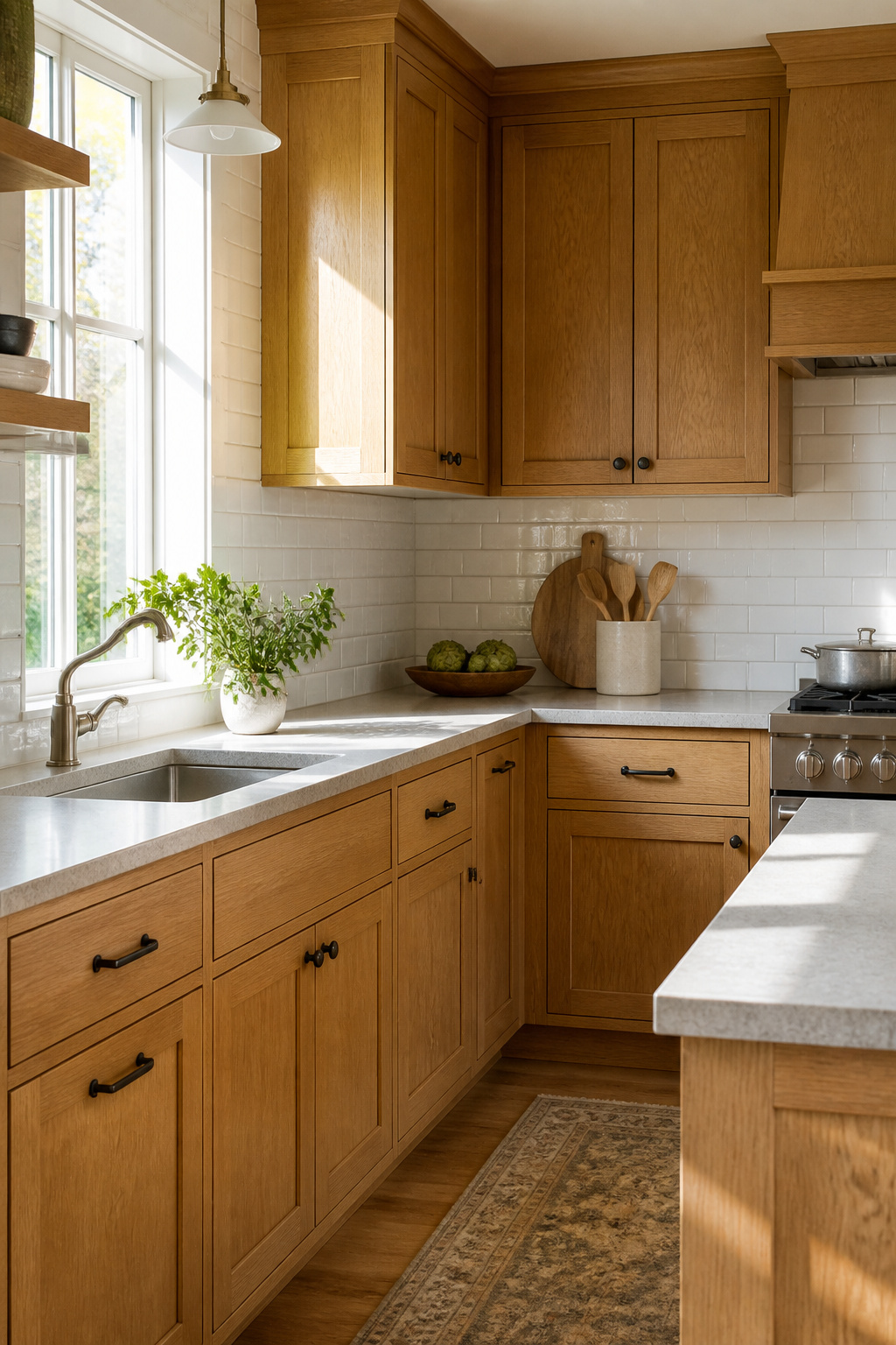
White backsplash with light oak cabinets is the pairing most readers ask about first, and for solid reason.
The honey oak’s golden-orange undertones read heavy in a dim kitchen, and white tile bounces light back into the room without competing against the wood’s warmth. It is the quickest way to brighten the space without touching the cabinets themselves.
Finish matters more than color here. Glossy ceramic or glass will throw the most light around; matte subway tile softens the glare if your kitchen already gets harsh afternoon sun.
Marble, ceramic, glass, and textured mosaic tiles all work, so the choice turns on what your walls can handle weight-wise and what your weekend budget allows.
I would skip anything too creamy; off-white can drift toward yellow and amplify the orange you are trying to quiet. A clean, true white freshens the oak instead of aging it.
This is the easiest way to brighten light oak cabinets, which is why it shows up in so many weekend projects.
The Scandinavian look sources describe, airy and restrained, builds from this exact pairing: pale wood below, pale tile above, nothing shouting between them.
Renters especially should note that white subway tile is the most forgiving to source and the simplest to install in a Saturday with a rental-grade tile saw.
Recommended Products

✿ 1.4 Times Coverage Area: 10 sheets thickened self-adhesive tiles, 12" X 12" each (The small piece is 3.3" X 1.8"), which covers 40% more area than 10"x10" tile

Premium Performance: Our peel and stick wall tiles are designed with high-performance PVC polymer material, offering waterproof, heat-resistant, stain-resistant, anti-scratch, and fadeless properties. Rest assured, the super-strong adhesive ensures the tiles stay securely in place!

Easy DIY, Just Peel & stick, cut with tin snip, utility knives or hand saws, saving large amount on labor
2. Gray Subway Tile
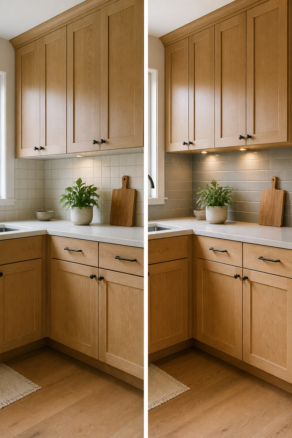
Gray subway tile gives light oak cabinets a modern counterweight without turning the kitchen cold.
The gray reads as a deliberate contrast, not a mismatch, because it sits opposite the warm honey undertones on the color wheel rather than fighting them.
Medium to soft gray tones work best here; they offset the wood’s warmth without the harshness that darker shades can bring.
Installation direction changes the whole effect. Horizontal subway tile keeps the look classic and draws the eye across the room, which can make a narrow galley feel wider.
Vertical stacking does the opposite, pulling the gaze upward and giving the backsplash a more current, linear presence that pairs well with simple slab cabinet fronts.
Either way, the gray provides a visual breather between the oak and the countertops, letting the cabinets remain the focal point while the tile does the quiet work of balancing the palette.
Porcelain options in this color range run durable enough for a rental kitchen that sees real cooking, and the material holds up to the cleaning that a light-colored grout line will eventually need.
Recommended Products

𝐏𝐫𝐞𝐦𝐢𝐮𝐦 𝐌𝐚𝐭𝐞𝐫𝐢𝐚𝐥𝐬:Made of PVC composite laminate, anti-scratch, high impact, color fadeless, more durable and stronger than other plastic self-adhesive tiles. Glossy/Poished surface finishing with realistic ceramic look, high waterproof and stain-resistant performance, protect the walls from splash and iol.

Realistic Ceramic Tile Look: Glossy and shiny hexagon tile is scratch-resistant, high-impact and fade-resistant, creating a high-end look for you, long hexagon design can be installed vertically or horizontally.

Case includes: 5 sheets glass mosaic tiles covering 5 sq.feet. Safe well packed. Mesh mounted glass mosaics tiles with foam pads inside the thickened superhard carton box.
3. Beige Mosaic Tile
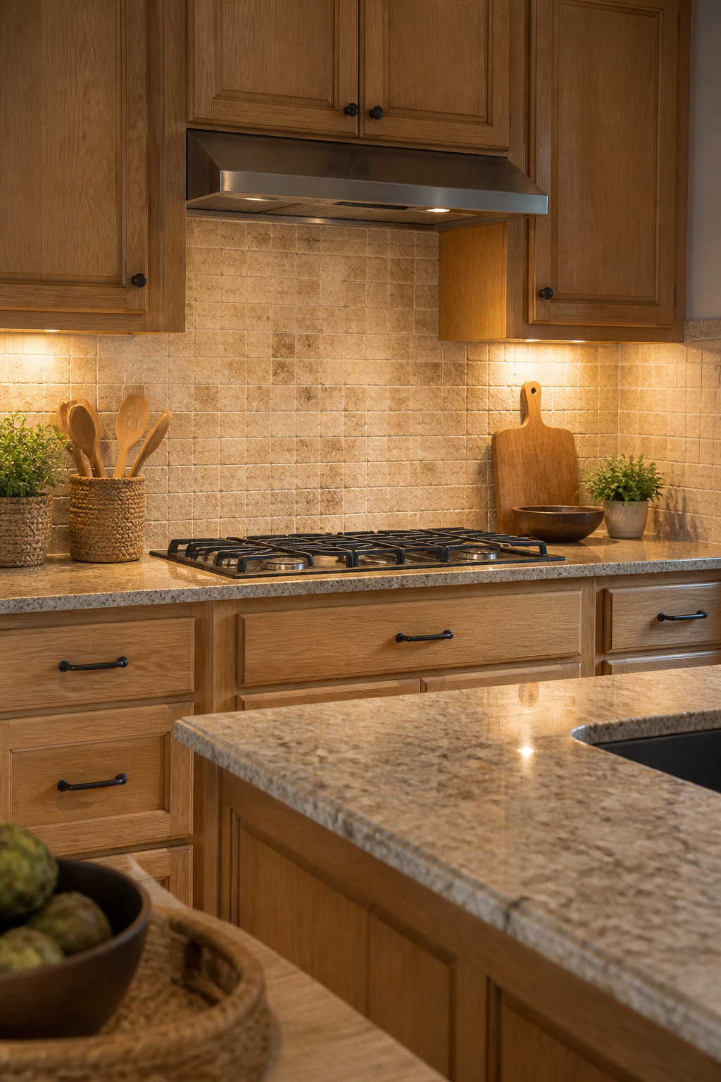
A beige mosaic tile with uneven edges and a weathered surface reads as an extension of the oak itself rather than a frame around it.
The color picks up the warm undertone already in the cabinets, so the wall and the wood share a single tone instead of competing.
That makes the whole kitchen feel larger, which matters most in a small space or one with limited natural light where strong contrast would chop the room into pieces.
The texture is what keeps this from going flat. The slightly irregular edges catch light differently across the day, so the wall has movement even though the palette stays quiet.
It works with the same antique brass or matte black hardware that already shows up against oak, and the pairing feels intentional rather than matched to death.
Styles that lean into warmth do best here: a cottage kitchen, anything with a lived-in Scandinavian feel, or a transitional space that wants to avoid the crispness of white subway tile.
The tradeoff is that beige this close to the cabinet color will not hide cooking splatter the way a mid-tone gray might. You are committing to wiping the stove wall with the same regularity you already give the counters.
For some kitchens that rhythm is fine; for others it is a reason to look at something with more separation.
Recommended Products
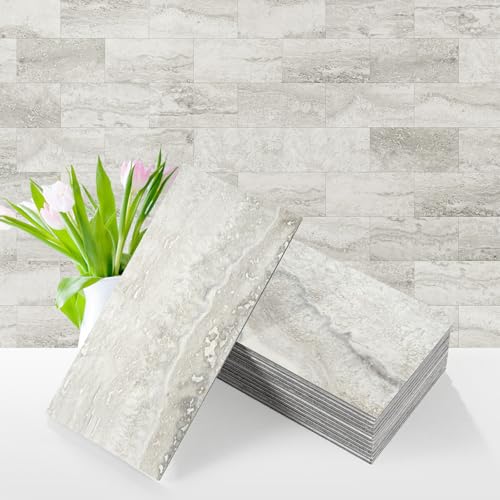
Premium Material :Made of PVC composite laminate, anti-scratch, high impact, color fadeless, more durable and stronger than other plastic self-adhesive tiles. Natural surface finishing with realistic marble look, high waterproof and stain-resistant performance, protect the walls from splash and iol.

Matte Black Texture Design:Matte black finish with a natural stone-inspired texture adds depth and a modern look to kitchens, bathrooms, laundry rooms, fireplaces, and accent walls.

SIZE AND COVERAGE: 20 sheets self adhesive PVC tiles, 11.58"x11.35"x0.16" each, cover about 18.24 square feet which would usually covers a standard kitchen. Please consider cutting loss 3-5% in every DIY project. An added BONUS: comes with a pair of gloves protect your hands from dirty and injury
4. Green Glass Tile
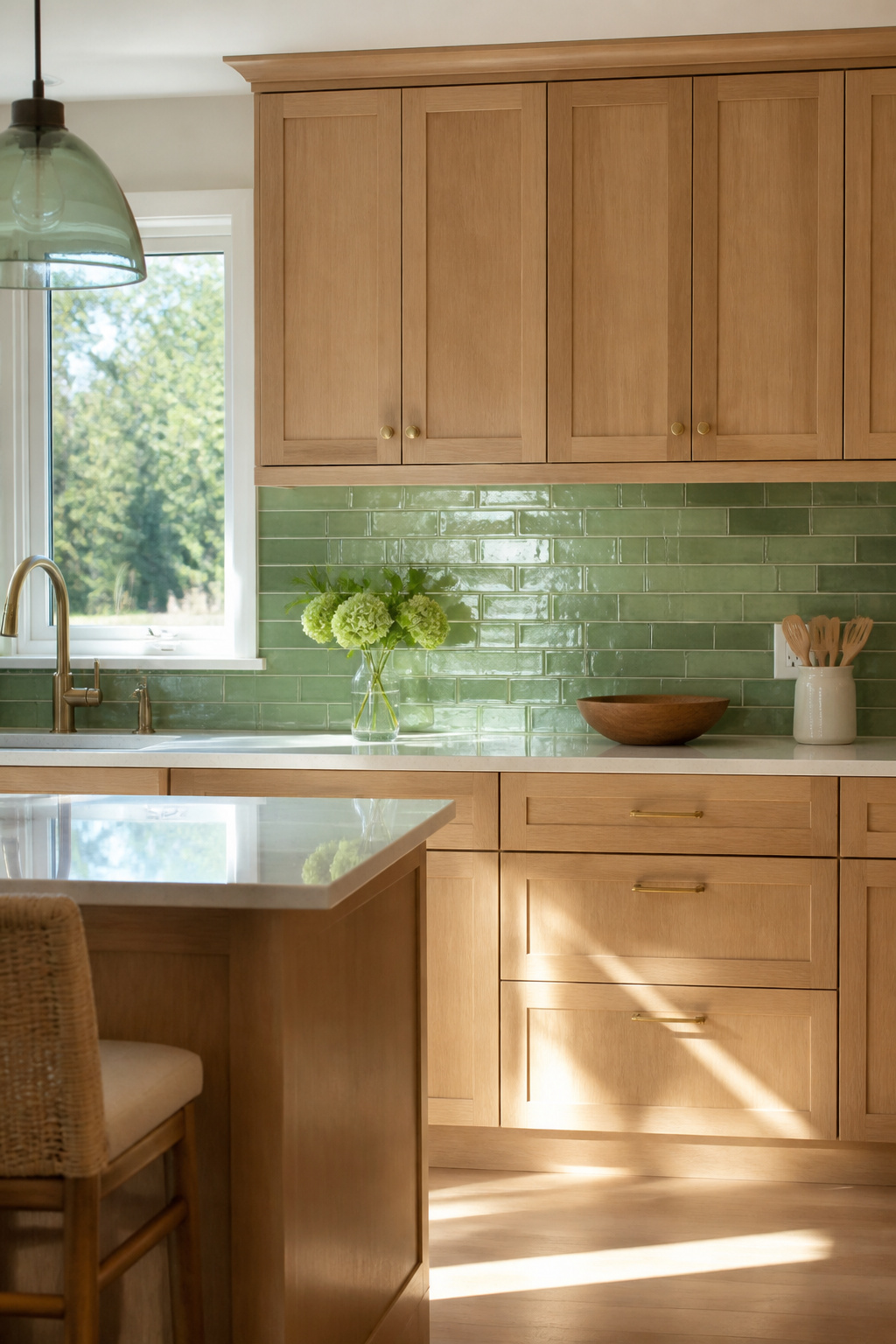
Green glass tile gives light oak cabinets a pulse of color without fighting the wood’s warmth.
Sage softens the grain into something coastal, emerald turns the contrast sharp and modern, and teal lands in the middle with enough blue to feel cool against the honey tones.
The sources lean toward that sea green range for a reason: it reads fresh against oak’s yellow undertone where a true forest green would muddy.
Glass matters here in a way it doesn’t with painted cabinets. Oak’s grain already carries visual texture, so a glossy, reflective backsplash keeps the wall from competing.
The surface bounces light around a small kitchen, which renters especially notice in galley layouts with one window. But that same reflectivity shows every water spot and grease film.
Sources pair glass with quartz countertops partly for the look, partly because both wipe clean with a damp sponge and no sealing ritual.
Skip glass if you cook daily and hate the wipe-down; the maintenance is low-effort but constant, not forget-it-for-a-week like porcelain.
Recommended Products

SIZE AND COVERAGE: 20 sheets self adhesive PVC tiles, 11.58"x11.35"x0.16" each, cover about 18.24 square feet which would usually covers a standard kitchen. Please consider cutting loss 3-5% in every DIY project. An added BONUS: comes with a pair of gloves protect your hands from dirty and injury

【Special Design】Faux stone mosaic. Matte silver gray limestone look large subway tile design. Special material which will be flickering of certain visual angle. Peel and stick backsplash is designed to be with intentional natural shade and veins variation, we intend to give the peel and stick tile the depth and richness from natural stone. Close-joint subway tiles with clear edge bevel processed, no grouting required, the seamed design make it just like a real caulked tile

Peel and Stick Backsplash Kitchen Tiles Measurement:Multi rectangular tile staggered,tight joint,sheet measures 9.53"(W)x11.42"(L),sheets are interlocking,brick pattern linear mosaic tiles
5. Calacatta Porcelain Tile
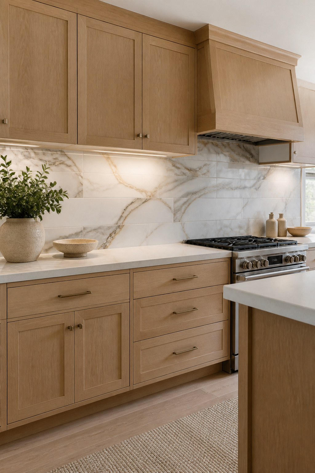
Calacatta is not a generic marble look. The veining runs in thick, dramatic strokes of warm gray and gold against a bright white field, not the scattered veins of Carrara.
That distinction matters when you pair it with light oak cabinets, because the bold pattern needs the wood’s quiet grain to keep the kitchen from feeling busy.
Porcelain carries that look at a fraction of the maintenance. Real Calacatta marble is porous, stains with red wine or tomato paste, and asks for yearly sealing.
The porcelain version is non-porous, so the same wipe with a damp cloth or sponge handles spills without the panic.
For a weekend project on a few hundred to a thousand dollars, that difference between surviving dinner and planning a re-do is the whole calculation.
The tile reads as luxury because the veining is specific, not because the material is precious. Light oak warms the white base enough that the combo avoids the cold showroom feel.
Install it in a subway or stacked layout and the pattern does the work; no need for fancy cuts or accent strips that eat time and budget.
Cleaning is straightforward. No special stone cleaner, no sealing schedule, no etching from lemon juice or vinegar.
The maintenance reality is ordinary dish soap and water, which for most of us is the only kind that actually happens.
Recommended Products
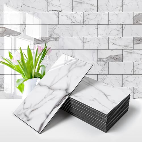
Material:Made of PVC composite laminate, anti-scratch, high impact, color fadeless, more durable and stronger than other plastic self-adhesive tiles. Glossy/Poished surface finishing with realistic ceramic look, high waterproof and stain-resistant performance, protect the walls from splash and oil.

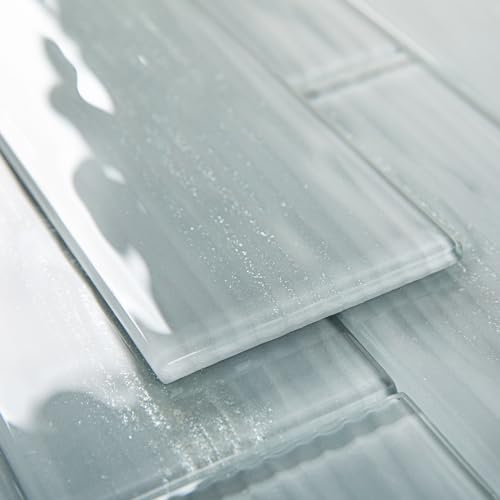
【Peel and Stick】Diflart peel and stick glass tiles are self-adhesive design, no grout, no mess, easy to install.
6. Dark Gray Subway Tile
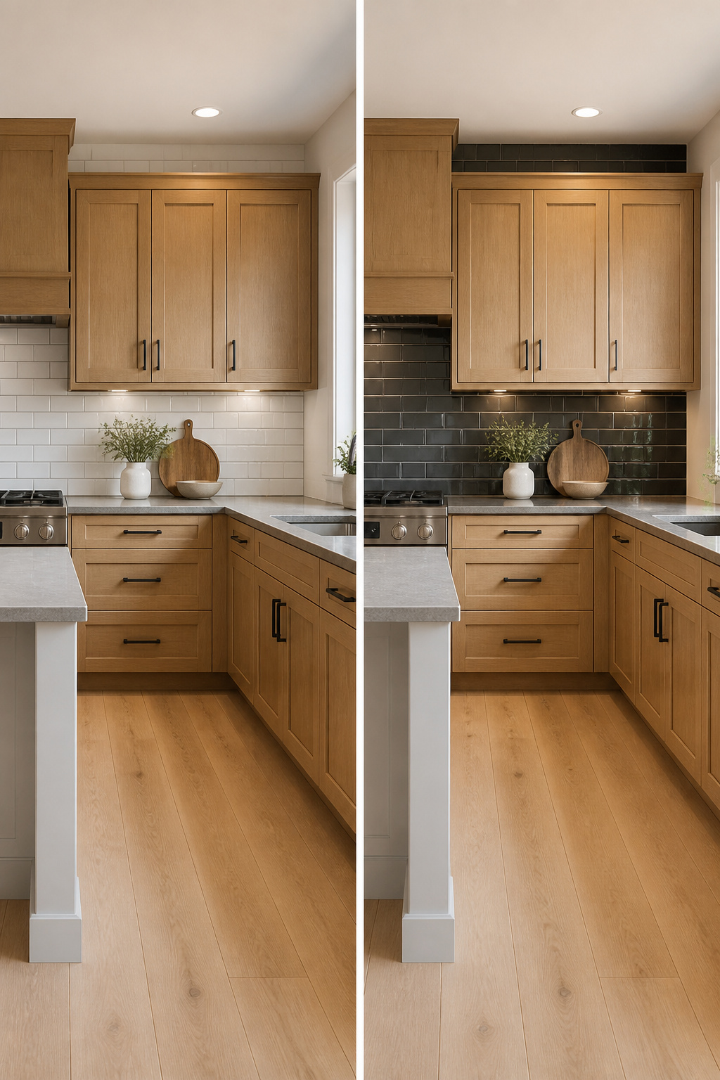
Dark gray subway tile lands heavier than the lighter grays, and that weight is the whole point. Where pale stone-look porcelain reads as quiet background, charcoal-toned subway tile pushes forward as a deliberate frame around light oak.
The contrast works best when the kitchen already has some built-in brightness to balance it: pale floors that bounce light back up, a window over the sink, or oak that runs toward white oak’s cooler undertone rather than honey’s warmth.
Without one of those three conditions, the risk is a kitchen that feels like it is happening in two separate rooms.
The visual depth comes from the tile reading as shadow rather than color. Installed in a standard running bond, dark gray subway recedes just enough to let the oak feel sunlit by comparison.
Flip the orientation vertical and the same tile turns architectural, drawing the eye up and making standard-height ceilings feel intentional rather than low.
Either layout pairs cleanly with matte black or antique pewter hardware, which keeps the palette tight instead of competing.
Go dark gray when your oak is on the cooler side and your floors are already light; the tile will do the heavy lifting of defining the space without black’s tendency to flatten everything into a single plane.
Recommended Products
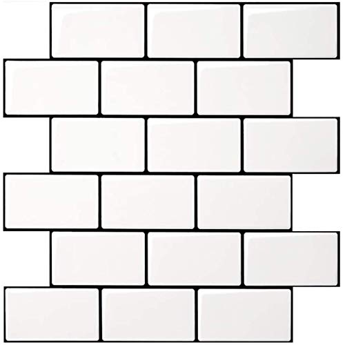
Upgraded Thicker Build: 2–3 times thicker than regular peel and stick tiles, resistant to tearing and bending for easier installation.

2-3 Times Thickness: Each tile is 2mm-2.5mm thick, offering durability and solidity, providing a high-quality alternative to soft sticker tiles

Easy to install: These wall tiles are simple to install—just peel and stick, no extra adhesive required.
7. Stone Mosaic Tile
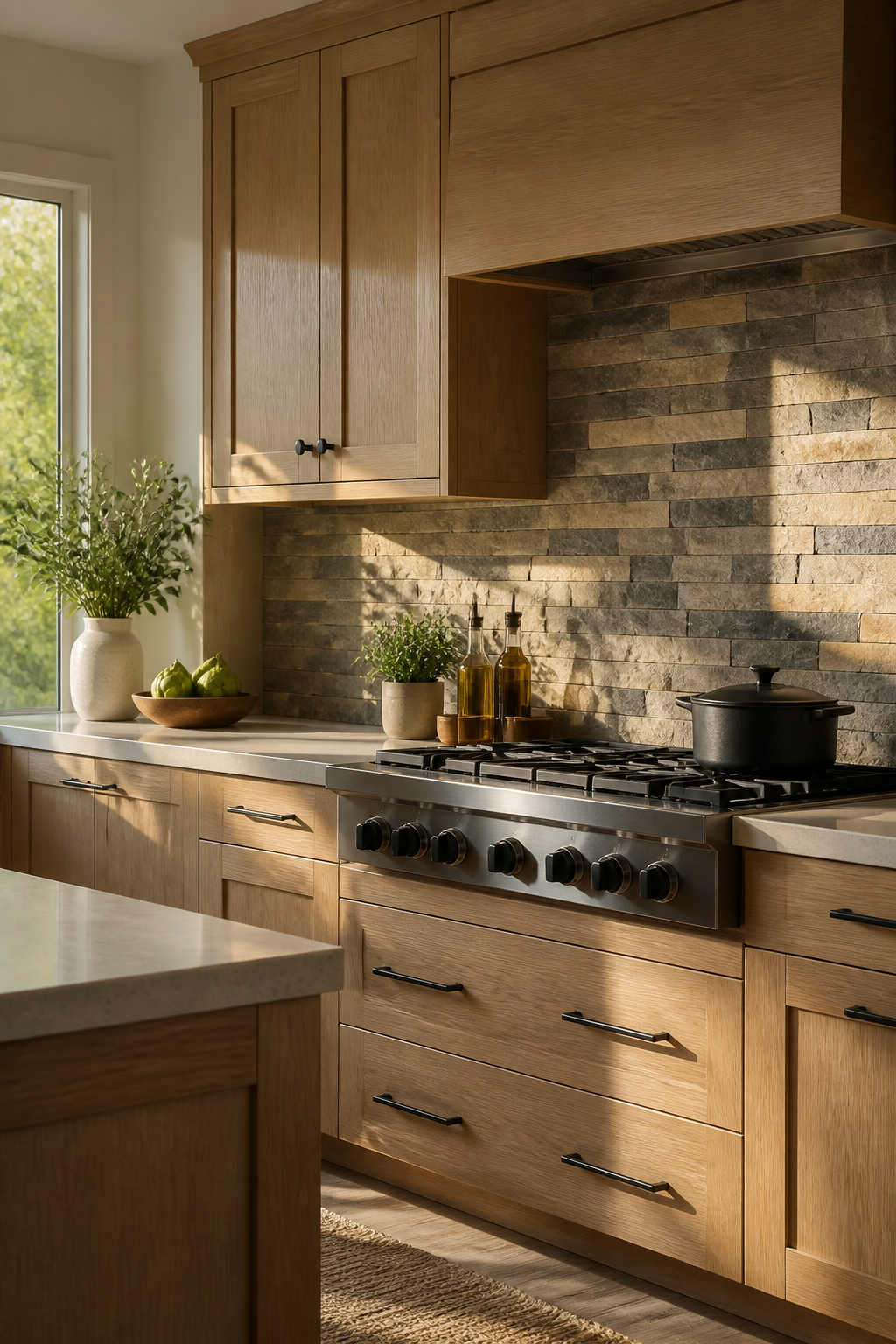
Stone mosaic tile carries the same irregular warmth that makes light oak feel alive in a kitchen. Travertine, slate, and pebble each handle that pairing differently.
Travertine keeps the tone pale and quiet, almost disappearing into the same honeyed register as the cabinets.
Slate pushes darker and rougher, which sounds risky against light oak until you see how the grain in both materials starts a conversation across the wall.
Pebble mosaics, the kind with actual river stones set on mesh, read almost as a third wood tone from a few feet back.
The mosaic format matters because oak’s grain is already doing a small-scale pattern of its own. A large stone slab would fight it; a mosaic of one-inch or smaller pieces lets the two textures stay in their own lanes.
Your eye catches the rhythm of the tile, then the rhythm of the cabinet, without either one flattening the other.
Sealing is the part nobody warns you about. Ceramic and glass backsplashes wipe down and forget.
Stone, even the dense stuff, drinks oil and tomato sauce unless you seal it before grout, after grout, and again every year or two. Skip that second coat and you’ll know exactly which burner you cook bacon on.
The sealer itself runs maybe thirty dollars a quart, and the work adds an afternoon to the job. Budget for it, or budget for regret.
Recommended Products

𝐏𝐫𝐞𝐦𝐢𝐮𝐦 𝐌𝐚𝐭𝐞𝐫𝐢𝐚𝐥𝐬:Made of PVC composite laminate, anti-scratch, high impact, color fadeless, more durable and stronger peel and stick subway tiles than other plastic self-adhesive tiles.

PINWHEEL PATTERN TILE:10 Sheets high quality glass and pvc peel and stick tile backsplash, 12"x12"x0.12" each,cover about 10 square feet. This square peel and stick backsplash makes installation easier and reduces cutting waste. The design of pure white and glass will make your overall home look brighter and more spacious.

Material:Made of PVC composite laminate, anti-scratch, high impact, color fadeless, more durable and stronger than other plastic self-adhesive tiles. Glossy/Poished surface finishing with realistic ceramic look, high waterproof and stain-resistant performance, protect the walls from splash and oil
8. Earth Toned Backsplash
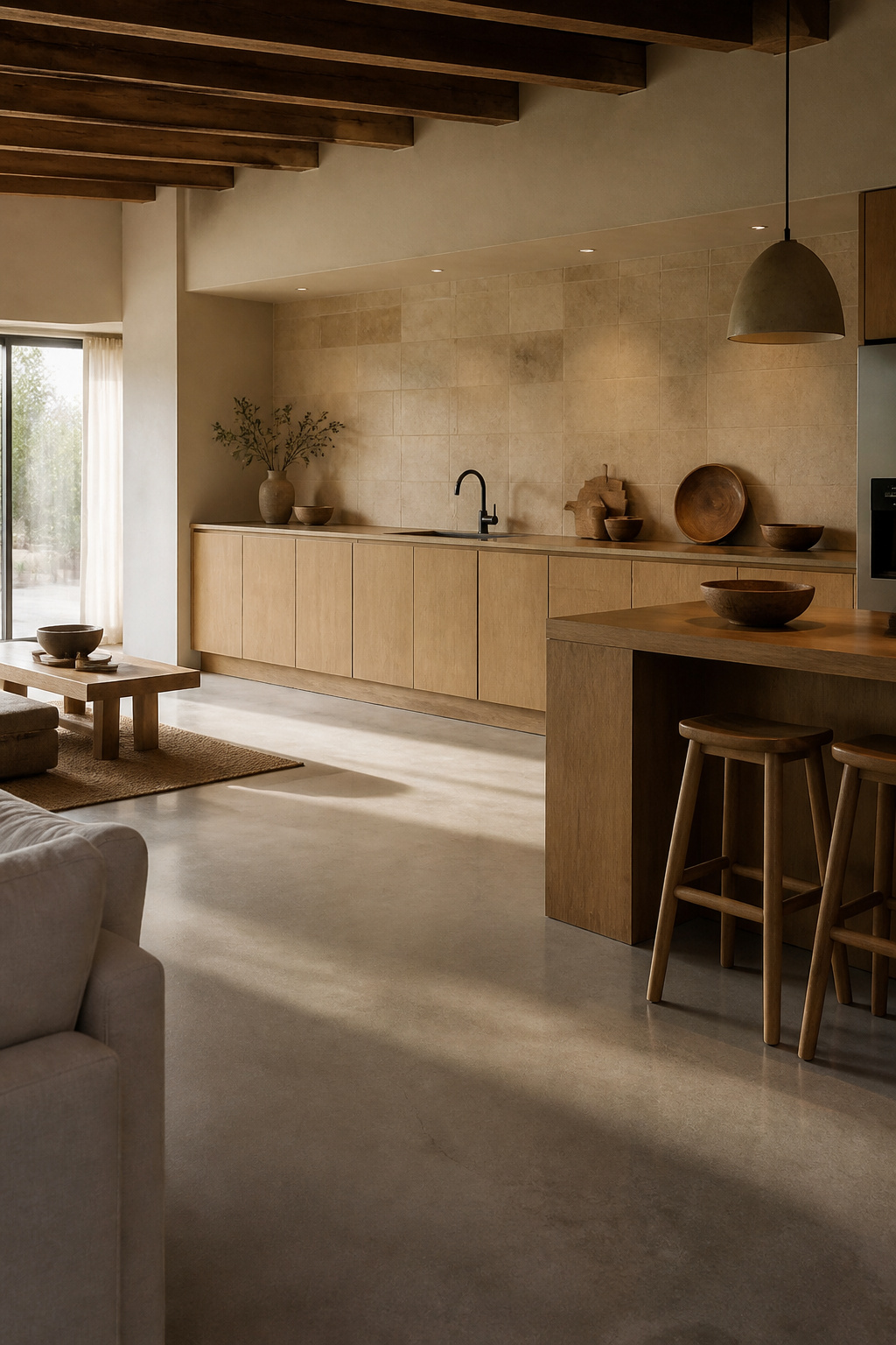
Beige, cream, and brown tiles in larger formats read differently than the small beige mosaics covered earlier.
Where mosaic draws the eye to texture and grout lines, a 6-by-6-inch field tile or a long subway stretches the color in quieter planes. The warmth lands as atmosphere, not pattern.
Light oak already carries honey and amber notes. An earth-tone backsplash keeps those tones talking to each other instead of introducing a new conversation.
The effect is cohesive rather than contrasting, which matters when the kitchen opens to a living area and you want the wall to recede.
Sources pair this palette with honey oak countertops specifically for that harmonious feel, noting it avoids the starkness of black or the flatness of pure white.
The trade-off is edge. A cream subway against light oak can feel soft to the point of sleepy.
Matte black or antique brass hardware breaks that up without abandoning the palette, and the slight variation in handmade or distressed finishes adds enough shadow to keep the wall alive.
For renters or first-time owners working a weekend timeline, large-format earth tones forgive imperfect walls and go up fast with less cutting around outlets.
When this works best: you want the kitchen to feel like a single exhale, not a design statement. The cost stays modest, the warmth reads immediately, and the result survives real mornings with coffee splashes and no time to stage.
Recommended Products

Premium quality matte Subway Peel and Stick Tiles: Provides real stone looks and have matte finish, non-slip, waterproof and heat resistant. It also features Low-maintenance and easy clean will make your life so much easier

3"x6" Essential White Matte Ceramic Tile Matches our other Essential White items such as 2"x2" Tiles; Color Code 0790

Coverage and Quantity: Listing is for 12.5 square feet, which is 100 pieces of 3x6 tiles
9. Geometric Tile Patterns
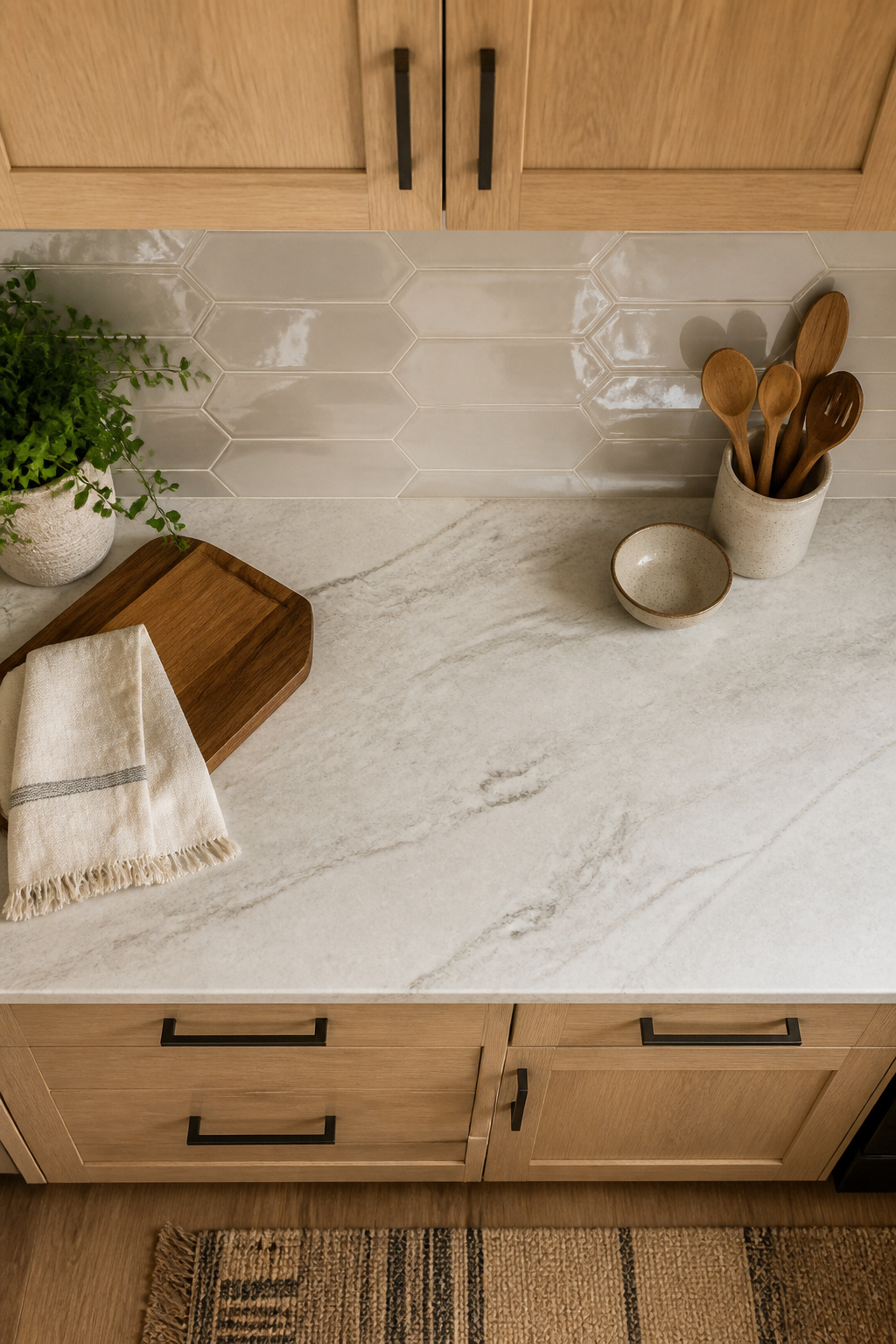
Geometric tile pulls light oak cabinets toward a contemporary look without stripping out their warmth.
A hexagon mosaic at 8 by 10 inches, or an elongated hex running 3 by 7 7/8 inches, hits the right scale: large enough to read as pattern, small enough to stay crisp against the grain.**
Chevron works similarly, though its strong direction needs breathing room; pair it with simple slab cabinet fronts rather than raised panels where both would compete.
Arabesque and diamond shapes fall in between, adding rhythm through curves that contrast the wood’s linear grain.
The risk is visual overload. Oak’s grain is already a pattern, and a busy backsplash on top turns the wall into noise.
Glossy finishes help, reflecting light and keeping the geometry from feeling heavy against honey-toned cabinets. One way to play this: keep the tile color close to white or cool neutral and let the shape do the work.
Another is to use the geometry in a smaller zone, behind the range only, with a quieter field tile surrounding it.
The full-wall geometric backsplash wins if you want the kitchen to feel designed and current; the accent approach wins if you want the cabinets to stay the story.
Recommended Products
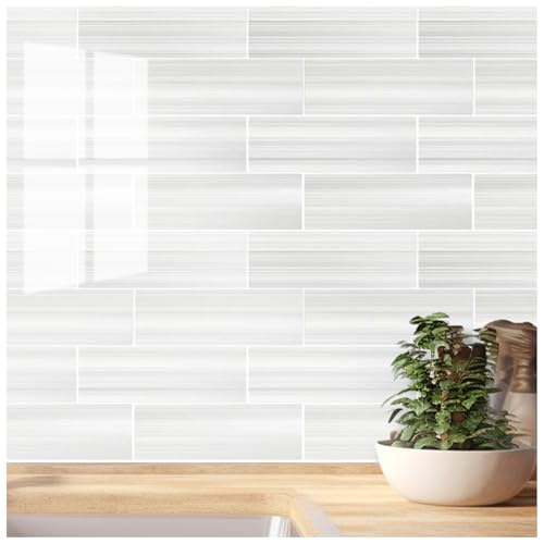
Versatile Sizing: Each rectangle measures 3" x 9" x 0.04". Four rectangles form a group. 10 sheets/package. Total area about 7.5 square feet.

Effortless Installation: Simply peel and stick! No grout, mortar, or tools needed – transform your space in minutes with our user-friendly adhesive tiles. Perfect for DIY beginners and busy homeowners.

PREMIUM PEEL AND STICK TILES MADE IN NORTH AMERICA : Buy local from the market leader in self-adhesive wall tiles. At Smart Tiles, we offer a large selection of easy to install, high quality backsplash tile designs.
10. Textured Tiles
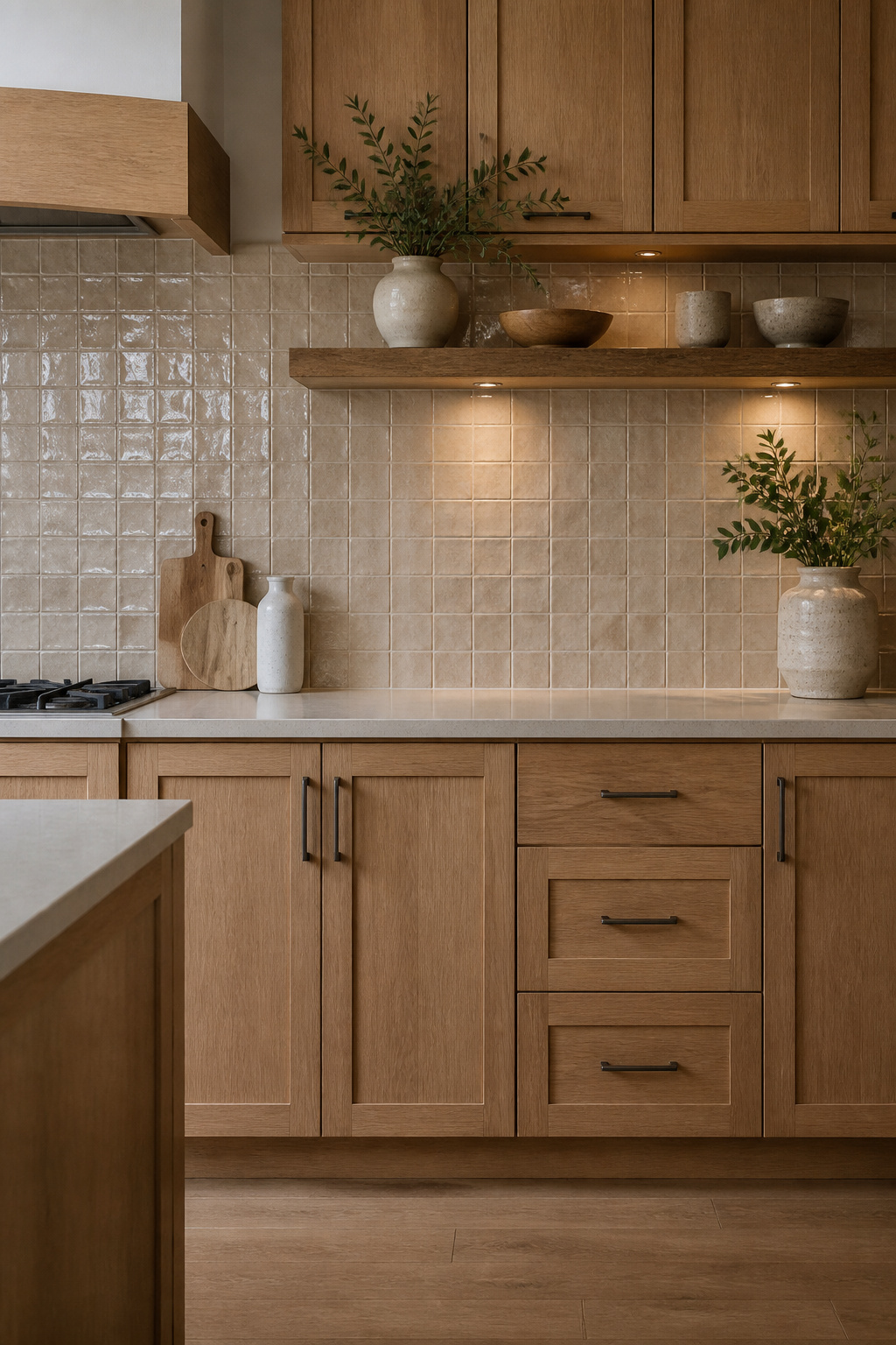
Hand-formed tile brings an irregular surface that machine-pressed alternatives simply flatten away.
The slight warping, the finger marks, the glaze pooling thicker in one corner: these are the marks that read as texture up close and as warmth from across the kitchen.
Against light oak cabinets, that handmade variation picks up the same irregularities in the wood grain, so the two surfaces feel like they belong to the same story rather than competing for attention.
Zellige tile takes this further with its dimensional glaze. Each piece catches light differently, creating a ripple effect that changes as you move through the room.
The square layout gives structure, but the tile itself supplies the movement.
For a weekend project on a few hundred dollars, this is where to put the money if you want the backsplash to do the visual work without adding another color to the palette.
Relief textures work on larger formats, a single 6-by-6 or 8-by-8 tile carrying its own shadow lines. This is not mosaic texture built from dozens of small pieces; it is one surface with depth pressed or carved into it.
The install stays simpler, the grout lines stay fewer, and the cleaning stays more forgiving.
Hand-formed edges will vary by a noticeable fraction of an inch, so budget the extra half-day for sorting pieces before you set them and for building out the thinset to true each one.
Recommended Products

2-3 Times Thickness: Each tile is 2mm-2.5mm thick, offering durability and solidity, providing a high-quality alternative to soft sticker tiles

𝐏𝐫𝐞𝐦𝐢𝐮𝐦 𝐏𝐞𝐫𝐟𝐨𝐫𝐦𝐚𝐧𝐜𝐞: Our peel and stick wall tiles are designed with high-performance PVC polymer material, offering waterproof, heat-resistant, stain-resistant, anti-scratch, and fadeless properties. Rest assured, the super-strong adhesive ensures the tiles stay securely in place!
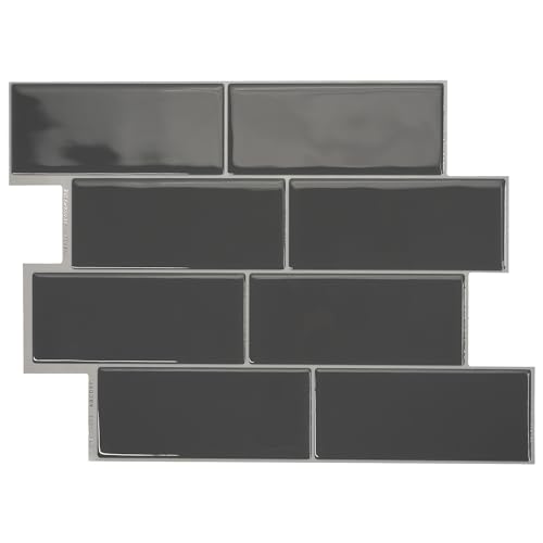
PREMIUM PEEL AND STICK TILES MADE IN NORTH AMERICA : Buy local from the market leader in self-adhesive wall tiles. At Smart Tiles, we offer a large selection of easy to install, high quality backsplash tile designs. Each pack of 5 tiles covers 2.76 Sq. Ft.
Color Schemes That Work
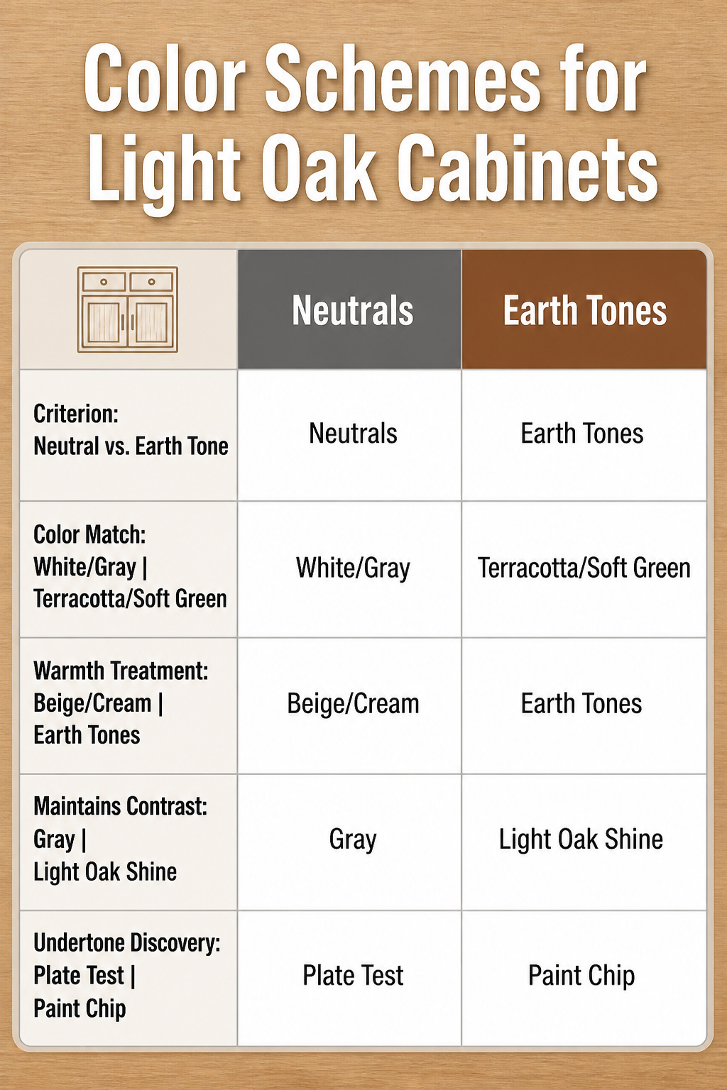
Light oak cabinets carry a warm undertone that can shift toward honey or amber depending on the finish and the light in your room. That warmth is the starting point for every backsplash decision, not something to fight against.
Neutrals work because they create breathing room around oak rather than competing with it. White and off-white tiles soften the golden-orange notes that can feel dated, while gray adds contrast without the harshness of black.
A gray backsplash paired with stainless appliances reads as intentional and modern rather than a compromise.
Beige and cream lean into the warmth instead of cooling it down, which solves a different problem: kitchens that feel stark or unwelcoming.
Earth tones like soft green or terracotta do the same, pulling from the natural wood rather than introducing something foreign.
The undertone test takes two minutes. Hold a white ceramic plate, a gray paint chip, and something beige against your cabinet doors in both morning and afternoon light.
One of the three will make the oak look muddy; one will make it look clean. That is your direction.
Green and deeper earth tones enter only after you know which side of neutral your cabinets sit on, because a gray-green tile balances honey oak while a beige-green one can double the warmth past what a small kitchen can handle.
Material Choices and Cleaning Reality
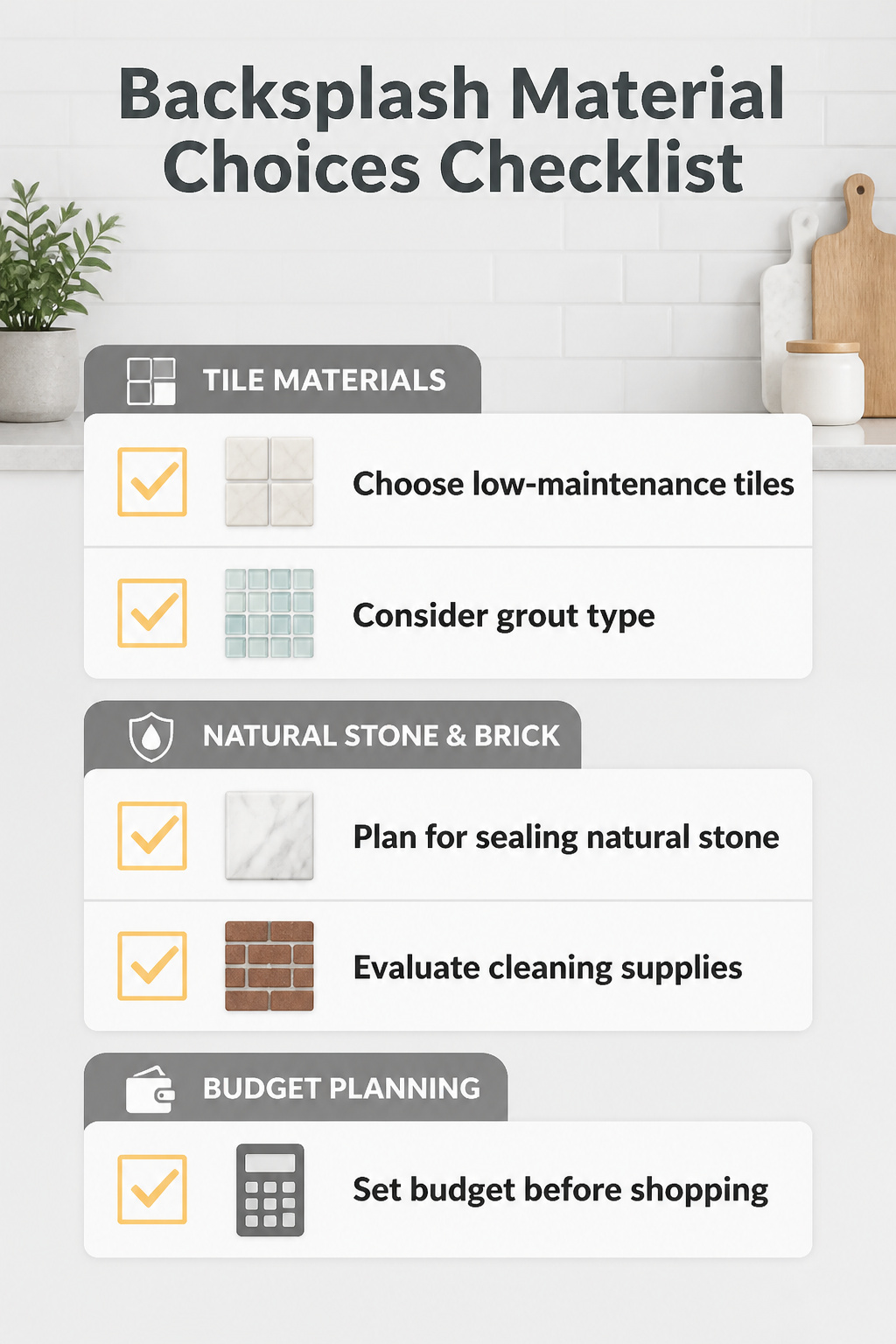
Ceramic and porcelain tiles forgive a rental-grade installation better than anything else on the wall. The material itself is low maintenance, but grout choice matters more than the tile for whether your Sunday cleanup stays easy.
Sanded or epoxy grout on a matte ceramic resists stains where bright white sanded grout on glossy glass will show every cooking splatter and water spot.
Glass itself wipes clean with any mild detergent, yet fingerprints and water spots appear almost daily, so the sleek look costs more in attention than in dollars.
Natural stone like marble reads luxury against light oak, but it demands sealing and pH-neutral soaps. Skip the harsh chemicals or the sealant erodes.
Brick runs even more porous, needing that same sealing step just to survive normal kitchen moisture.
If the budget is tight, porcelain and ceramic stay the durable choice; spring for glass or stone only when the install is solid and the maintenance budget extends past the first weekend.
Layout and Lighting
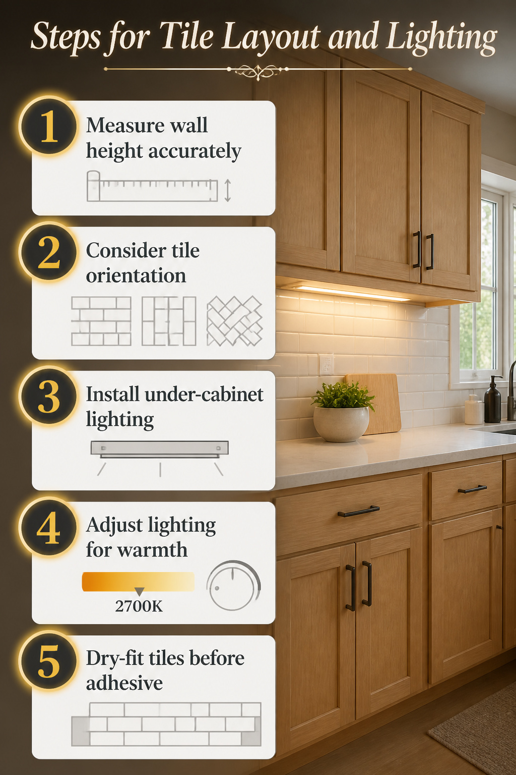
Tile orientation changes how light oak cabinets read in a kitchen more than most people expect. Horizontal subway tiles widen the wall and ground the cabinets, which helps if your oak has that slightly yellow cast older finishes pick up.
Vertical stacks draw the eye up and can make standard eight-foot ceilings feel taller; I saw this in a bathroom with rich oak cabinetry where the vertical tile pattern genuinely elongated the space.
Herringbone adds movement but needs precise cuts around outlets, and the busier pattern can fight oak’s own grain if both sit at eye level.
Under-cabinet lighting matters more with oak than with painted cabinets because oak reflects warmth unevenly.
A painted cabinet face bounces light back predictably; oak’s grain creates pockets of shadow that read as dirt or wear unless you add dedicated task lighting.
Warm LEDs, around 2700K, keep the wood from looking pink, and dimmable fixtures let you adjust as daylight shifts through the day. Glossy or reflective tile finishes especially need this controlled light or they throw glare back into the room.
Measure the wall height from countertop to cabinet bottom, not to the ceiling, and note every outlet and window edge to the nearest eighth inch before ordering tile.
The standard subway run leaves a thin sliver at one end that looks accidental; knowing your exact wall length lets the supplier calculate whether starting with a half-tile or a third-tile avoids that.
DIY Installation What to Know
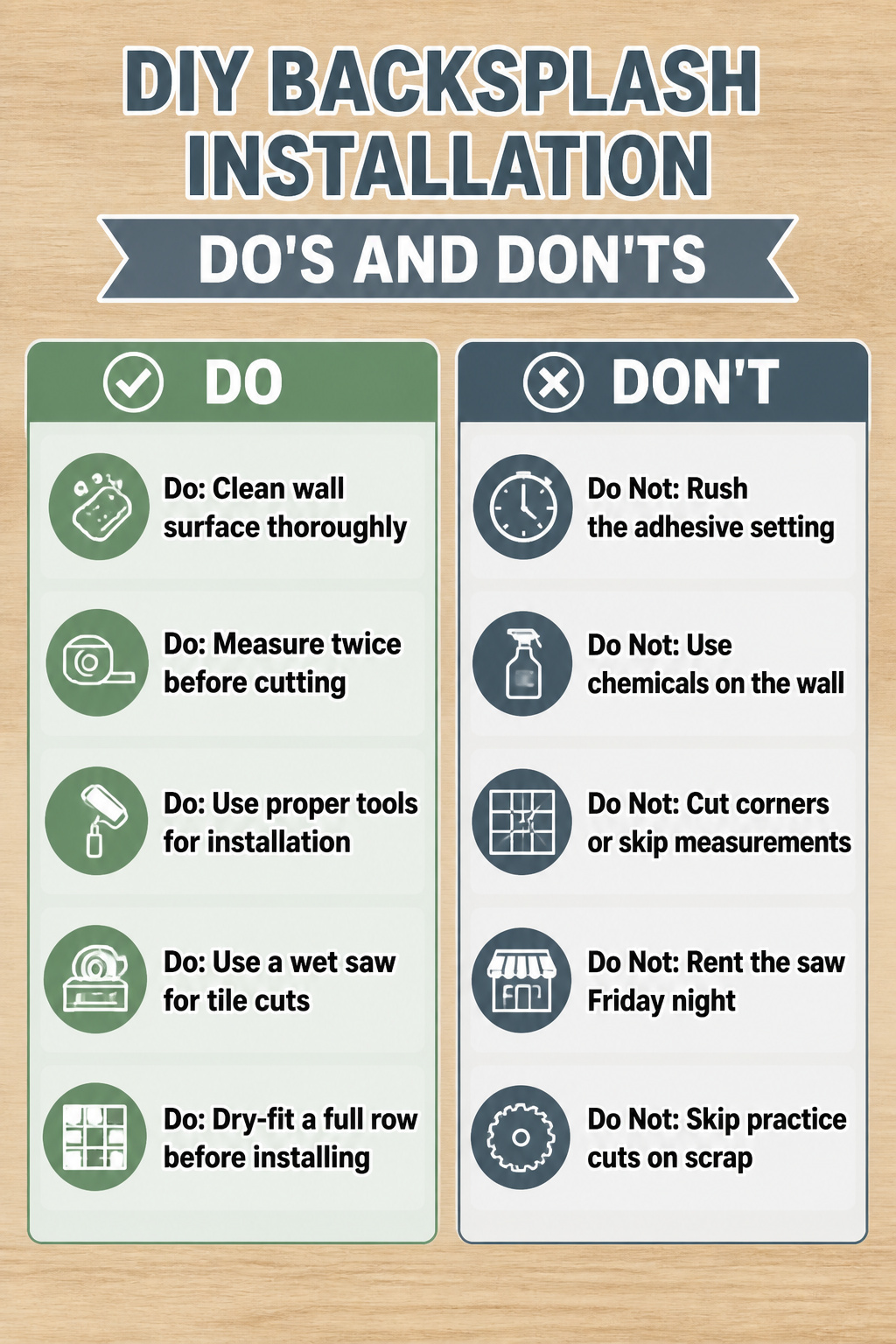
The weekend timeline lives or dies in prep, not installation. A backsplash is small square footage with big consequences for mistakes, because tile cuts are permanent and adhesive sets fast.
I spend Friday evening clearing counters, killing power to outlets, and scrubbing grease off the wall with warm water and simple soap. No chemicals.
You do not know what residue is on there, and you do not want to find out when thinset refuses to bond.
Tools that matter: a four-inch roller for primer on any painted drywall behind the range, a 2.5-inch angle brush for cutting around outlets, and a quality wet saw or at minimum a snap cutter.
Rent the saw Saturday morning, not Friday night when the store is closing. I learned that one the hard way.
First-timers can handle peel-and-stick and painted backsplashes. Genuine ceramic or glass tile demands the wet saw, and the learning curve on that blade is real.
If you have never operated one, practice on scrap tile before your first measured cut. Stone mosaic arrives on mesh sheets, which helps with spacing but not with the weight.
You will need more adhesive than you think, and working time is shorter than the bag claims.
The common material-waster is the corner cut. Measure twice, cut once sounds obvious until you are holding a $12 sheet of mosaic that cracked wrong.
Dry-fit a full row before any adhesive touches the wall. That hour of patience saves three hours of prying up set tile.
Frequently Asked Questions
What backsplash looks best with honey oak cabinets?
u003cpu003eHoney oak works with a wide range: bright white and soft gray for balance, beige and warm brown for harmony, green and natural stone for contrast, and even deep tones like charcoal if the kitchen has enough light.u003c/pu003e u003cpu003eThe best choice depends on whether you want to brighten the wood, blend with it, or frame it deliberately.u003c/pu003e
What color backsplash tones down honey oak cabinets?
u003cpu003eSoft white, true white, light gray, and muted beige all soften those golden-orange undertones. A gray-green tile can also work if you want slightly more contrast while still cooling the warmth down.u003c/pu003e
Does white backsplash go with honey oak cabinets?
u003cpu003eYes, and it is the quickest way to freshen the space. A clean, true white bounces light back into the room without competing with the wood’s warmth.u003c/pu003e u003cpu003eSkip anything too creamy; off-white can drift yellow and amplify the orange instead of quieting it.u003c/pu003e
Can you use gray backsplash with honey oak cabinets?
u003cpu003eGray pairs beautifully, especially medium to soft tones that balance the wood’s warmth without the harshness darker shades bring. It sits opposite honey’s undertones on the color wheel, so the contrast reads as intentional rather than mismatched.u003c/pu003e