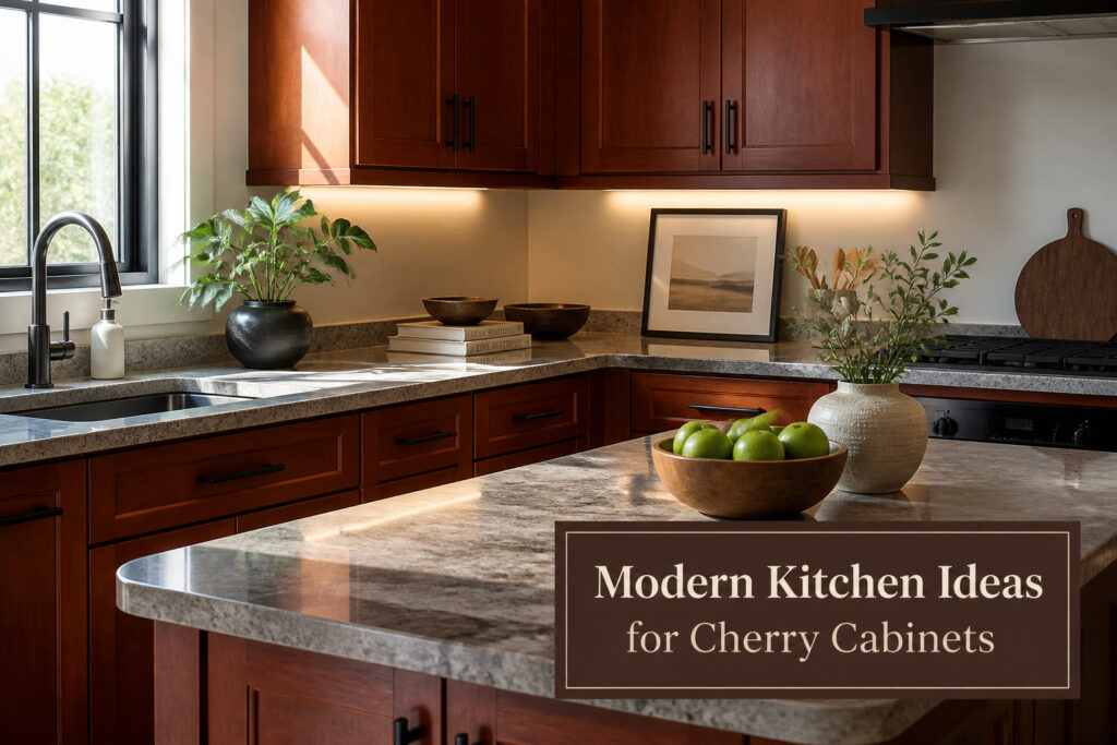
Modern kitchens with cherry cabinets can read either current or stuck in 1999, and the difference is rarely the wood itself.
The same cabinets that looked heavy and dated with cream quartz and brushed nickel pulls felt intentional once the countertop went to cool gray, the hardware to matte black, and the lighting to 4000K strips under the cabinets.
What flips them toward 2026 is not one dramatic change but the cumulative effect of choices that stop agreeing with cherry’s warmth and start contrasting it.
1. Color Palettes That Calm Cherry Down
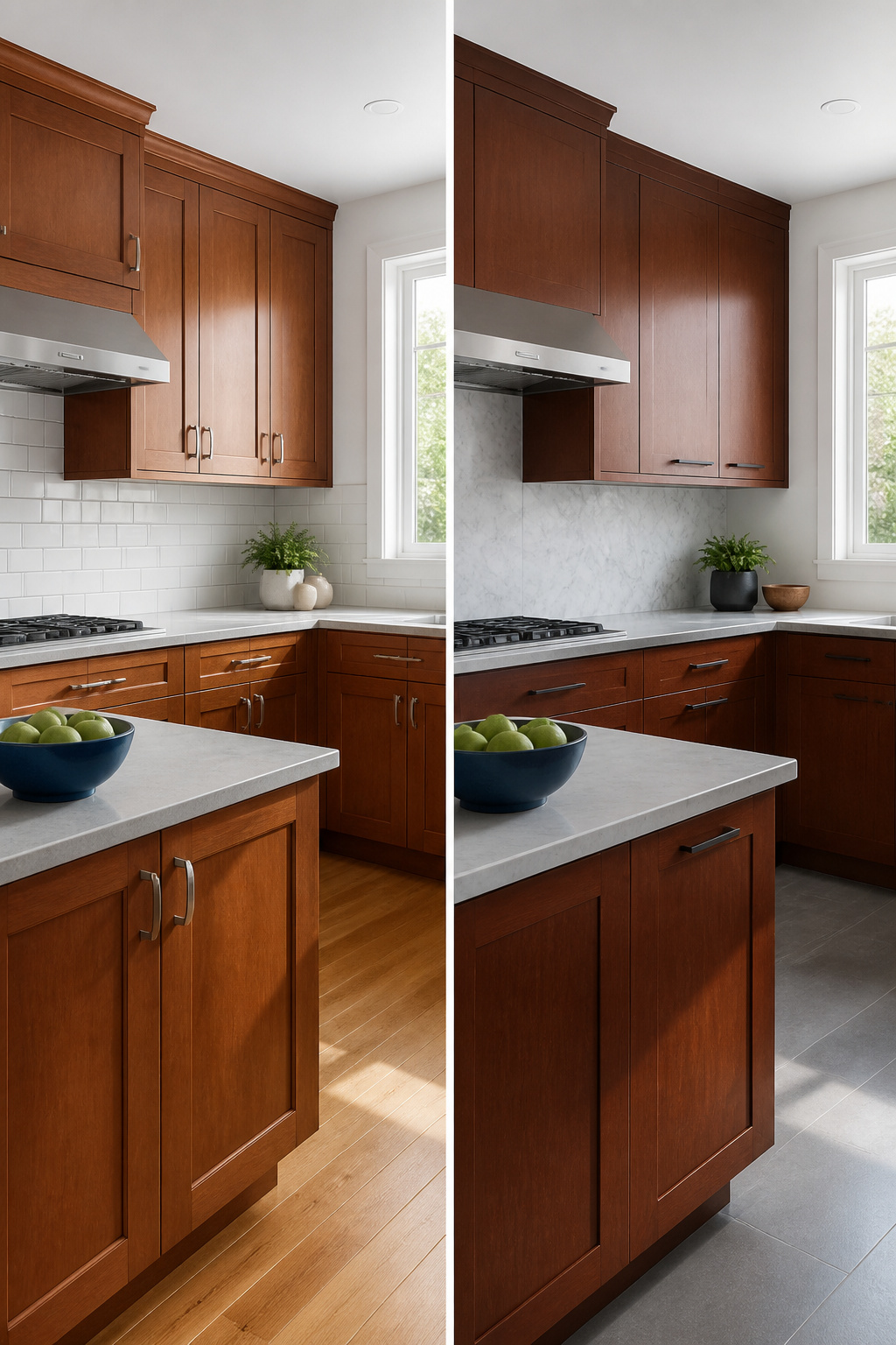
White walls are the safest starting point for a modern kitchen with cherry cabinets, because bright white reflects light and gives the red undertone room to breathe without competing.
Gray works too, but only the cool side of the spectrum; warm grays slide toward taupe and end up looking muddy against cherry’s warmth. Beige is the trickiest of the three.
It can read fresh and current if you stay in the greige family, but the moment it picks up a peach or yellow cast, the whole kitchen starts feeling like a 2004 builder spec.
For deeper color, navy blue and emerald green are the two that actually earn their place. Navy reads as a near-neutral in most light and lets cherry feel intentional rather than accidental.
Emerald green borrows from the natural green-and-red schemes that sources keep returning to, and it pairs especially well if you have any sight lines to outdoor plants.
The mistake to avoid is anything orange-leaning: a red that carries even a hint of coral or rust will fight the cabinets instead of layering with them, and the kitchen ends up looking like two different eras arguing.
Jewel tones like ruby red or sapphire blue belong on an accent wall or in decor, not on every surface.
Ruby red can pick up the cabinet tone and amplify it, which works in a single dose but becomes overwhelming across a whole room. Sapphire blue gives you the saturation without the direct competition.
Use it on a single wall, a pendant shade, or a runner, and let the cherry cabinets stay the dominant warmth.
Recommended Products

All-surface uniquely formulated paint solution: Easily refinish furniture, cabinets, countertops, doors, trim, floors and more

Beyond paint counter top paint pint - color - bone

2 Tiers of Shelving & 2 Cabinets for Concealed Storage
2. Countertops That Read Modern, Not Dated
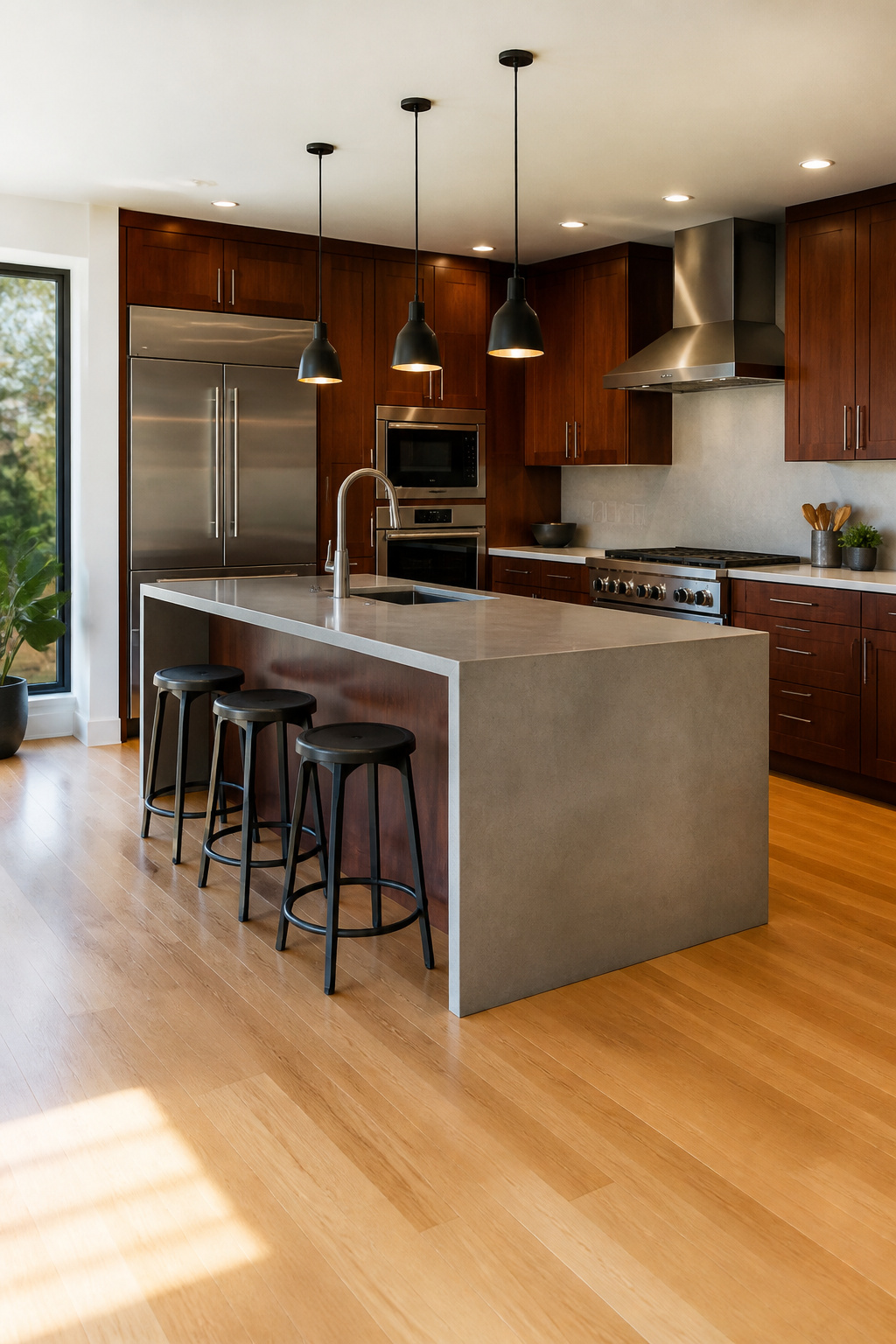
Quartz, concrete, and stainless steel each pull cherry cabinets toward a modern kitchen with cherry cabinets rather than letting them settle into the 1990s look everyone fears.
White or gray quartz gives the cleanest contrast, brightening the wood’s red undertones without fighting them.
Concrete carries an industrial edge that works when the rest of the room stays minimal; it can be molded to fit any shape and customized in color and finish, though occasional sealing is needed to avoid stains and water damage.
Stainless steel delivers the integrated professional look, sturdy and heat-resistant and easy to clean, though scratches and fingerprints will show.
I once tried a cream quartz with too much warmth in it, and the cabinets and countertop bled together into one muddy mass. The pairing died from too much agreement.
White subway tile as a backsplash would have been the affordable rescue, but I had already locked in a busy stone. The lesson cost me a full redo.
Recommended Products

PREMIUM SAFE MATERIAL - Our silicone trivets for hot dishes are made of 100% BPA-free food-grade silicone, safe for food, temperature from -105F to 446F, and oven, microwave, and dishwasher safe too.

PREMIUM FOOD-GRADE SILICONE & PERFECT SIZE - Made from 100% <br>BPA-free food grade silicone , non-slip,flexible <br>enough to comfortably grab a hot dish, measures 9x12x0.22 <br>inches,Weight:0.66 Lbs per set(thicker and weighter than competitors).

Trivets Set - You will receive 4 pieces of trivets for hot dishes. Measuring 7 inches in diameter and 0.3 inches thick, These hot pads for kitchen blend Boho and country farmhouse styles, suitable for dishes, pans and pans under 7 inches.
3. Hardware Swaps With Real Impact
Brushed nickel reads cooler against cherry than matte black, and the difference is enough to swing the whole room.
I learned that after mounting bar pulls on a bank of uppers and realizing the warm wood looked muddy next to the soft gray sheen.
Switched to matte black on the lowers and the cabinets finally felt grounded, not fighting themselves.
Cup pulls work best on base drawers where your hand drops naturally. I placed mine dead center on the drawer face, which for standard 3-inch screw spacing meant measuring down about 2.5 inches from the top edge.
On the uppers, tab pulls mounted at the lower corner keep the sight lines clean; the lip barely shows until you reach for it.
The cheap bar pulls I grabbed first, the ones that looked identical in the product photo, bent at the center mount before a month was out. Aluminum pretending to be steel.
Replaced them with solid stainless at roughly triple the price per pull, but the heft is unmistakable and the threads don’t strip. Hardware is the one place in a kitchen where an ounce of metal matters more than you’d think.
Recommended Products
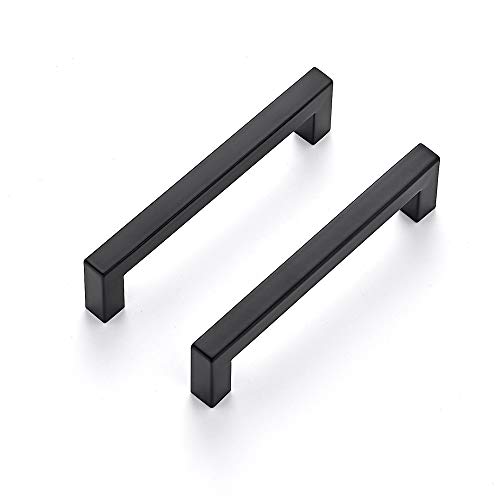
365-Day Evaluation: We believe you'll find value in your Ravinte handles. Use them for a full year, and if they don't meet your needs, we're here to help
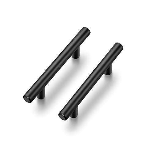
365-Day Evaluation: We believe you'll find value in your Ravinte handles. Use them for a full year, and if they don't meet your needs, we're here to help

SIZE: This Matte Black cabinet pulls center to center distance are 5 inch (128 mm), high 1-2/5 inch (35mm), over length 5-1/2 inch (140mm), width 1/2 inch (12mm). Hollow.
4. Lighting at Three Levels
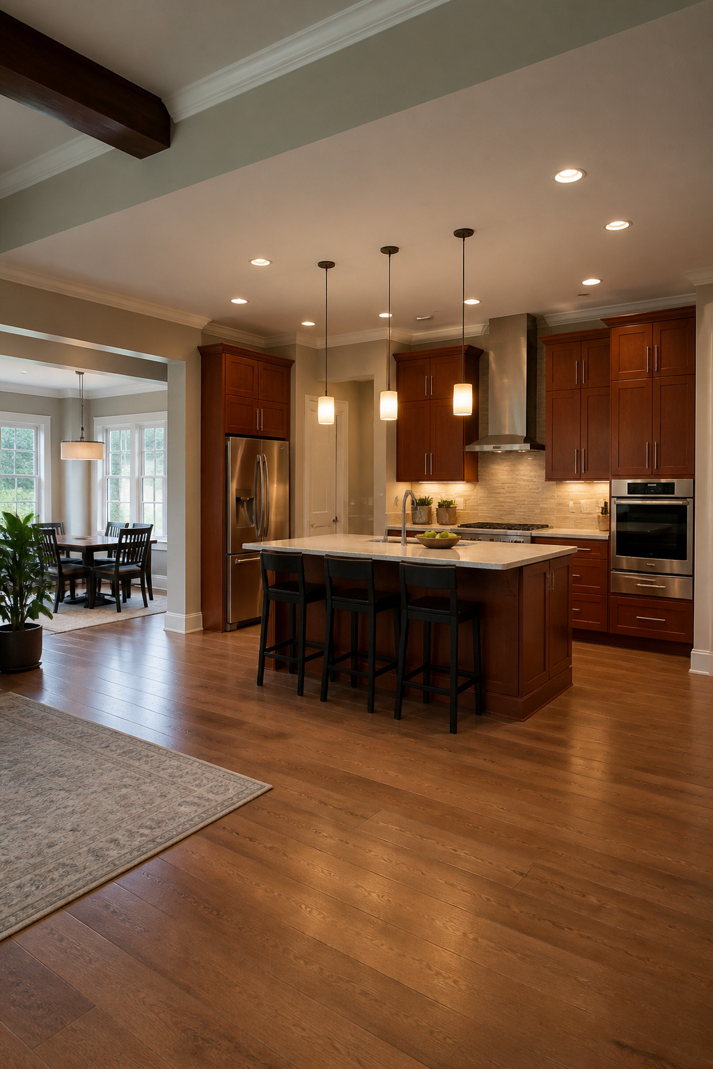
Cherry cabinets pull light in and hold it, which means the fixtures matter as much as the bulbs. Pendant lights over an island need to sit low enough to actually illuminate the work surface, not just hover there like decoration.
Thirty to thirty-six inches above the counter is the range that keeps the light useful without blocking sightlines across the kitchen.
Color temperature is where cherry gets tricky. Three-thousand Kelvin reads warm and flattering against the red undertone, but it can push the whole room toward orange if every bulb matches.
Four-thousand Kelvin gives a cleaner, more modern feel and keeps the wood from looking like it belongs in a nineties suburban kitchen.
Most people settle on 3000K for pendants where people gather and 4000K for under-cabinet strips where the actual cutting and reading happens.
Under-cabinet lighting was the project I thought I could handle myself. The plug-in LED kit from the hardware store worked for about six weeks before the adhesive failed and the strips started sagging.
Paying an electrician to hardwire a proper low-voltage system cost roughly three hundred dollars and took him under two hours. The difference in evenness alone was worth it; no more dark spots where the tape buckled.
Recessed ceiling lights fill whatever gaps remain, and on a dimmer they keep the kitchen from feeling like an operating room after dark.
Recommended Products

Professional quality LED strip lights require a professional DC 24 Volt power supply (sold separately).

【Super Bright】 ---31W bright warm white cabinet lighting kit. No LED dots. No light glaring.

DIY Design: 8 pcs 20inches light strips, 4 pcs 5.9inches connectors and 4 pcs 2.8inches connectors available, many kinds of connection options. 8 pcs connectors are designed to bend and fold around corners and they can freely combine to cross different gaps.
5. Backsplash Patterns That Work
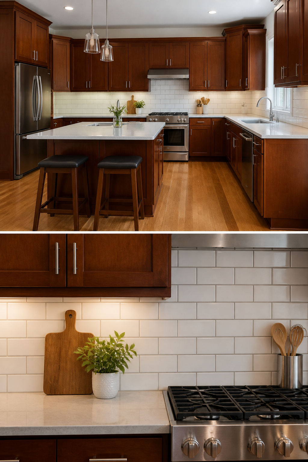
Subway tiles in a running bond or stacked layout keep the backsplash quiet enough that cherry cabinets stay center stage.
The 3×6 white subway I put in reads classic, not busy, and the glaze catches light without competing with the wood grain.
Warm gray grout was the move there; bright white looked sterile against the cabinets’ red undertone, like a hospital corridor had crashed into a dining room. Geometric patterns work too, but they need restraint.
A small hex or a tight chevron in ceramic or porcelain can pull the eye upward and add energy, though I’d keep the tile itself neutral. Let the pattern do the visual lifting, not a second color fighting the cherry.
Matching grout softens the geometry; contrasting grout turns every tile into a drawn line, which gets exhausting above a stove you use daily.
Recommended Products

Belong To Your kitchen: The kitchen cabinet features 2 large door cabinets and 2 full extension drawers great for storing coffee beans, seasoner, spare kitchen paper, or some sundries. Meanwhile, your coffee maker, toaster, can sit on our wide tabletop

100% Hardwood - We take pride in using only the finest quality materials for our products. Our raw maple base filler is made from solid hardwood, providing strength, durability, and a classic aesthetic that will last for years to come.

【Ample Storage】Measuring 15.7"D x 31.5"W x 30.5"H. With the adjustable and removable shelf behind doors, you could adjust it according to your storage need. The wide table top is ideal for coffee makers, glasses or other home decor.
6. Flooring for Contrast
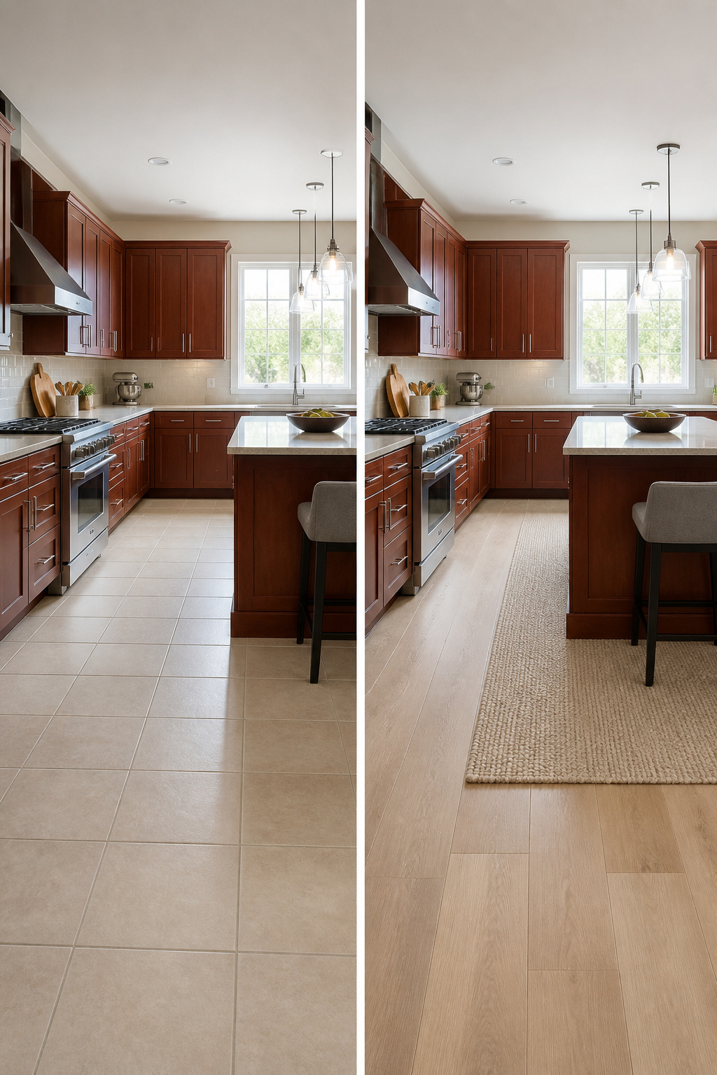
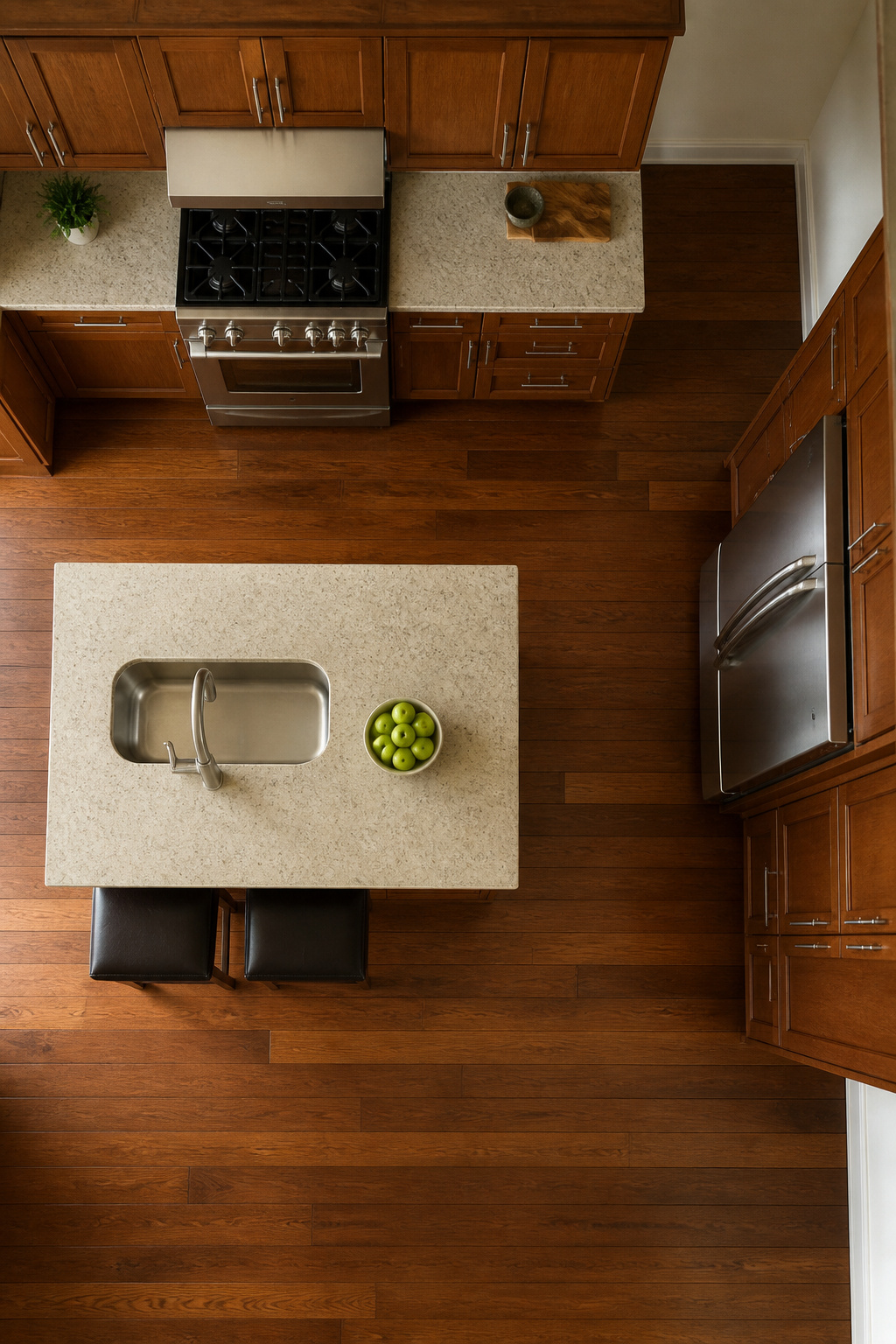
Wide-plank hardwood in a pale oak or ash gives a modern kitchen with cherry cabinets the lift it needs. The boards draw the eye across the room instead of letting that deep red-brown pool at the bottom.
Luxury vinyl planks do the same job for less, and they handle the traffic better if you are cooking every night.
I laid an oak LVP in my own kitchen last spring, and the difference was immediate: the cherry cabinets looked intentional instead of heavy. The one hiccup was the doorway into the mudroom.
The subfloor heights did not match, so I needed a transition strip to keep the edge from chipping. It cost maybe eight dollars and ten minutes, but skipping it would have ruined the install within a month.
Large-format tiles in white, gray, or beige work too, especially if you are in a climate where hardwood swells. The fewer grout lines, the cleaner the look, and that clean line is what keeps cherry reading current rather than traditional.
Lighter floors keep cherry from going bottom-heavy; the contrast adds to the richness rather than fighting it.
Recommended Products

Beyond paint counter top paint pint - color - charcoal
Beyond paint counter top paint pint - color - khaki
7. Open Shelving and Glass Fronts
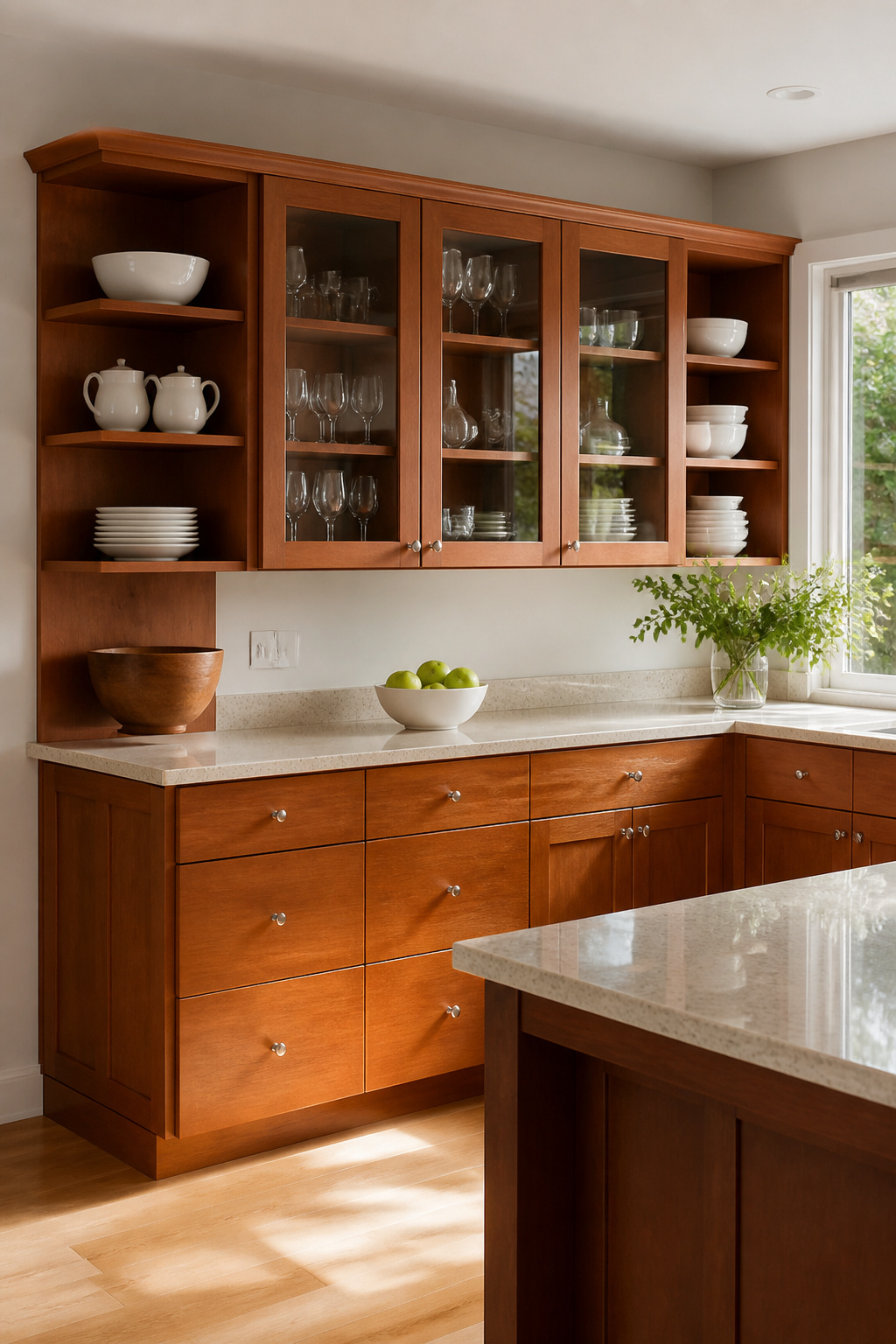
Open shelving belongs at the ends of a cabinet run or in a corner where a solid door would box the room in.
Glass fronts work better for the long stretches above counters, since they still bounce light around but keep the visual clutter behind something you can wipe.
What convinced me, looking through dozens of kitchen photos, is that cherry cabinets already carry enough warmth and weight. Breaking them up with either treatment keeps the wall from reading as a solid block of red-brown.
I display the everyday stuff on open shelves: white plates, a wooden bowl, the coffee maker in morning use. Hide the mismatched storage containers and anything with a barcode.
The dust on open shelves is real, not a minor issue. I run a microfiber cloth across mine every Saturday morning; it takes maybe two minutes if you stay on top of it.
Glass fronts collect greasy film near the range, so the cleaner I keep under the sink is the same spray I use on the cooktop. Skip the ammonia formulas.
They streak on glass and the residue catches light at night.
Recommended Products

PREMIUM FOOD-GRADE SILICONE & PERFECT SIZE - Made from 100% <br>BPA-free food grade silicone, non-slip,flexible <br>enough to comfortably grab a hot dish, measures 9x12x0.22 <br>inches(thicker than competitors).
Food Grade Silicone:We have a lot silicone products in our store.We are professional to offer the food grade silicone to you .Keep away from the cheaper silicone mat.
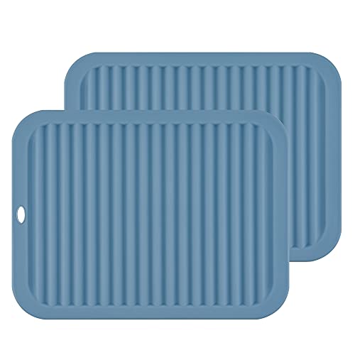
PREMIUM FOOD-GRADE SILICONE & PERFECT SIZE - Made from 100% <br>BPA-free food grade silicone and can pass FDA test, non-slip,flexible <br>enough to comfortably grab a hot dish, measures 9x12x0.24 <br>inches(thicker than competitors).
8. Accents That Add Personality
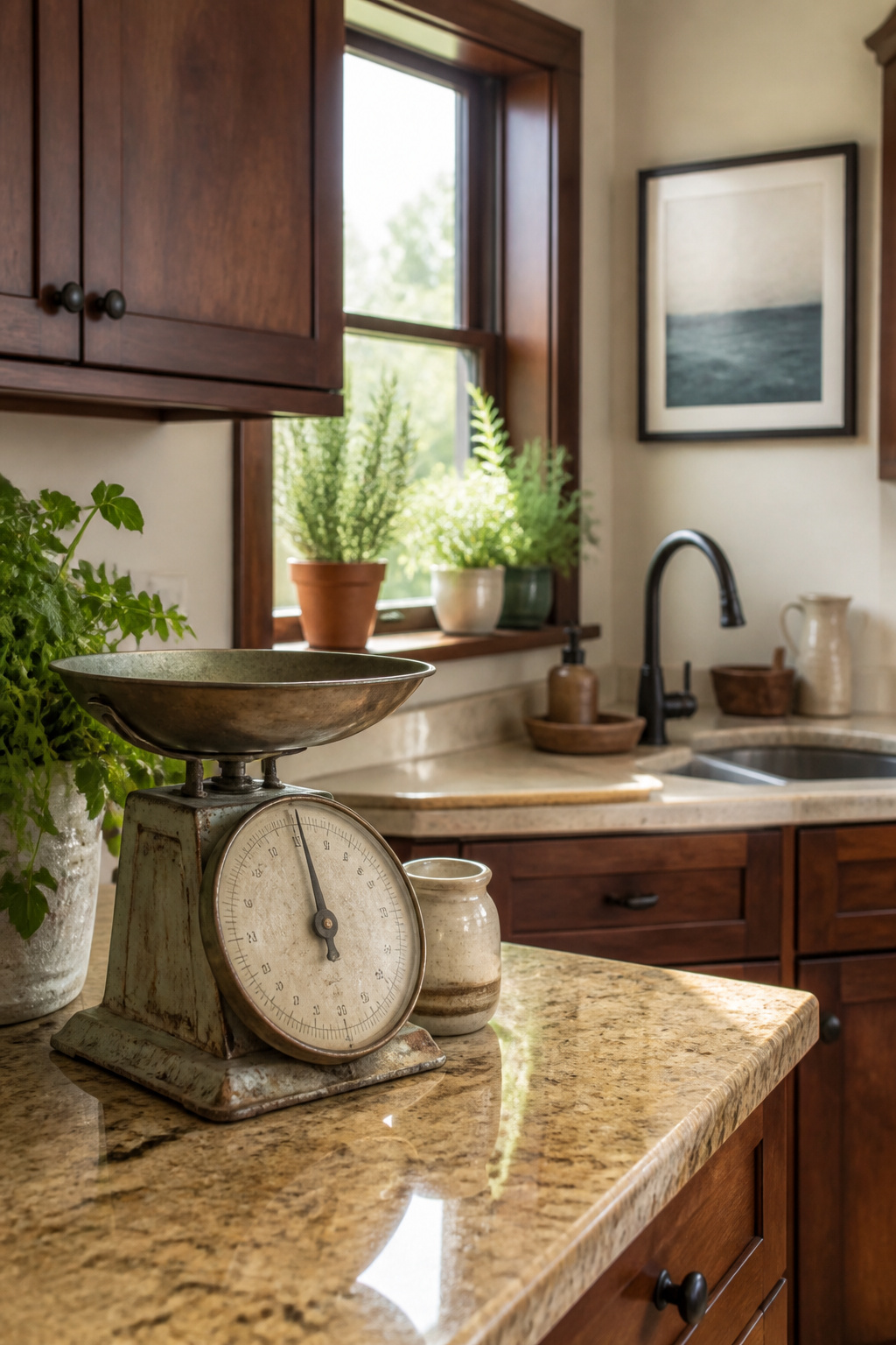
Cherry cabinets already carry the weight of the room, so the extras need to know when to stay quiet. A windowsill with three plants, a vintage scale on the counter, one framed print above the sink: that is usually enough.
I have killed enough herbs to know that mint, rosemary, and a pothos are the only ones that survive my light, and even the mint needs rotating every few days.
The scale is a 1950s kitchen model I found at a flea market for under thirty dollars.
It does not work, which is the point; it holds lemons and looks like someone chose it on purpose rather than inherited it by default.
Artwork should pick up the cooler tones you have already introduced elsewhere, a blue or a soft gray, so the eye travels rather than sticking on the wood. The mistake is treating cherry like a neutral that needs warming up.
It is already warm, already patterned by grain. Add one more layer of brown and the whole room turns into a cabinet showroom.
My test is the phone photo: if the counter reads as a still life rather than a clutter pile, the balance is right.
Recommended Products
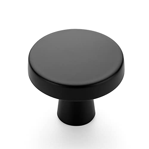
Dimensions: The heavy circular cabinet knob measures 1-1/4 inch (32mm) top diameter, 1/2 inch (12.7mm) base diameter, and projects 1inch(25mm) from the front of the cabinet door or drawer

Size of Cabinet Pulls: Screw-hole center: 3 inch(76mm). Overall Length:3-5/16 inch(85mm); Width: 11/32 inch(9mm); Projection: 1-3/32 inch(28mm)

Premium Stainless Steel Construction: Hollow yet durable, these black cabinet handles offer lightweight strength with superior corrosion resistance for long-lasting use in kitchens and bathrooms.
Two-Tone Cabinetry
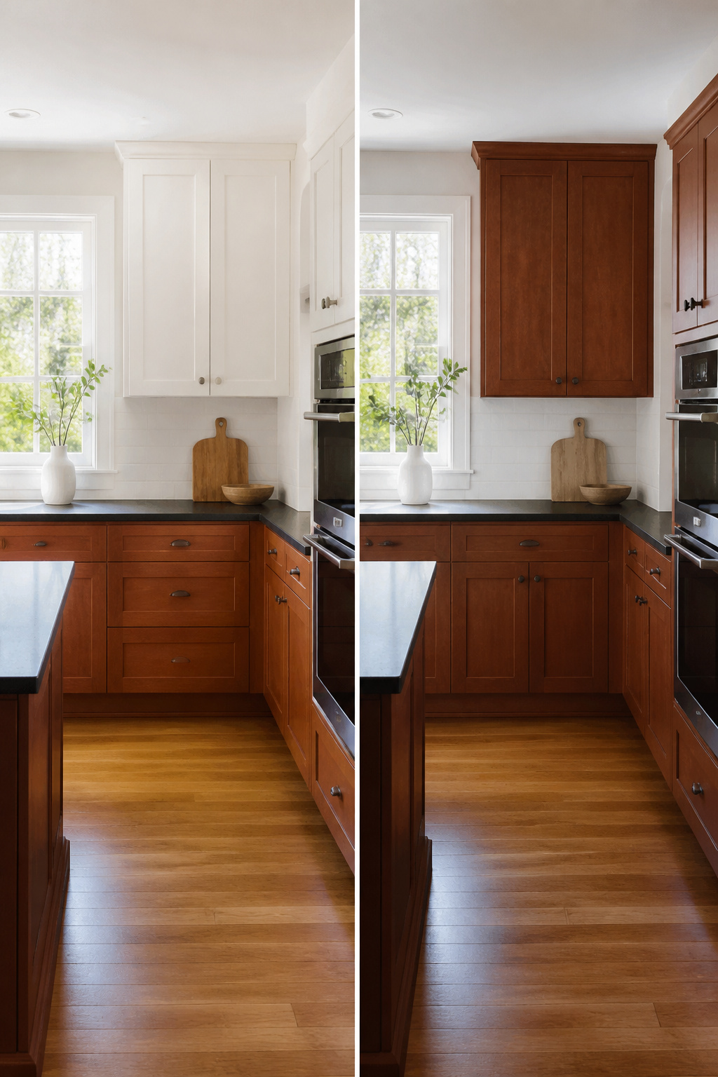
The weight of cherry cabinets settles best below eye level, which is why painted uppers in white or pale gray keep a kitchen from feeling like a furniture showroom.
The split that works is roughly 60/40 or 70/30 cherry to paint, enough wood to feel warm but not so much that the room closes in.
I saw the reverse tried once, cherry uppers over white bases, and the effect was oddly top-heavy. The darker mass hovered overhead like a low ceiling, and the lighter color below offered no visual anchor.
It read as a mistake in proportion rather than a brave choice.
For renters or anyone testing this before a full commit, the lower cabinets carry most of the daily wear. Cherry bases hide scuffs from shoes and vacuum bumps; painted uppers stay cleaner and brighter where grease and steam collect.
That practical split mirrors the visual one, and both tend to last longer because of it.
Recommended Products

Super-Bright Illumination:Our Under Cabinet Strip Lighting Plug in emits intense light, effectively brightening up your workspace. With its high - luminosity LEDs, it provides excellent visibility, whether you're cooking in the kitchen, working on a DIY project in the garage, or reading in the study. Say goodbye to dimly lit areas

【Brighter, Lower Voltage Drop】PAUTIX 24V 480 LEDs/m (total 2400 LEDs) COB (chip on board) LED strip light has lower voltage drop and better brightness than conventional 12V. High color rendering index (93+), high light efficiency, rich colors, and strong reduction. 180-degree beam angle design, 50% wider lighting, multiple chips on board, compared with traditional SMD LED strips, more uniform lighting, no worries about dark spots!

WHAT YOU'LL NEED: You will need a 12 volts Power Supply to light up your lights, or choose a dimmable driver and wire lead connector to customize your personalized lighting projects. (They are sold separately)
Mixing Wood Tones Without Clash
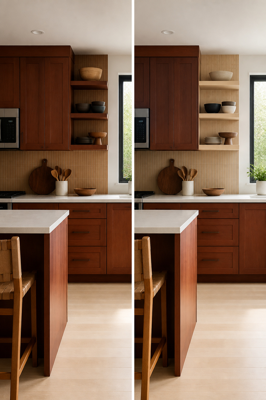
Cherry cabinets carry a lot of red-brown weight, so pairing them with another wood asks for either shared warmth or a deliberate cool contrast.
The undertone test is the only way to know which side your samples fall on: hold them together in natural light, not under the kitchen’s LED spots, and look for whether they glow in the same direction or pull against each other.
Oak, walnut, and maple each read differently depending on the finish, so the sample in your hand matters more than the species name.
I learned this the hard way with a set of oak bar stools that looked balanced in the store and read straight-up orange against my cabinets at home. They went back the same weekend.
What worked instead was a lighter maple open shelf with a faint gray wash that picked up the cooler shadows in the cherry grain rather than competing with its warmth.
For flooring, the same rule applies: lighter tones build contrast that lets cherry read as rich rather than heavy, whether you choose hardwood, laminate, or vinyl. The material matters less than the value shift.
Recommended Products

【2-in-1 Multipurpose Sideboard】The 2-in-1 large buffet table can be used separately as two glass cabinets. In addition to kitchen buffet cabinet, it can be placed in the living room as an entertainment center or in the entryway as a console table. Overall Dimension: 67.7"×15.7"×30.9"(L×W×H). They are sent separately in two packages, so you may receive them at different times.

Stylish and Durable: Our buffet cabinet doubles as a console table and sideboard, making it perfect for any room in your home, from the dining room to the balcony. Vacuum Forming process bonds the prints and boards together, make the board surface waterproof, wear-resistant and fade-resistant.

Easy Assembly: Pre-assembled drawers designed for a quick and seamless set-up
Painting Cherry Cabinets
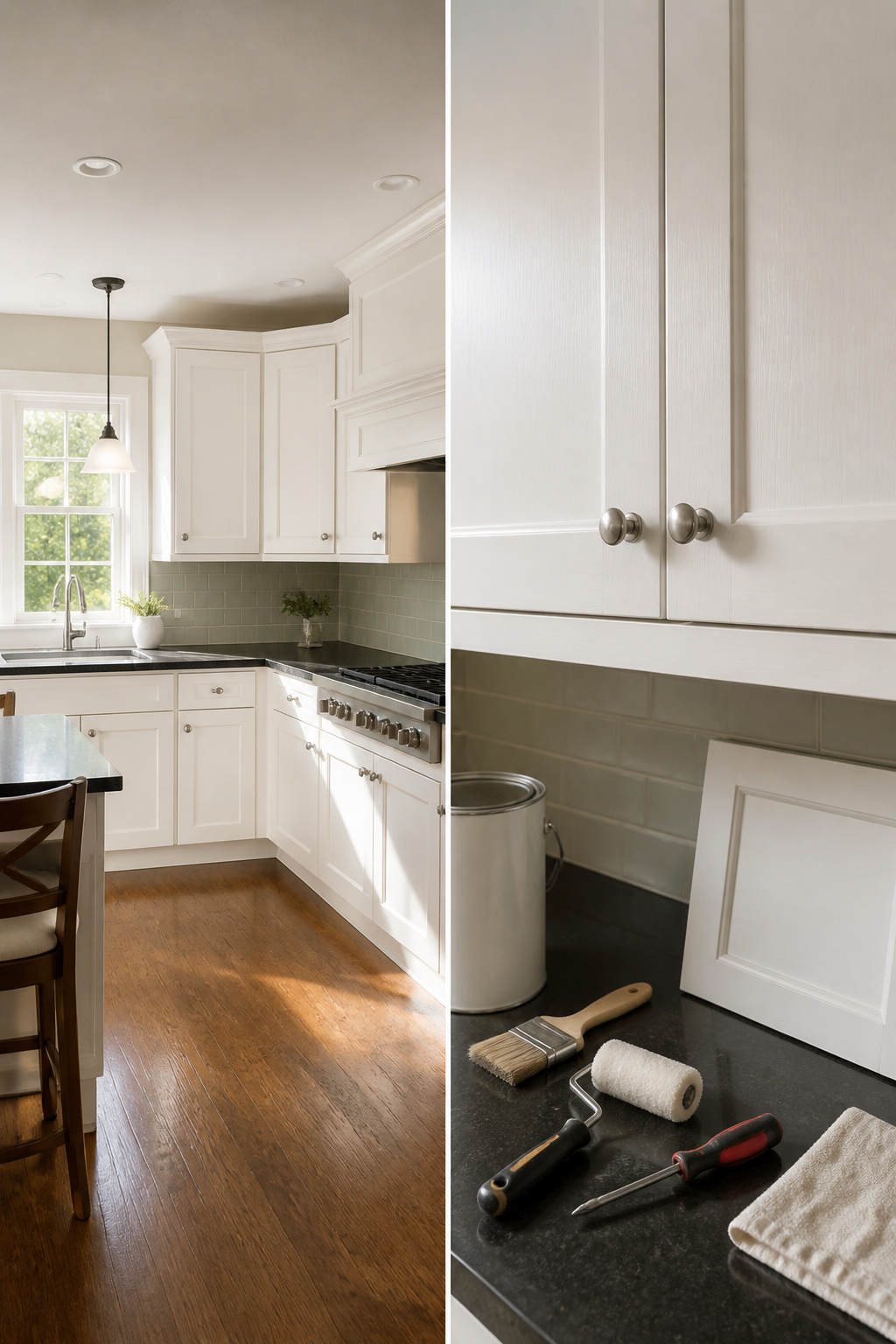
Painting makes sense when the grain of the cherry itself is what dates the kitchen, not the door style or the layout.
A flat-panel cherry cabinet from 2008 can read current in Shaker White; the same wood with heavy cathedral grain and rope molding still looks like a cover-up even in fresh paint.
The prep that actually holds up starts with a deglossing wipe on every surface that gets touched, then a bonding primer meant for cabinets, not walls.
Cabinet-grade paint, the kind sold in satin or semi-gloss specifically for kitchen use, goes on in thin coats with a foam roller on the flats and a good brush on the frames.
Paint is irreversible. Cherry does not take stain back evenly once it has been sealed over, so the decision costs the wood itself.
I spent two weekends watching a friend work through hers, deglossing Friday night, priming Saturday, two color coats Sunday and the next Saturday, plus hardware back on by Sunday evening.
The result looked crisp and modern, but I chose not to for my own kitchen. I liked the warmth of the wood too much to trade it for a color I might tire of before I moved.
Frequently Asked Questions
What type of flooring works best with modern cherry cabinets?
u003cpu003eWide-plank hardwood in pale oak or ash, luxury vinyl planks, or large-format tiles in white, gray, or beige all work well. Lighter floors keep cherry cabinets from going bottom-heavy; the contrast adds to their richness rather than fighting it.u003c/pu003e u003cpu003eIf subfloor heights vary at doorways, use a transition strip to protect the edge.u003c/pu003e
Can I mix other wood tones with cherry cabinets for a modern look?
u003cpu003eYes, but hold samples together in natural light to check whether their undertones glow in the same direction or pull against each other.u003c/pu003e u003cpu003eOak, walnut, and maple each read differently depending on finish, so the actual sample matters more than the species name.u003c/pu003e u003cpu003eA lighter maple with a faint gray wash can pick up the cooler shadows in cherry grain without competing with its warmth.u003c/pu003e
Can I paint my cherry cabinets to make them look new?
u003cpu003eYes, if the grain itself is what dates the kitchen rather than the door style or layout. Prep with a deglossing wipe, then a bonding primer meant for cabinets, followed by thin coats of cabinet-grade paint in satin or semi-gloss.u003c/pu003e u003cpu003eThe decision is irreversible; cherry does not take stain back evenly once sealed over.u003c/pu003e