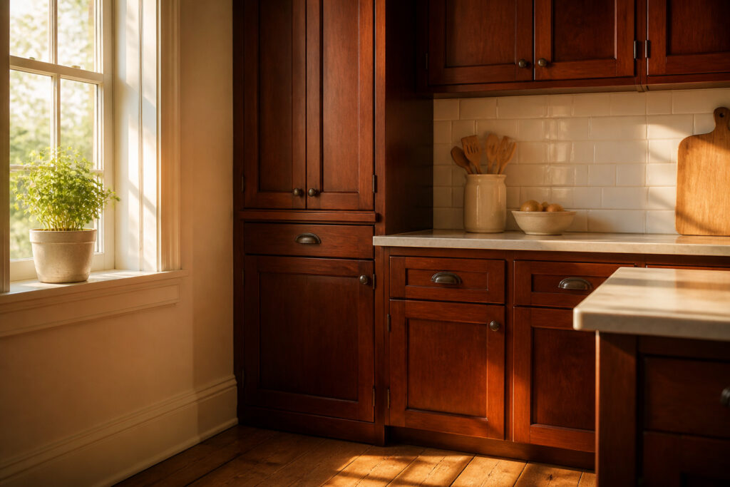
The right backsplash for cherry cabinets depends on whether you want to balance the wood’s weight or let it dominate.
White is the most common answer, but the real decision is how much light your kitchen actually gets; a north-facing galley with one window turns even soft blue cold and clinical, while the same tile reads airy once you add under-cabinet LEDs.
For renters keeping spend under a few hundred, beadboard paneling or subway tile both finish in a weekend, and warm white with a hint of cream keeps aged cherry from looking dirty by comparison.
1. White Backsplash
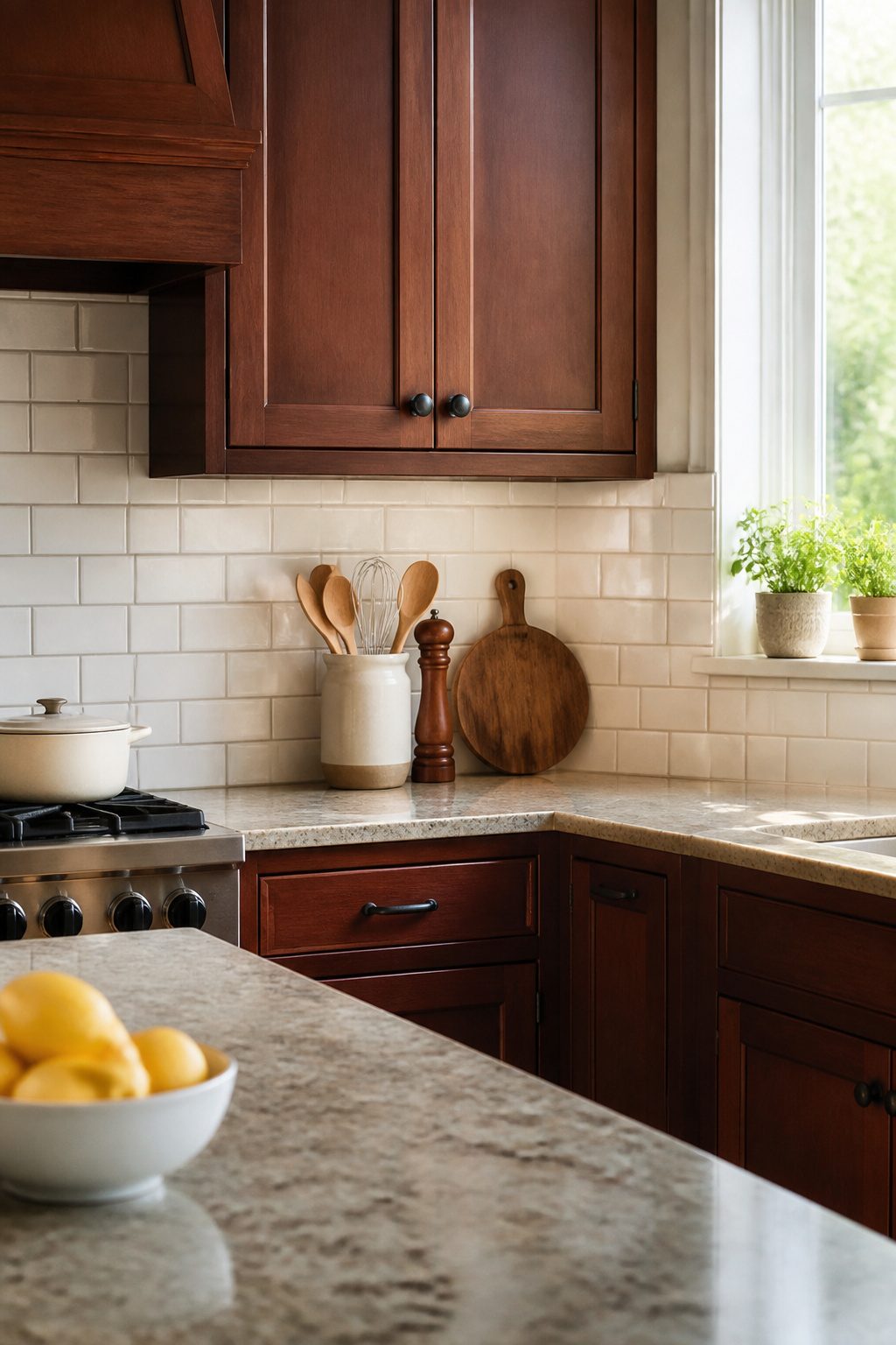
White backsplash is the pairing you will see recommended most often for cherry cabinets, and the reason is straightforward: cherry reads heavy, and white cuts that weight without fighting the undertone.
The contrast wakes up a kitchen that can otherwise feel like a dark box, especially in a rental with limited windows or overhead lighting.
For a weekend project, three options keep the work manageable and the budget under a few hundred dollars.
Subway tile is the default for a reason; the 3-by-6-inch format is forgiving to set, and the grout lines break up the white just enough so it does not read sterile against the warmth of the wood.
Beadboard paneling runs even faster if you rent and want something you can pull down later; a single sheet cuts to fit behind a stove or sink with a jigsaw and finishes with paint matched to your trim.
Painted shiplap lands in the same territory, though the horizontal lines draw the eye wider, which helps in a galley kitchen but can feel busy if your cabinets already carry a lot of door detail.
What convinced me, reading through a dozen of these kitchen refreshes, is that white does not have to mean cold.
A soft warm white, something with a hint of cream rather than a stark blue-white, keeps the cabinets from looking orange by comparison.
The mistake I saw repeated was choosing a white too clean against aged cherry; the cabinets end up looking dirty by association, which is the opposite of the intended effect.
2. Gray Backsplash
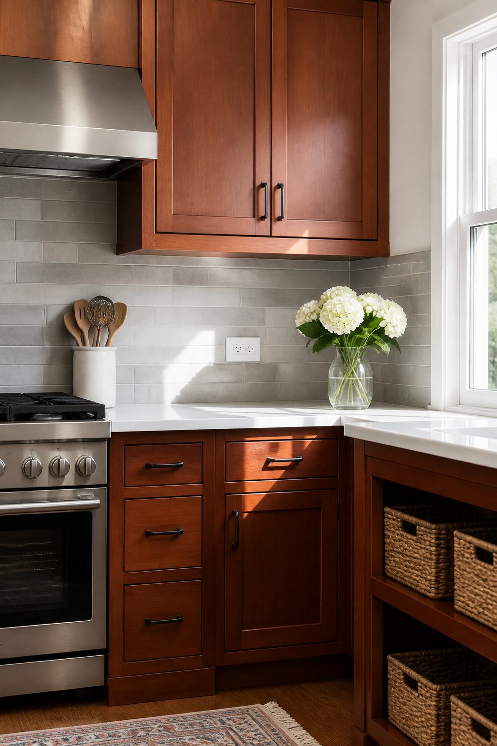
Gray settles cherry cabinets without starting a color fight.
The red undertone stays, but it stops shouting across the kitchen. I like that flexibility: light gray reads clean and airy against the wood, while charcoal pushes the whole space toward modern without turning cold.
For renters or anyone keeping the budget under a few hundred, concrete-look porcelain tile hits the mark. It carries the industrial texture people want right now, installs like standard subway tile, and costs a fraction of real concrete.
Honed slate works the same way, softer than polished stone and easier to live with under kitchen lights. Both materials let the cherry stay traditional while the backsplash moves the room forward.
3. Beige Backsplash
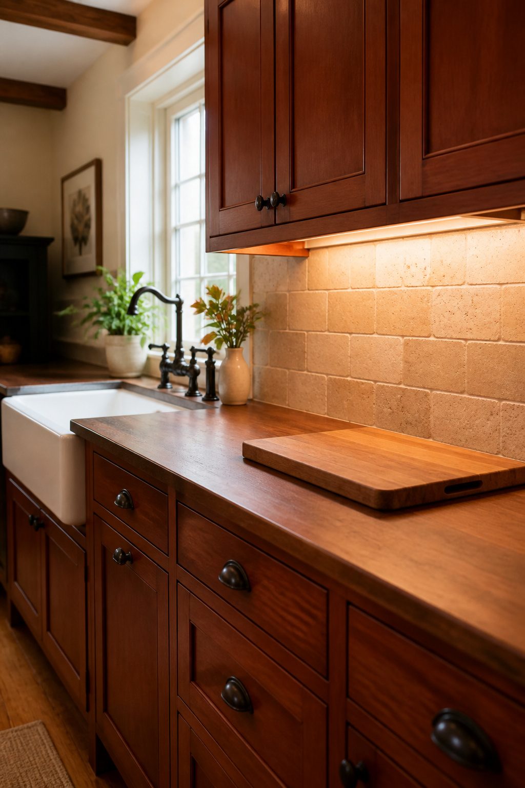
Beige stays in the same warm family as cherry without trying to match it, which is why it works so well.
The cabinets carry that ruddy, rose-tinted depth, and a beige backsplash lets them stay the star while softening the whole wall.
I look at it as creating a pause between the wood and the rest of the kitchen rather than a statement of its own.
Travertine-look porcelain bridges traditional and current better than almost anything else in this color range. You get the pitted texture and warm variation of real stone, but the maintenance drops to wiping it down like any standard tile.
For renters especially, that matters: you are not sealing natural stone every year, and if a tile cracks, the replacement sits at any big-box store.
Creamy limestone does the same bridging if you want the real thing and do not mind the upkeep.
Actual stone adds depth you can feel, not just see, and the creamy tones pull out the lighter streaks in cherry grain that a harsher white would flatten.
The catch is the sealing. Plan on it yearly, and budget for that time or skip to the porcelain version.
Either material keeps the kitchen from reading as a period piece while still respecting the warmth that drew you to cherry in the first place.
4. Blue Backsplash
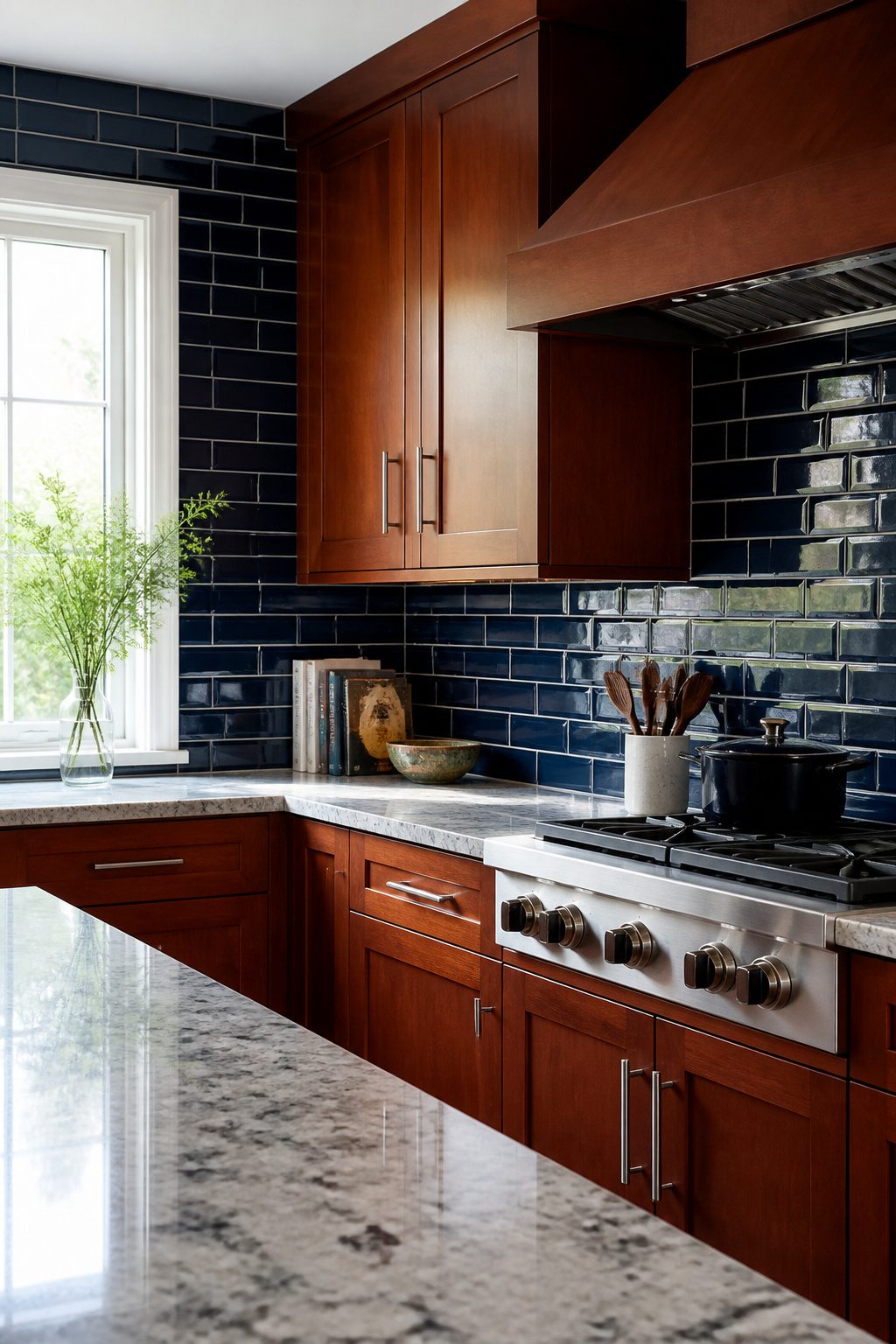
Blue sits opposite red on the color wheel, so a blue backsplash against cherry cabinets creates contrast by design rather than by accident. The range matters more than most people expect.
Navy reads almost like black, giving the kitchen a dim, moody sophistication that can swallow a small space whole. Powder blue does the opposite, bouncing light around and keeping the red undertones in the cherry from dominating the room.
I lean toward the lighter end for rentals and first projects because it forgives a lot: uneven grout, dated hardware, cabinets that have darkened over years of use.
The sources flag natural light as the deciding factor, and that matches what I’ve seen looking through dozens of kitchen photos.
A north-facing galley with one window turns even a soft blue cold and clinical. Add a window or under-cabinet lighting, and the same tile feels airy.
If your kitchen is short on daylight, blue is still workable, but you’ll want to test a large sample during the hour you actually use the space, not at noon when the sun hits it best.
5. Black Backsplash
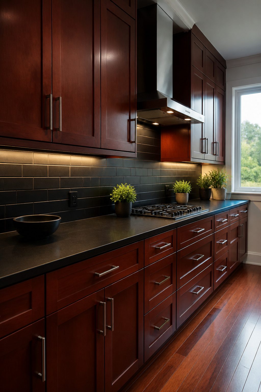
Black tile against cherry wood reads dramatic in the right light and oppressive in the wrong one.
The contrast works because cherry’s warmth keeps the pairing from turning cold, but the line between moody and cave-like is about lumens, not taste.
Matte black ceramic in a subway format gives you texture without glare, though every fingerprint and water spot shows up.
Blackened steel panels carry an industrial weight that suits heavier cabinet hardware, and they install in sheets rather than individual pieces.
Chalkboard paint is the outlier budget fix, something I considered for a rental once and abandoned after realizing the constant re-coating; it also absorbs light rather than reflecting any back.
If your kitchen has one window and no under-cabinet lighting, this direction will swallow the room. Add LED strips or pick a lighter countertop before committing to the backsplash.
6. Green Backsplash
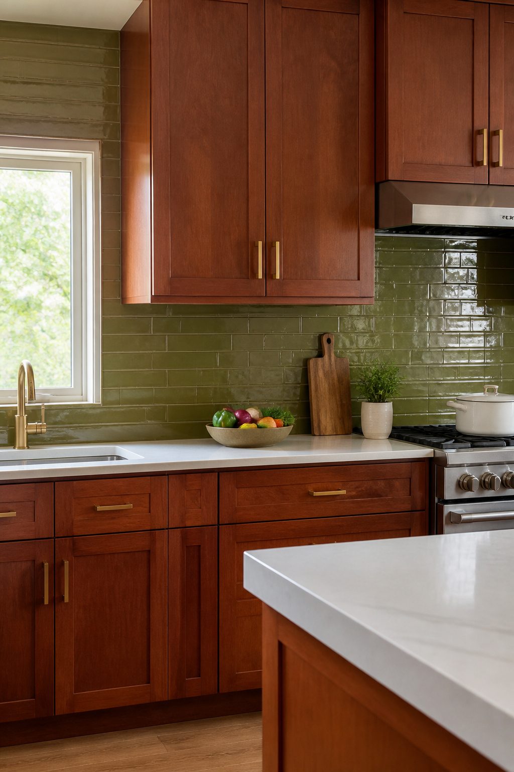
Green tends to get passed over for cherry kitchens, which is a shame. The red undertones in cherry wood sit opposite green on the color wheel, so the two colors push each other to look richer rather than muddier.
Sage reads soft and quiet against dark cherry, forest green goes deep and moody, and olive green subway tile builds contrast that actually works without shouting for attention.
I spent a while comparing swatches before I believed it. Olive in particular has enough brown in it to feel like a natural neighbor to wood grain, and the subway format keeps the look grounded in something classic.
Satin brass hardware, if you are already replacing knobs or fixtures, threads the two colors together so the kitchen feels finished rather than patched.
The coastal green ceramic option carries the same color-wheel logic but with a glossier, slightly more handcrafted surface that wipes down easily after cooking.
The risk with green is picking something too bright or too cool, which turns the pairing into a Christmas effect. Stick to muted, dusty versions and test a few tiles against your actual cabinets before committing.
7. Multicolor Backsplash
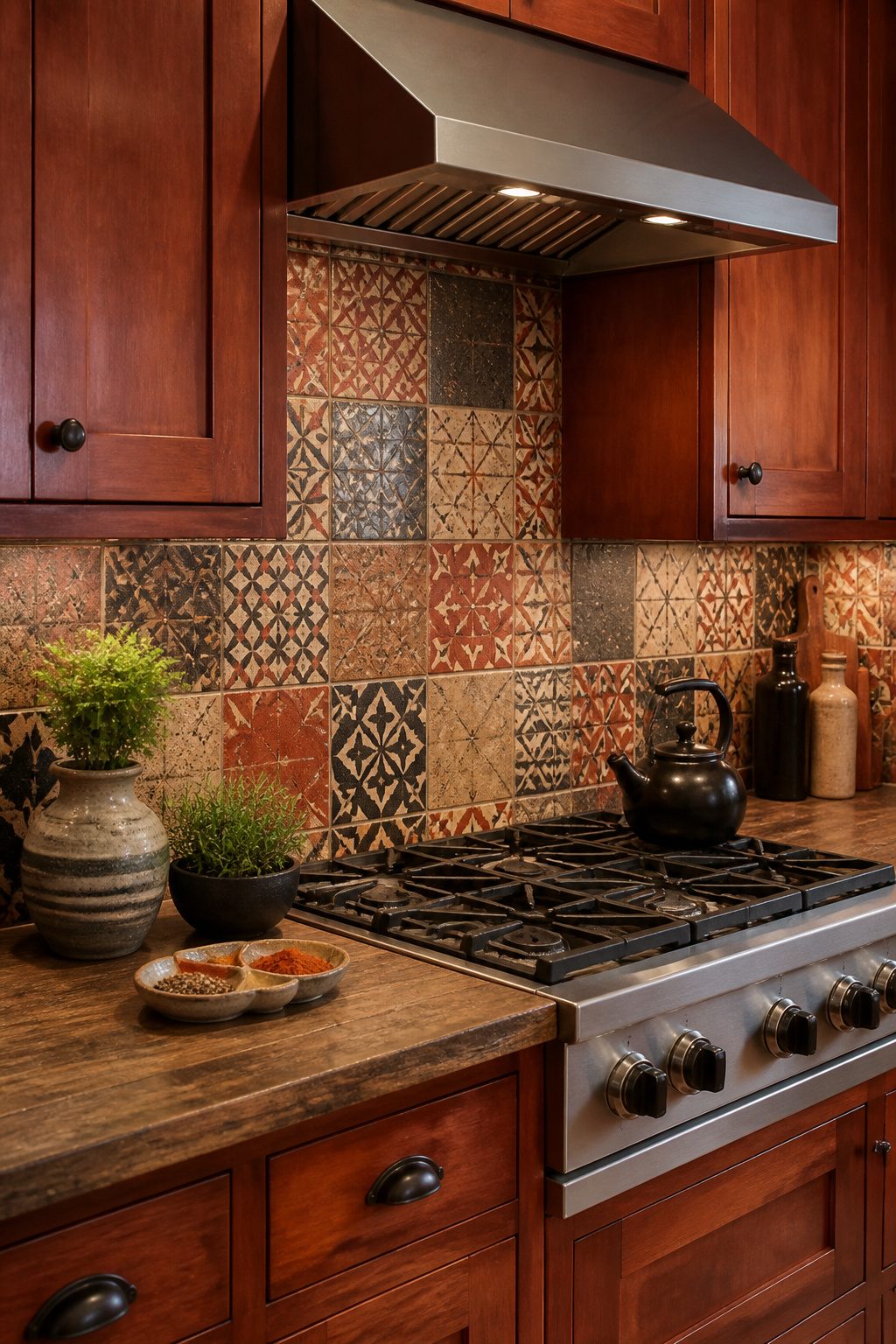
Patchwork and encaustic tile fields that pull cherry red into a mix of neutrals can anchor a kitchen without letting the cabinets feel like the only warm thing in the room.
The trick is making sure at least one tone in that mix directly echoes the cabinets themselves; otherwise the wall reads as random collected tile rather than intentional design.
I have seen layouts where a vintage patterned field carries red, gray, and black together, and the red thread is what keeps the backsplash from competing with the wood.
Multi-color marble subway works on the same principle: warmer veins in the stone pick up the red-brown of the cabinets while cooler neutrals keep the overall palette balanced.
If the tile runs too cool across the whole sheet, the cabinets start to look orange and isolated.
One warm tie to the wood is the non-negotiable rule. Tall white uppers or glass-front cabinets help keep the room from going dark once that richer tile goes up, especially in a galley or a space with limited natural light.
8. Marble Backsplash
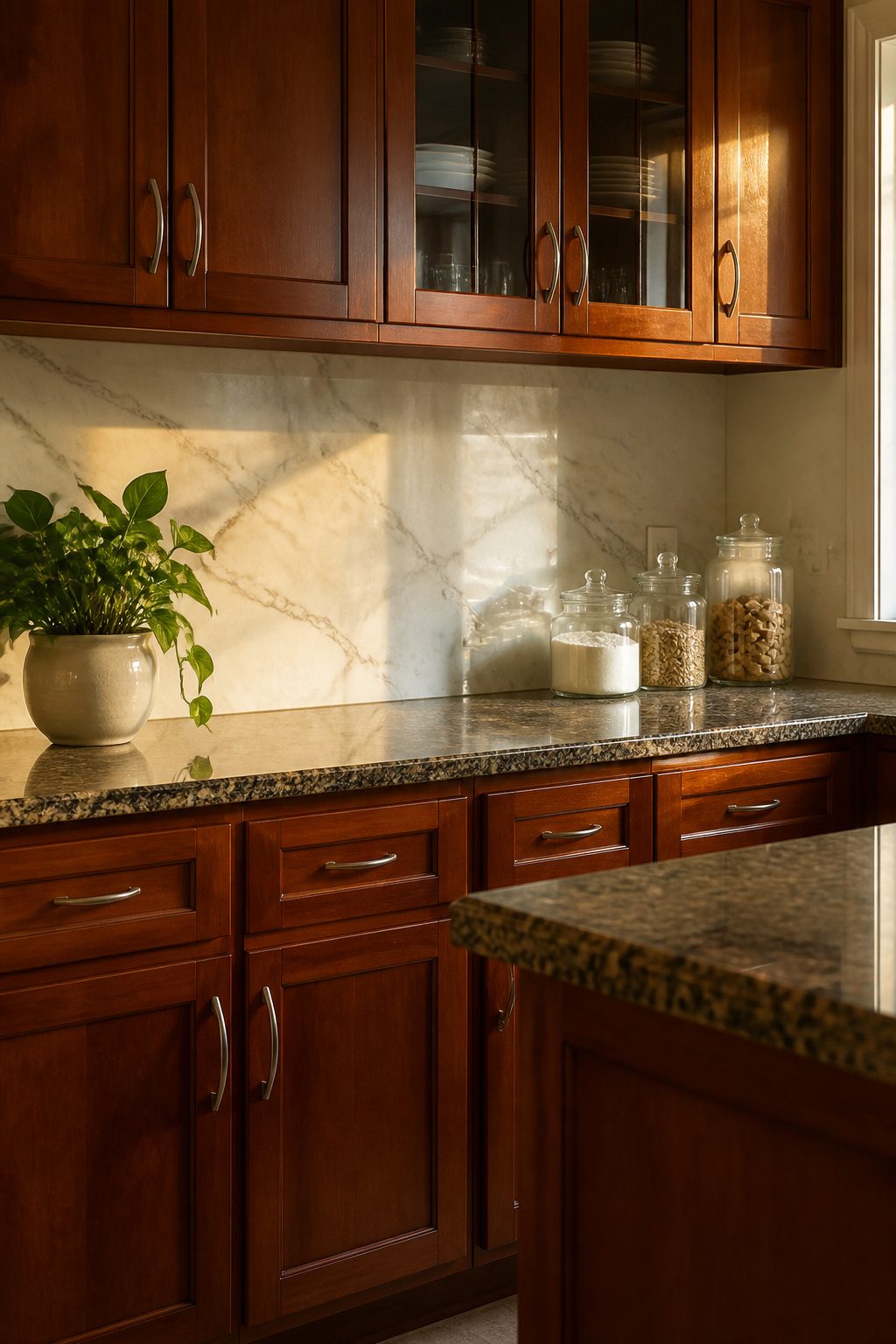
Real marble backsplashes bring a cool, pale counterweight to cherry’s warmth, and the stone’s organic veining picks up the wood’s movement without trying to copy it. The two materials stay in conversation rather than competition.
What stopped me on every kitchen forum was the splatter question. Honed marble hides water spots and grease far better than polished, which turns every cooking session into a wiping drill.
If the maintenance still feels like too much, porcelain lookalikes have gotten convincing enough that you need to touch them to know.
They cost less, install lighter, and let you stop worrying about red wine or tomato sauce. For a weekend project budget, that trade is worth making unless you are dead-set on the real thing and prepared to seal it yearly.
9. Glass Backsplash
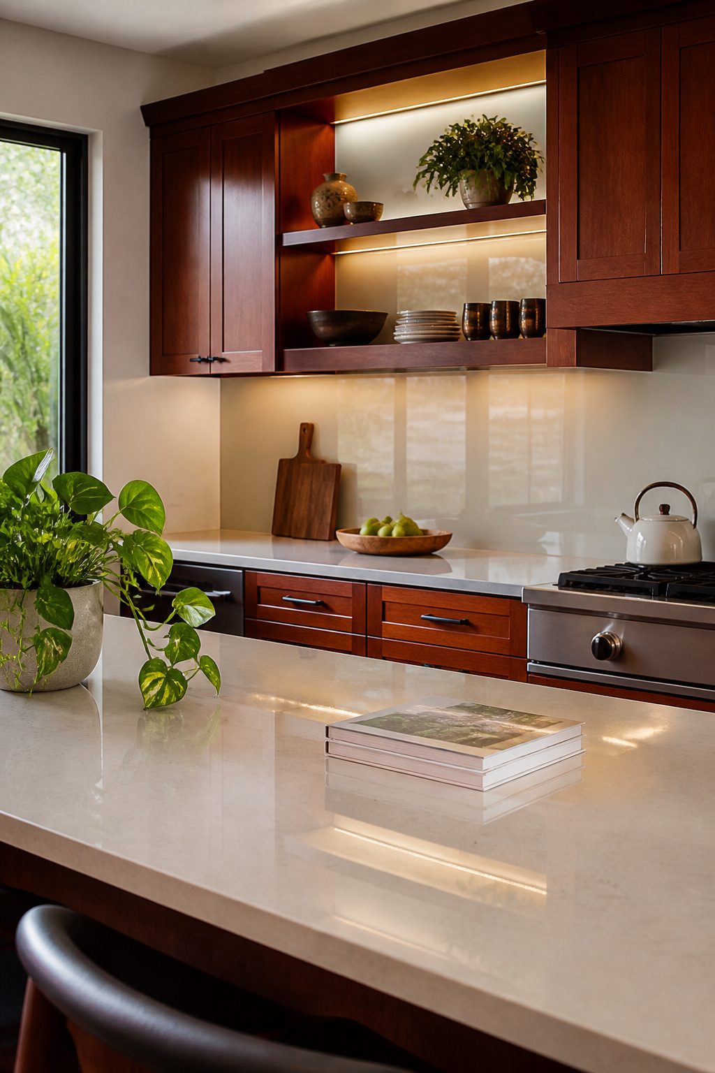
Glass has a way of solving two problems at once in a kitchen with cherry cabinets, which tend to read heavy against walls.
A smooth glass backsplash bounces light back into the room, and the surface wipes clean with nothing more than a damp cloth.
That reflective quality matters more than people expect; in a galley kitchen or any space without windows on multiple walls, the backsplash can effectively double the light you do have.
Solid painted glass gives the cleanest, most contemporary look, almost like a polished slab of color floating behind the counter.
Textured glass, by comparison, scatters light rather than reflecting it directly, which softens the effect and hides water spots or grease between cleanings.
For a small kitchen, the solid glossy finish is the one that actually makes the walls feel farther apart.
The tradeoff is that glass shows every smear until you wipe it, and installation requires precise cuts around outlets. Neither issue is a dealbreaker, but it is a surface that rewards tidiness rather than forgiving clutter.
10. Vintage Patterned Tile
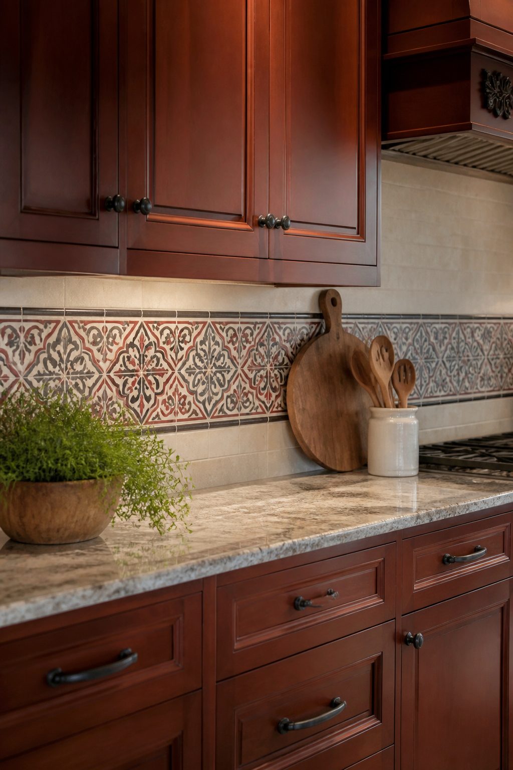
Vintage patterned tile in red, gray, and black pulls directly from the tones already living in cherry cabinets, so the backsplash reads as intentional rather than competing.
The palette leans traditional, eclectic, or mid-century modern depending on what else you layer in.
Reproduction cement tile is the usual source for this look. The trick is using it as an accent band rather than running it wall-to-wall.
A six-to-eight-inch strip at eye level, or a band behind the range only, keeps the pattern from overwhelming a kitchen where cherry wood is already doing a lot of visual work.
Full wall coverage works in a powder room; in a kitchen with warm cabinets, it starts to feel like two conversations at once.
The accent approach gives you the color story without the busyness, and it cuts both material cost and installation time.
11. Distressed Blue Subway Tile
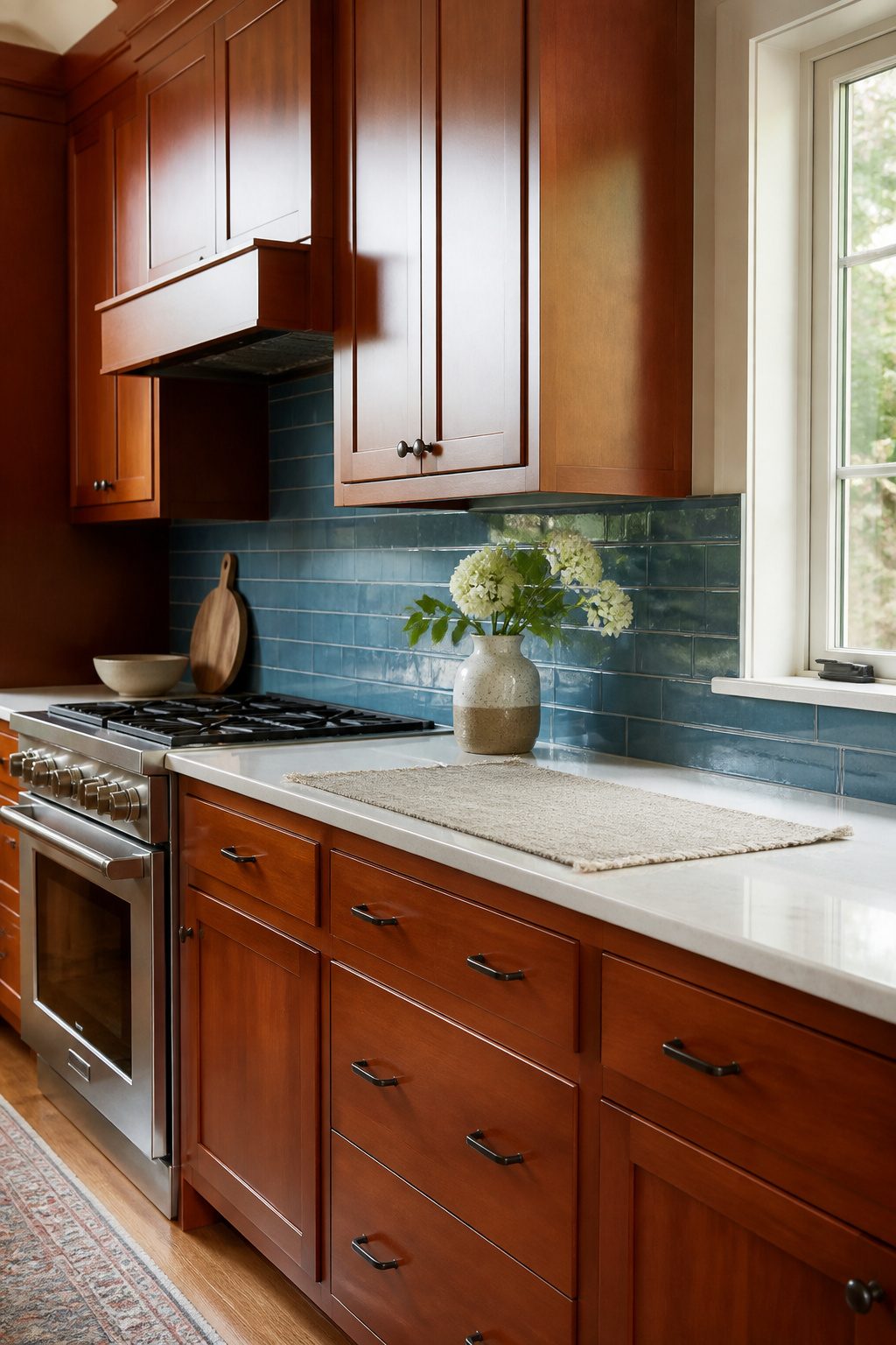
A weathered glaze on blue subway tile reads more relaxed than polished ceramic, and that casual finish happens to hide grout lines better than glossy alternatives.
The irregular surface catches light in small shifts throughout the day, which sets up a nice tension against cherry’s smooth, uniform finish. The glaze also makes the tile easier to wipe down than a true porous matte would be.
In a kitchen with cherry cabinets, the blue reads as color without shouting for attention. The distressing keeps it from feeling too deliberate or showroom-perfect, which matters when the cabinets themselves already carry that formal, traditional weight.
Install it in a running bond pattern and the variation in the glaze keeps the grid from looking too mechanical.
The risk is choosing a blue too grayed-out; against cherry’s red undertone, a muddy blue can turn the whole wall dirty.
A mid-tone with some saturation holds its own. Sample it against your actual cabinets, not a swatch on a screen, because cherry shifts dramatically under warm kitchen lighting versus daylight.
12. Coastal Green Ceramic Tile
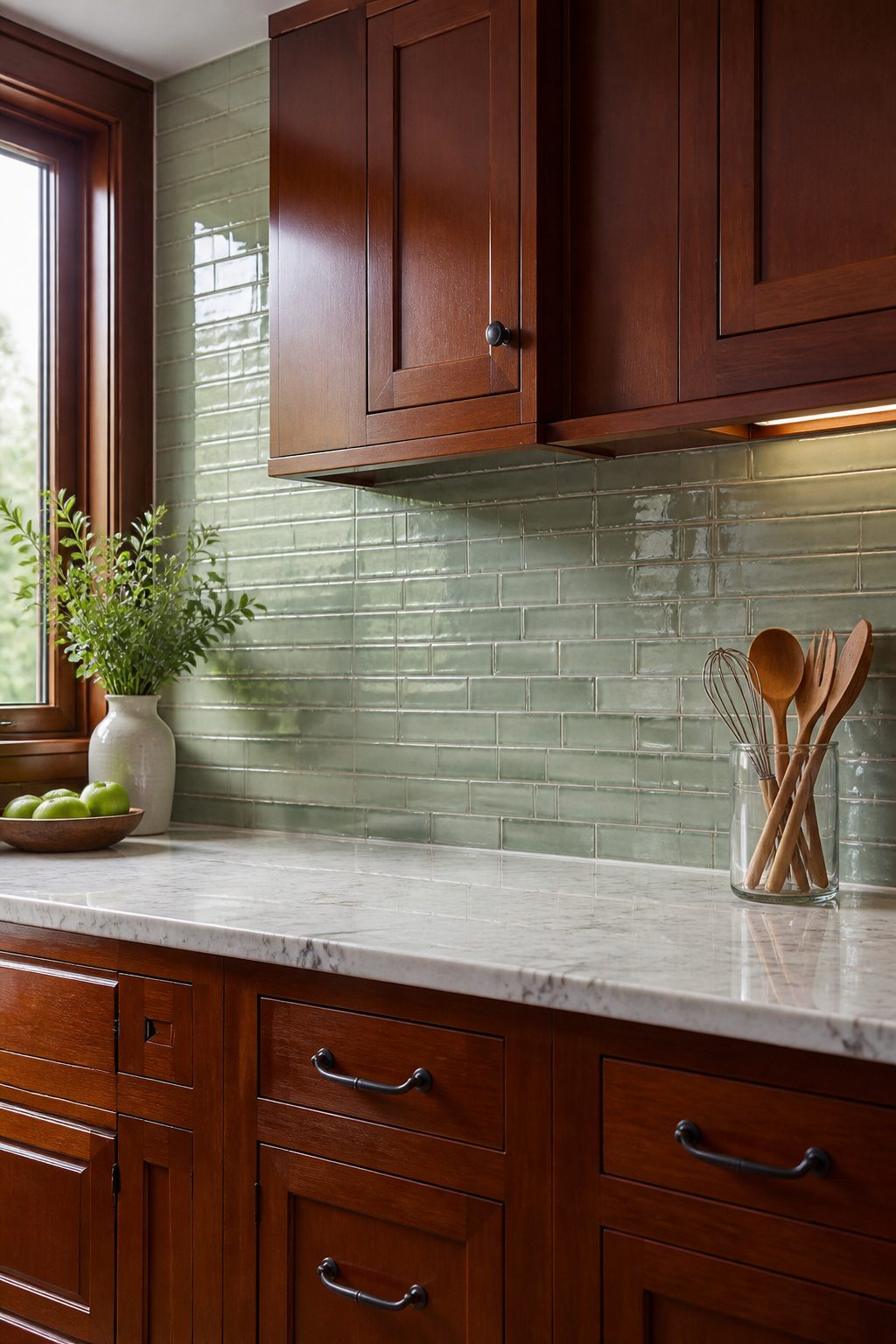
Green sits opposite red on the color wheel, which is exactly why coastal green reads as fresh instead of fighting the depth of cherry cabinets.
The contrast wakes both colors up; the cabinets look richer and the backsplash looks cleaner than it would against a safer neutral.
Ceramic tile keeps this pairing affordable. Factory-made ceramic runs well under handmade prices and still gives you glaze choices that change the whole mood.
A matte finish quiets the green down for kitchens with a lot of natural light, while a glossy glaze bounces light back into darker spaces.
Crackle glaze sits in between, aged-looking without the actual age, and hides water spots better than a mirror finish.
I would skip crackle in a house I was selling soon; the trend reads very 2024 and buyers may already be tired of it.
For a place you are staying in, it is a cheap way to get texture that reads as intentional rather than budget.
13. Ivory Subway Tile
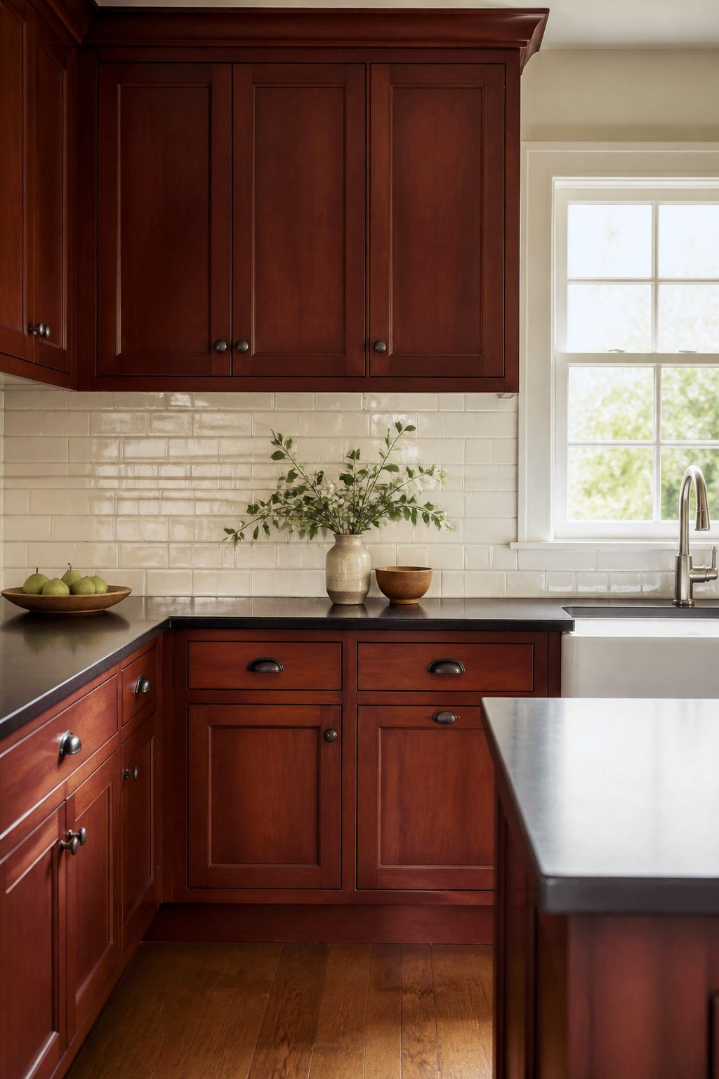
Ivory subway tile sits in the useful space between stark white and anything with real yellow in it.
The warmth flatters cherry cabinets rather than fighting their red undertone, and in most kitchens that pairing reads as intentional, not like a white that aged badly.
The glaze finish changes what you notice. A crackle glaze catches light in fine lines that read as texture from a few feet back, which helps if your countertops are plain.
Smooth ivory glaze stays quieter, almost flat, and in a small galley that calm can keep the walls from closing in.
Either way, ivory does the background work. It lets cabinet hardware, a marble counter, or a row of glass-front uppers carry the visual interest instead of competing for it.
If you are already committed to cherry and want the cabinets to stay the story, this is the tile that steps aside.
14. Olive Green Subway Tile
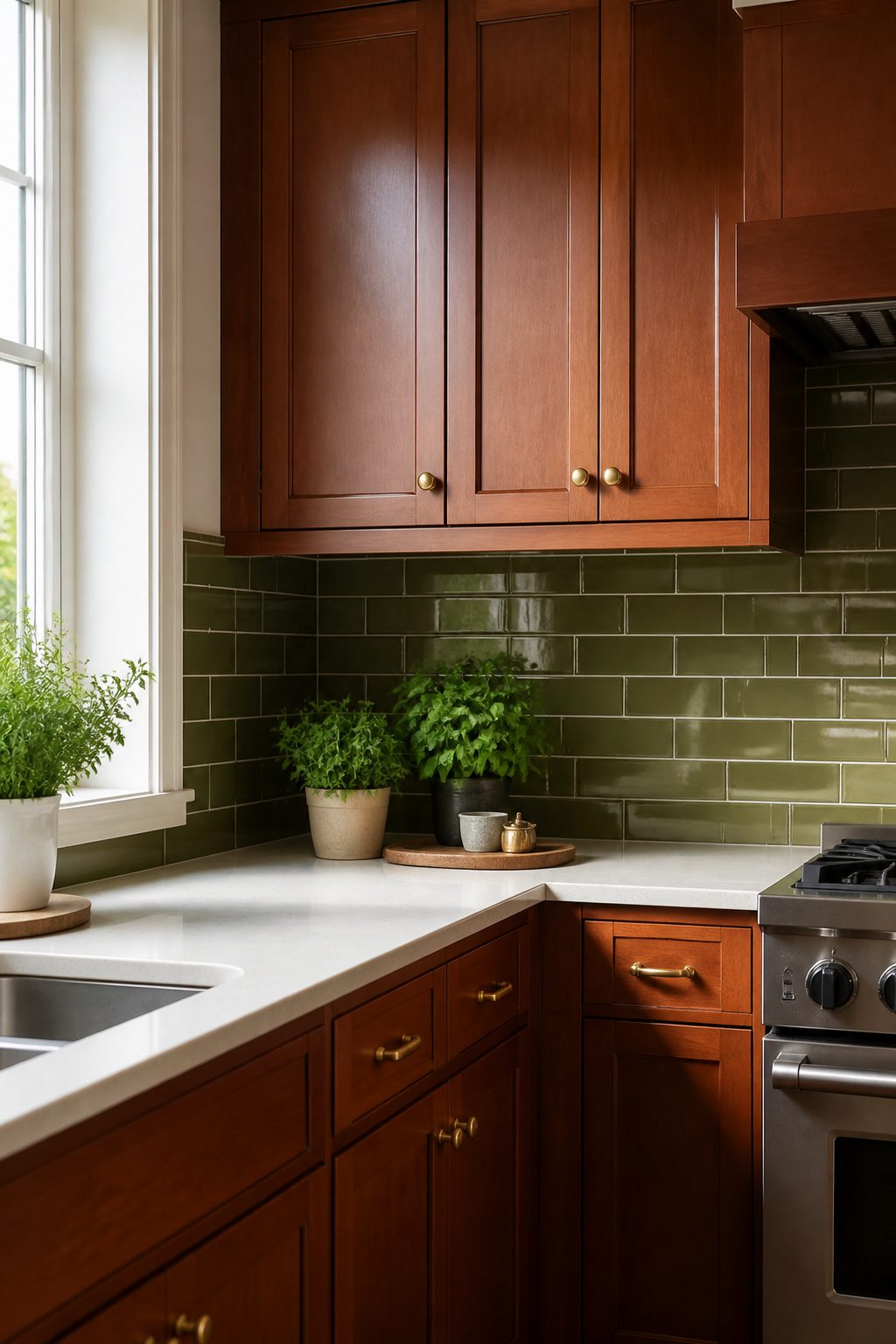
Olive green reads differently than the brighter greens most people default to. The brown undertone in this shade talks directly to the grain in cherry wood instead of fighting it, so you get contrast that still feels coordinated.
I keep coming back to this pairing when I want something bolder than neutral without the holiday-red-and-green effect.
A satin brass hardware finish pulls the two together even tighter.
The warm metal echoes the brown in both the olive tile and the cherry cabinets, so the whole wall starts to feel like one intentional decision rather than two colors that happened to land next to each other.
Subway tile keeps the labor reasonable for a weekend project, and the classic shape keeps olive from reading too trendy.
Glossy finish is the practical choice here; cherry kitchens tend to run warm, and the sheen bounces light around so the space doesn’t go flat.
15. Natural Stone Mosaic Tiles
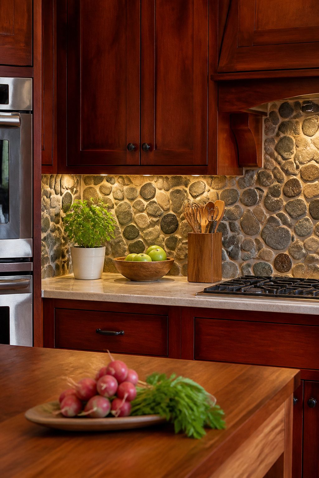
Small-format stone mosaics in slate, travertine, or mixed river rock carry an irregular texture that softens cherry cabinets rather than competing with them.
The variation in tone and surface catches light differently across the day, which keeps a kitchen from feeling flat under overhead fixtures.
Mesh-mounted sheets matter more here than with ceramic because individual stone pieces vary in thickness; the backing holds the pattern true while you work and cuts installation time to roughly half what loose tile would take.
Slate runs cooler and slightly more modern, travertine leans warm and traditional, and mixed river rock splits the difference with rounded edges that read casual.
Grout choice shifts the whole effect: a shade close to the darkest stone makes the mosaic read as texture alone, while lighter grout outlines each piece and turns the backsplash busier than cherry already is.
I would skip the light grout in a compact kitchen. Cost sits higher than ceramic but below most marble, and the sheets mean you can handle the labor yourself rather than paying for a setter.
The real limit is weight: stone mosaics run heavy, so verify that your wall substrate can take it before you order, especially on a backsplash that rises only partway rather than to the ceiling.
Material Options
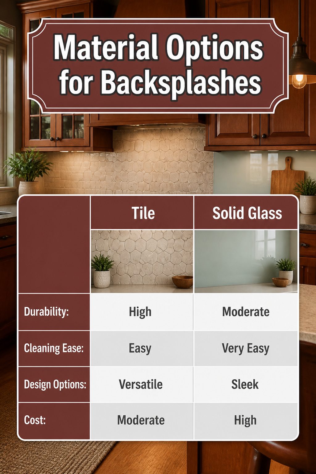
Cherry hardwood comes from the American Black Cherry fruit tree, and that origin is part of why its tone carries such a distinctive warmth. Against that richness, the material you choose for your backsplash changes the whole kitchen.
Tile still wins for most hands-on renovators because it survives real use.
Ceramic, porcelain, stone, even polished concrete: the shapes run from long narrow planks to hexagons, and the finishes range from matte to glazed. Spatter wipes off, and if one cracks, you replace one.
Solid glass reads modern and stays easy to clean.
Its transparency pulls subtle color into the space without competing against the wood. Stone, whether marble, granite, or travertine, doubles down on warmth and adds texture that makes cherry cabinets feel grounded rather than dated.
Wallpaper belongs in the conversation too, especially for a quick refresh under a few hundred dollars. New vinyl wall coverings go up fast and come back down when the lease ends or tastes shift.
The tradeoff is obvious: no splatter resistance, so keep it behind a range with a good hood or accept that it is temporary.
Color Combinations
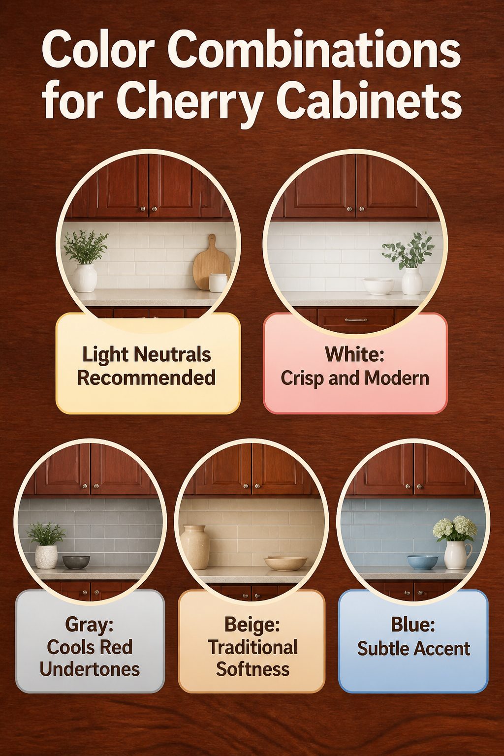
Cherry cabinets carry a red-brown warmth that can turn heavy under the wrong color.
Light neutrals are the most common answer to what color backsplash goes with cherry cabinets because they keep the kitchen from feeling like a dark box without fighting the wood’s natural undertone.
White reads crisp and clean against cherry, letting the cabinets feel intentional rather than dated. Gray cools the red down, which helps if the stain leans orange in afternoon sun.
Beige softens the contrast for a more traditional, pulled-together look. Blue, especially in lighter shades, picks up the cooler side of cherry grain and adds just enough color to feel considered rather than safe.
The choice comes down to what you want the room to do.
White and gray push the kitchen toward modern; beige keeps it classic; blue gives you a subtle accent without the risk of mint green or pastel pink, which can read gimmicky against such a strong wood tone.
Why Cherry Cabinets Still Work
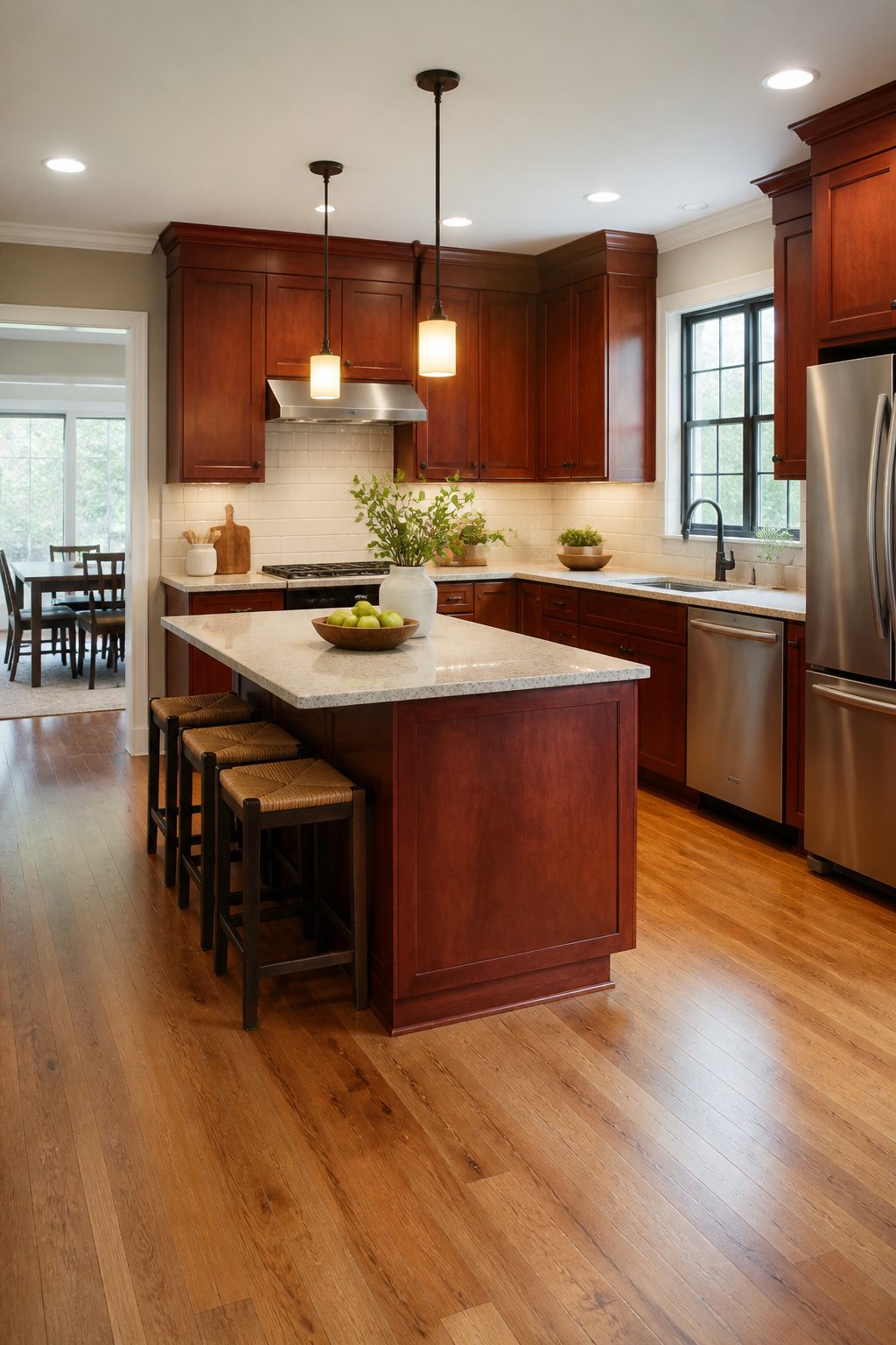
Cherry cabinets still hold their ground in 2024, and the reason is simpler than trend cycles would suggest.
American Black Cherry has that built-in warmth that reads as lived-in rather than dated, and it takes stain so smoothly that a kitchen can sit anywhere from a lighter, casual finish to the traditional deep glaze without losing its character.
The wood ages distinctly, sometimes in ways you didn’t quite predict, which keeps the room from feeling frozen in one era.
What actually dates a kitchen isn’t the cabinet species; it’s the pairing. Cherry’s deep red undertone can turn heavy fast, or it can stay balanced depending on what sits across from it.
The backsplash carries that weight. Cream, blue, green, geometric pattern, or a clean subway layout: cherry supports all of them, but the choice is what signals whether the room was assembled in 2006 or refreshed for this year.
The backsplash is your update lever, not the cabinets themselves. That is why sources still list cherry as a flexible foundation rather than a style to replace.
Frequently Asked Questions
What color backsplash goes with cherry cabinets?
u003cpu003eLight neutrals like white, gray, beige, and cream are the safest bets because they keep cherry from reading heavy without fighting its red undertone.u003c/pu003e u003cpu003eWhite brightens a dark kitchen, gray cools the red down, and beige stays in the same warm family so the cabinets stay the star.u003c/pu003e u003cpu003eIf you want color, blue, green, or even black can work, but they need the right lighting and the right shade to avoid turning the space cold or gimmicky.u003c/pu003e
Are cherry cabinets in style in 2024?
u003cpu003eYes, cherry cabinets still hold up because the wood’s warmth reads lived-in rather than dated, and it takes stain smoothly across a wide range of finishes. What actually dates a kitchen is the pairing, not the wood itself.u003c/pu003e u003cpu003eThe backsplash is your update lever; cherry supports everything from cream subway tile to blue ceramic to geometric pattern, and that choice signals whether the room was assembled in 2006 or refreshed for this year.u003c/pu003e
What backsplash material goes well with cherry cabinets?
u003cpu003eTile is the most practical choice for most renovators because it survives real use and comes in ceramic, porcelain, stone, and polished concrete. Solid glass reads modern and bounces light back into darker spaces.u003c/pu003e u003cpu003eStone such as marble, granite, or travertine doubles down on warmth and grounds the cabinets. Wallpaper works for a quick, cheap refresh but has no splatter resistance, so keep it away from the range or treat it as temporary.u003c/pu003e