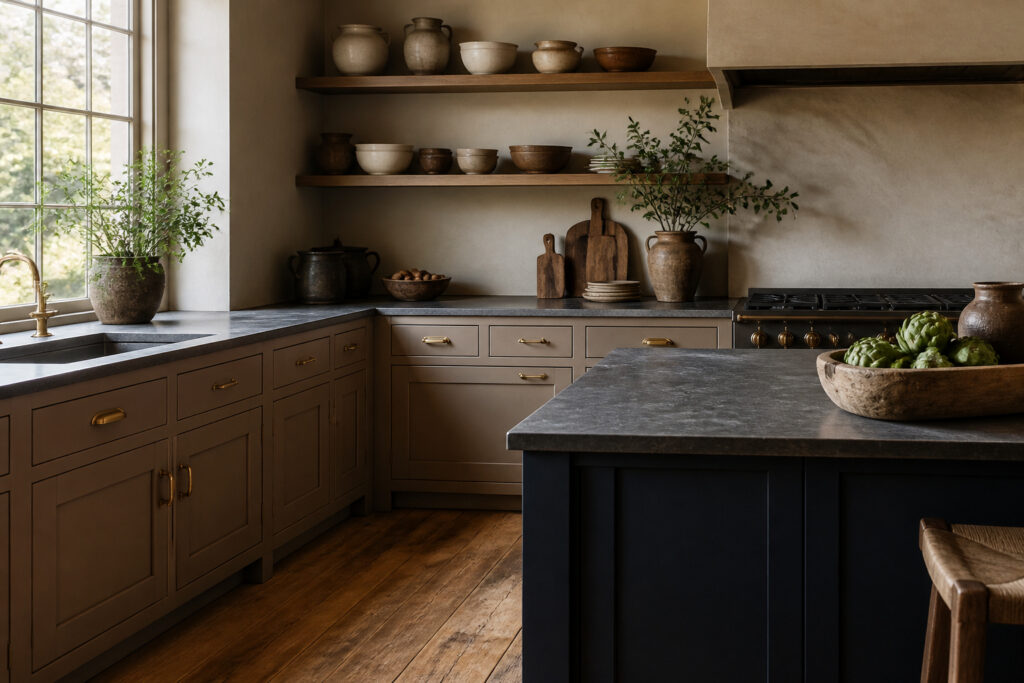
Taupe kitchen cabinets sit in the space between gray and brown, warm enough to avoid sterility but neutral enough to outlast trend cycles.
The catch is that taupe goes flat fast without contrast, which is why the pairings below matter more than the cabinets themselves.
A white upper over a taupe lower, or a navy island against taupe perimeter cabinets, gives the color the definition it cannot generate alone.
Unlacquered brass hardware on taupe doors ages into a living finish that factory-bright metals never quite match, and the same warmth pulls out beige undertones hiding in the paint.
Taupe and White
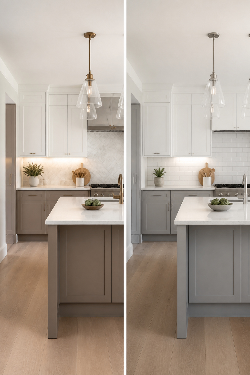
White against taupe gives the crisp contrast that keeps a warm neutral from going flat. In a small kitchen, that brightness bounces light around and keeps the walls from closing in.
In a larger one, the same pairing keeps the space from feeling like a single muddy wash.
Two ways to play it. All-white uppers over taupe lowers draws the eye upward, which helps if your ceiling sits a little low.
White quartz countertops with subtle veining do something similar at counter height, expanding the visual space while the taupe grounds the room. A white backsplash or white walls work too, though they read quieter than the two-tone cabinet route.
The hardware finish matters less than you’d think. Bronze, nickel, or brass all read clean against this pairing, so you can choose for the style rather than the color match.
What does matter is keeping the hardware consistent if you split the cabinet colors; mixed pulls on a two-tone kitchen start to look like a mistake rather than a plan.
Under-cabinet lighting helps, especially with white uppers. It highlights the transition line and keeps the white from going shadowy after dark.
Taupe and Navy
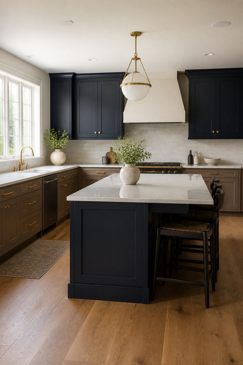
Navy gives taupe cabinets a weight that lighter pairings never quite reach. Where white brightens, navy sinks in and anchors the whole room.
I have seen this work best in three places: a single accent wall behind open shelving, a painted island against lighter perimeter cabinets, or lower cabinets kept taupe with navy uppers.
Each option lets you test the contrast without committing the entire kitchen to darkness.
The island route borrows from a trick that already works with taupe itself. Keeping perimeter cabinets white or cream while running navy on the island turns that piece into deliberate furniture, something chosen rather than installed by default.
Different hardware on the island drives the point home, brass or matte black pulls that read as collected over time rather than ordered from a single catalog page.
Hardware bridges the gap when navy and taupe share the same wall. Warm metals, gold or brass especially, keep taupe from going flat against such a saturated blue.
Matte black works too, but it sharpens the contrast; brass softens it. For renters or anyone who might repaint in a few years, hardware is the safer experiment.
Swapping pulls takes an afternoon and a screwdriver, and the old holes hide under replacement plates if you ever revert.
Taupe and Gold or Brass
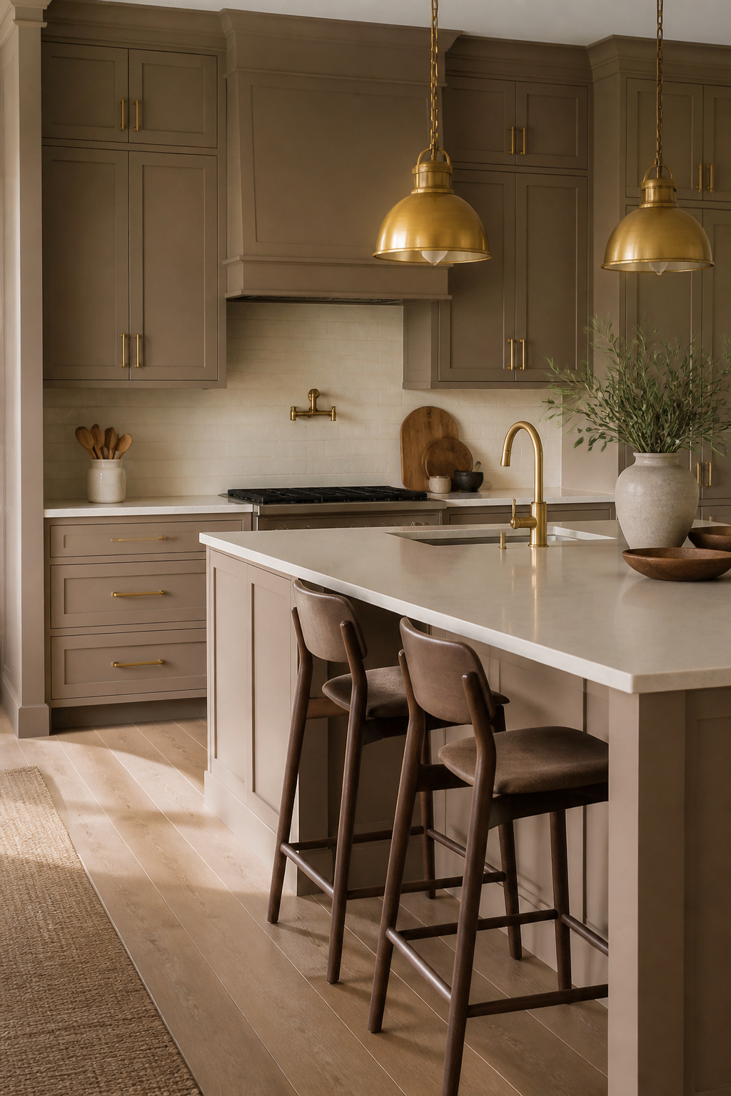
Warm metals pull out the beige undertones hiding in taupe, and the combination reads as expensive without trying too hard.
Brass pendant lights over an island or dining area catch daylight and evening lamplight differently, giving the kitchen a glow that shifts through the day rather than flattening into one static look.
The hardware is where most people start, and unlacquered brass is the choice if you want the finish to age into its own patina rather than staying factory-bright.
Matching the faucet to the cabinet pulls keeps the whole thing from looking accidental. Brushed brass works on modern profiles; more traditional doors can take something with a little more ornament.
Where this pairing slips is formality. Too much polished brass in a small kitchen starts to feel like a hotel lobby.
One source of warmth, maybe two, is usually enough. I would skip brass toe kicks or a brass range hood and let the cabinets stay quiet.
Pendants at 30–36 inches above the counter keep the light functional; a dimmer keeps the mood from going rigid. Two or three pendants spread the light better than one oversized statement piece trying to do all the work.
Taupe and Charcoal or Black
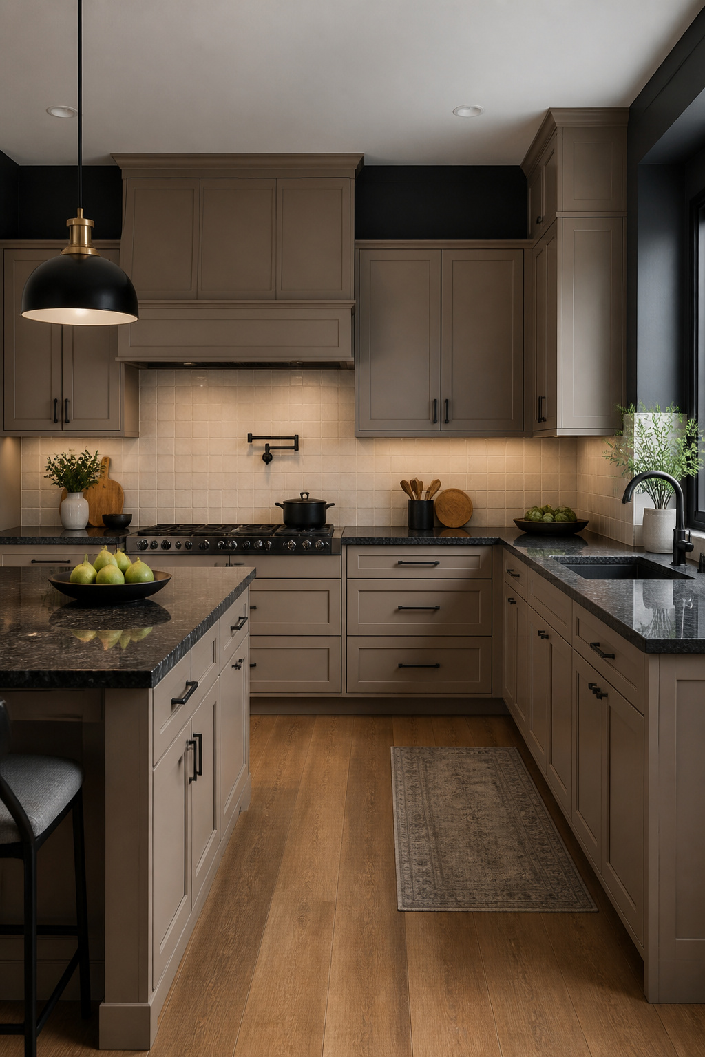
Charcoal walls or matte black hardware against taupe kitchen cabinets give the same grounded contrast as the stone options, but with a lighter footprint on the budget.
A full wall of deep charcoal paint reads as architecture rather than decoration, and the warmth in taupe keeps the combination from sliding into the coldness of a true black-and-white kitchen.
The same balance works at smaller scale: swapping brushed nickel for matte black pulls adds definition without demanding a full renovation.
For countertops, the dark granites that pair here are Absolute Black, Black Galaxy, and Ubatuba. Absolute Black is the most uniform, Galaxy carries those copper flecks that catch under-cabinet light, and Ubatuba runs dark green-black with subtle gold speckling.
All three ground the cabinets visually, though Ubatuba in particular softens the transition because its undertone echoes the warmth in most taupe paints.
Matte black hardware shows fewer fingerprints than polished finishes, which matters on cabinet pulls you touch daily. If the overall effect starts feeling flat, one brass pendant or a copper faucet introduces warmth without breaking the monochrome thread.
My preference runs to keeping the metal finishes consistent, black through and through, and letting the stone or the wall color carry any variation.
Taupe and Sage Green
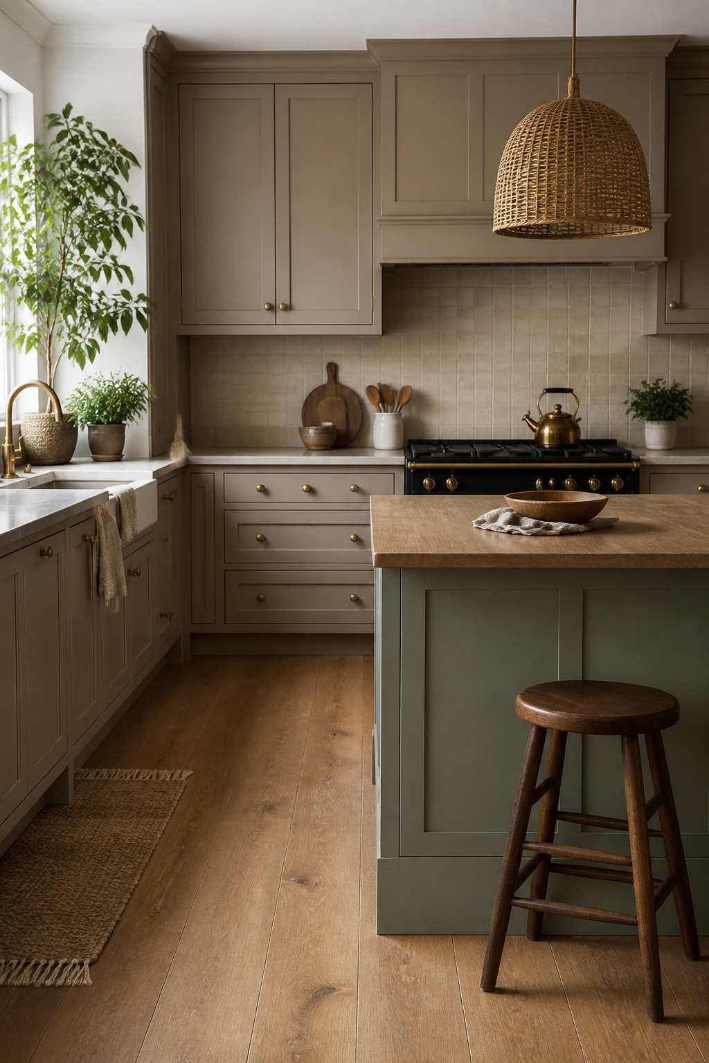
Taupe and sage green share the same grayed-down DNA, which is why they settle together so quietly. Neither color shouts; both read as found-in-nature rather than chosen-from-a-chart.
In a kitchen with taupe cabinets, that shared restraint keeps the room from feeling decorated.
The pairing works best when you let one surface carry the green rather than sprinkling it everywhere. A painted island in sage green, set against taupe perimeter cabinets, gives you the farmhouse kitchen feel without committing the whole room.
For a transitional take, sage green tile behind the range or across a backsplash adds the color in a harder material that still reads organic.
Small appliances in muted sage, like a stand mixer or toaster, let you test the combination before any paint goes up.
What convinced me, reading through the kitchen tours that pulled this off, was the difference between muted sage and anything brighter.
Olive and forest green also pair with taupe for that earthy feel, but sage sits in the middle, cool enough to keep taupe from going muddy, warm enough to avoid feeling clinical.
One homeowner mentioned her sage bar stools brought the space to life after the taupe alone had felt flat. Start with plants and textiles in that muted range before you buy permanent pieces.
Green-toned marble or quartzite counters or backsplash tie the two colors together if you want the combination built in rather than layered on.
Taupe and Dark Granite
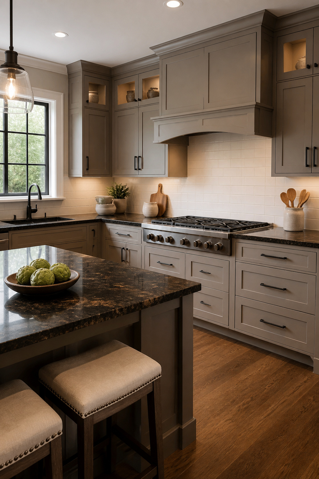
Dark granite against taupe cabinets reads as bold without the coldness of a true black-and-white kitchen. Absolute Black, Black Galaxy, and Ubatuba each give a different weight to that contrast.
Absolute Black is the most uniform, almost matte in its depth, while Black Galaxy carries those copper flecks that catch under-cabinet lighting.
Ubatuba sits somewhere between, a deep forest black with green and gold movement that softens the edge just slightly.
The finish on the stone matters as much as the color. A leathered or honed surface keeps the pairing current; high-gloss polish with a heavy ogee edge starts looking like 2008 faster than you’d expect.
A straight or slightly beveled edge, kept thin, lets the dark counter read as a slab rather than a frame.
Matte black hardware bridges the two tones cleanly. Brass or copper pulls warm the whole composition if the space starts feeling too severe, but keep the metal consistent, not mixed.
The backsplash should stay light, a soft white or pale cream, or the room tips toward cave-like regardless of how many windows you have.
Taupe and White Quartz
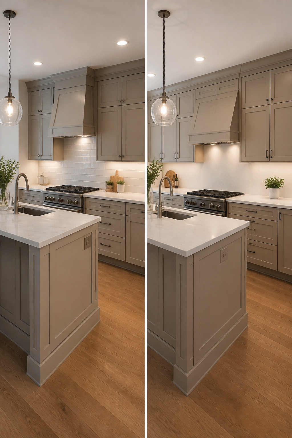
White quartz with subtle veining against taupe cabinets keeps the kitchen bright and expands the visual space in a way solid white countertops never quite manage.
The veining adds movement and depth, so the surface reads as designed rather than blank.
Warm taupe undertones pair best with veining that carries gray or soft gold threads, while cool taupe works better with veining that leans charcoal or faint blue.
Solid white, by contrast, can turn stark against the earthiness of taupe and often shows every crumb and water spot. The subtle pattern in veined quartz hides daily wear, which matters in a kitchen that actually gets used.
Greige cabinets with this combination photograph well, but the real advantage is practical: the quartz stays easy to clean while the taupe keeps the room from feeling sterile. Keep the backsplash simple and let the cabinet color do the work.
Taupe and Beige or Cream Marble
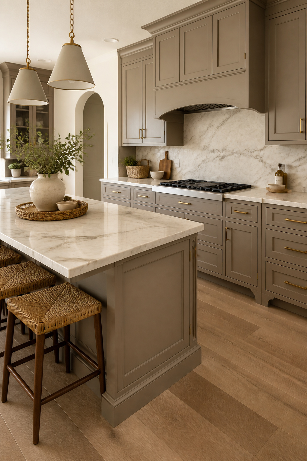
Warm stone and taupe cabinets share enough DNA that the pairing can disappear into itself if you let it.
The risk is a kitchen that reads as one flat wash of greige, pleasant enough but hard to live in because nothing anchors the eye.
Veining variation saves it. A cream marble with active, contrasting veins, gray or even soft gold, breaks the surface just enough to give the cabinets a backdrop they can push against.
Without that movement, the whole effect turns to mud.
I learned this the hard way looking at slabs for a friend’s remodel. The most uniform beige marble looked safest in the showroom and deadliest in photos of installed kitchens.
The piece she nearly chose would have swallowed her brushed nickel pulls entirely.
Honed marble helps here too. The softer finish catches light differently than polished stone, creating subtle shadow that acts as its own definition.
For budget balance, marble on the island with quartz perimeter counters keeps the look while containing both cost and maintenance.
Seal it properly either way; taupe hides water spots better than white cabinets do, but marble in a kitchen still asks for protection.
Taupe and Butcher Block
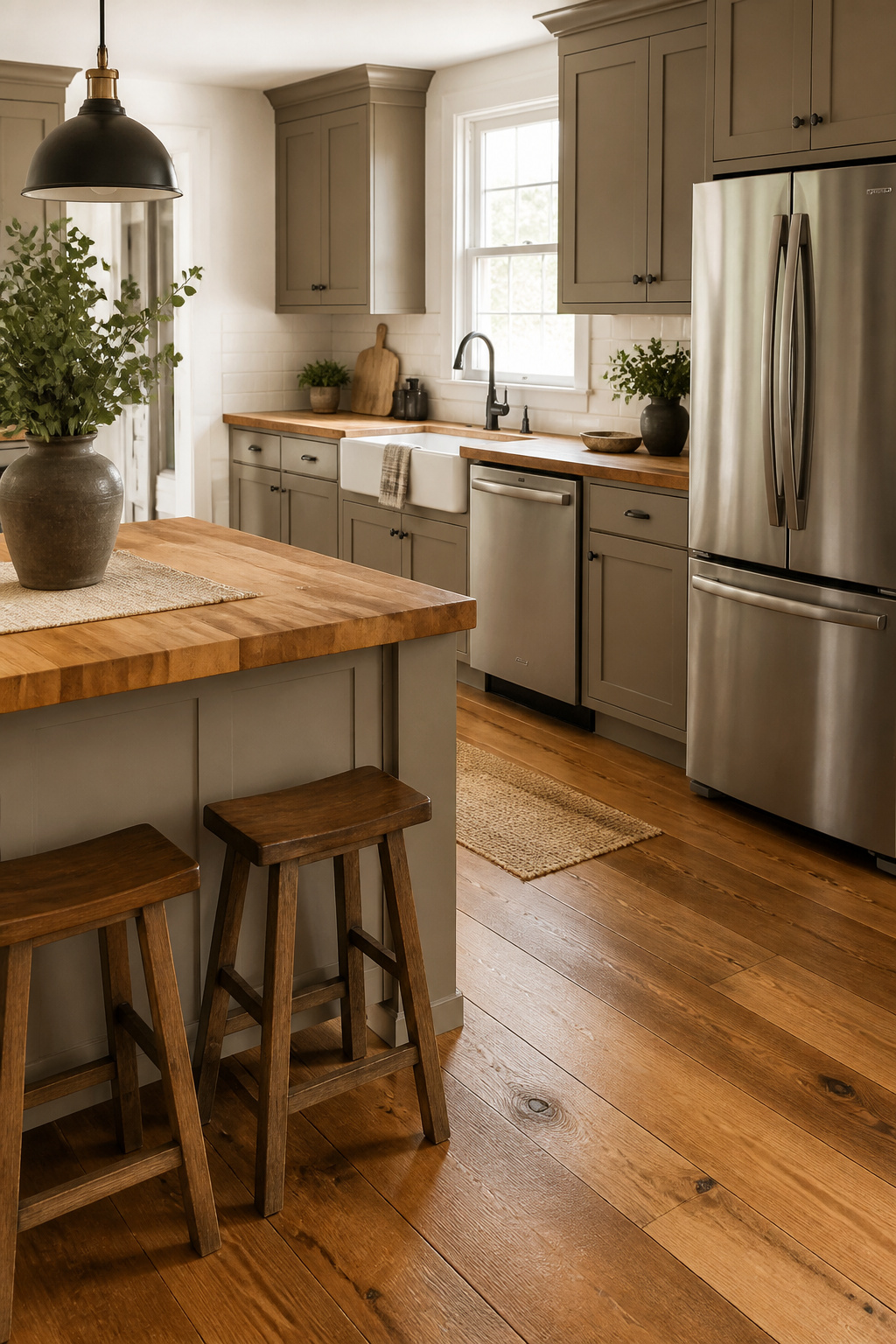
Butcher block countertops bring out something that stone never quite manages with taupe cabinets: the kitchen actually wants you to cook in it.
The honey tones in the grain pick up taupe’s warm undertones and make the room feel lived-in from the first morning, not staged for a photograph.
Walnut, oak, and acacia each read differently against the same cabinets. Walnut goes moody and sophisticated, oak stays light and farmhouse-leaning, acacia splits the difference with varied grain that hides the first few scratches.
Oil the surface monthly if you want that patina to age into character rather than just look dried out and neglected.
The maintenance is where this pairing lives or dies. A full butcher-block kitchen demands the discipline of someone who enjoys upkeep.
Most weekend renovators do better limiting wood to the island or a single stretch of counter, keeping the rest in something forgiving.
End-grain construction holds up to actual chopping if you are committed to the look, but edge-grain costs less and still reads warm across a room.
Taupe and Warm-Toned Granite or Quartzite
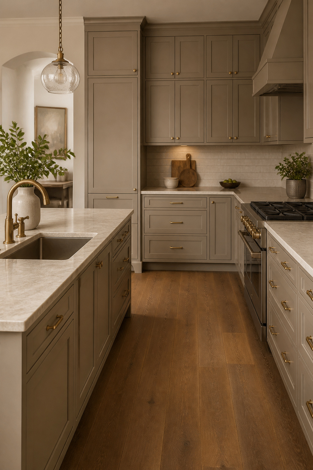
Warm stone with gold or taupe veining settles right into a taupe kitchen without fighting for attention.
Taj Mahal Quartzite and Colonial Gold Granite both do this: the pattern stays quiet, and the cabinet color reads as intentional rather than leftover.
What convinced me, looking through enough kitchen photos to blur my vision, was that the veining has to pick up taupe’s warmth, not its gray side.
A stone that turns too silver or ash against the cabinets looks like a mismatch you meant to fix later.
This is not the same as dark granite, where the whole point is the punch of contrast. It is also not beige marble, which can wash taupe out toward builder-grade bland.
The risk with warm stones is pushing too far into yellow or orange territory; those tones sit next to taupe like relatives who argue at holidays. Gold and soft beige veining stay in the same family.
Gray veining, even warm gray, pulls the eye in two directions at once.
Taupe and Black Countertops
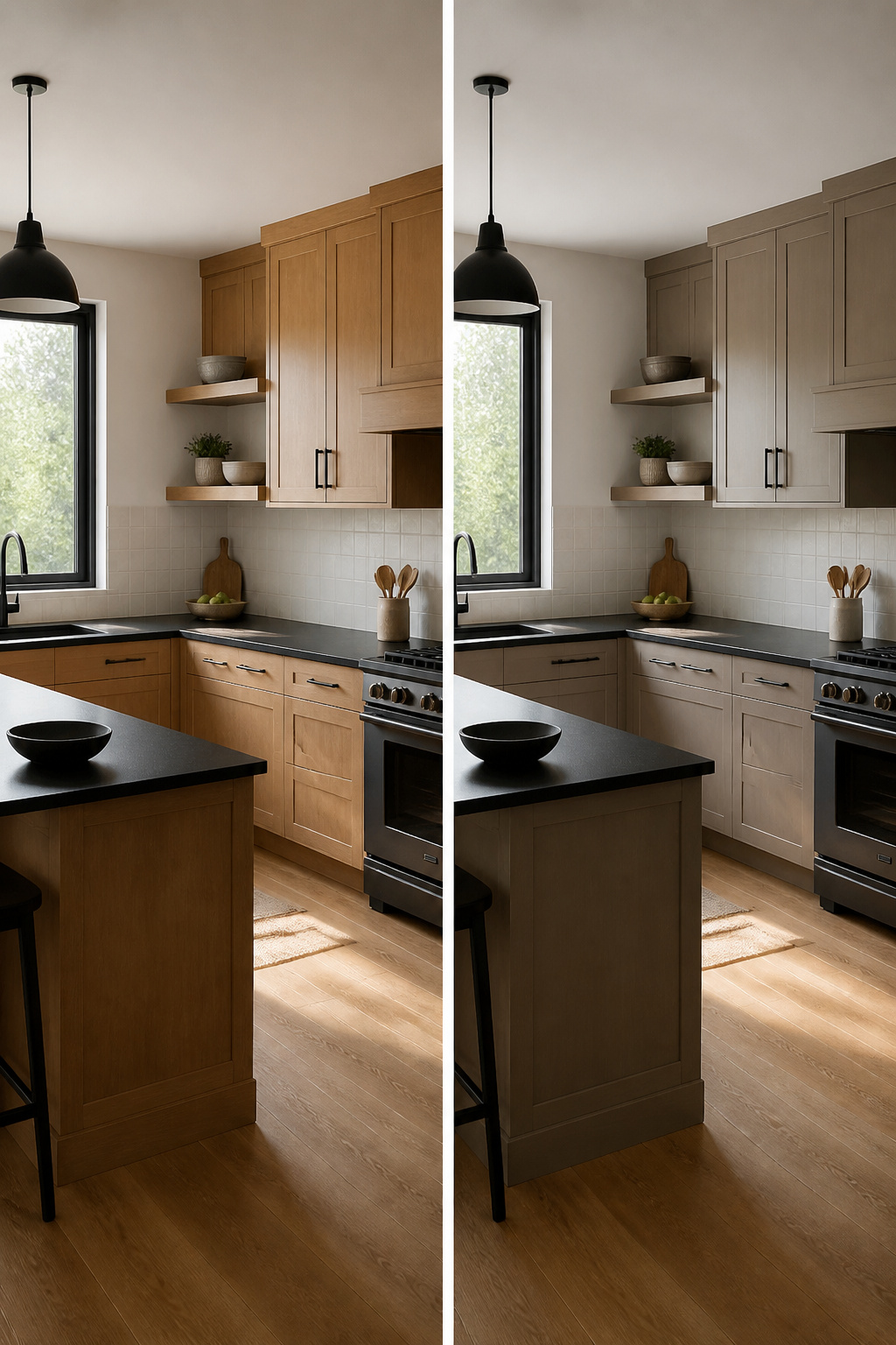
A solid black countertop against taupe cabinets reads differently than the busy surface of dark granite. Where Black Galaxy or Ubatuba throws flecks and movement at you, a pure black plane holds still and lets the taupe do the softening.
That stillness is what makes the pairing feel modern rather than traditional.
Matte black counters hide fingerprints and water spots, which matters more than people expect in a working kitchen.
My contractor mentioned matte black fixtures are the most requested finish right now, and the same logic carries to countertops: the finish stays cleaner between wipes.
Polished black, by contrast, throws light around and can brighten a kitchen that lacks windows, but every smudge shows.
Brass or copper hardware warms the combination enough that it never tips into the coldness of a black-and-white scheme.
A cousin of mine installed this pairing in her condo last fall, and she noted people always comment on how bold it looks without feeling harsh. The taupe does that work.
Keep the backsplash light, though; two dark horizontal bands would box the room in.
Taupe and Natural Wood Flooring
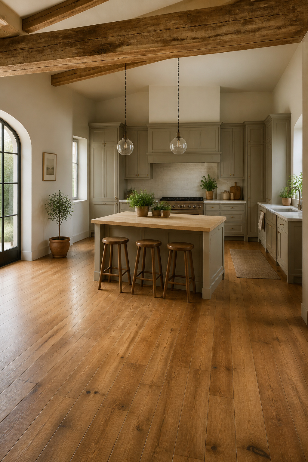
Wood floors give taupe cabinets something the color needs: warmth that feels earned rather than decorated. Pale oak keeps things light and modern, while medium walnut adds depth without turning the kitchen into a showroom.
The real decision sits in the undertone. Cabinets that lean warm and brown want honey or amber floors; gray-taupe shifts the choice toward weathered gray or white oak so the room does not go muddy.
Matching undertones matters more than matching the stain grade. Two woods can look identical on a sample board and clash once the cabinets’ color temperature hits them at scale.
Wide planks read cleaner in a kitchen than narrow strips, and running them lengthwise in a galley layout stretches the sightline.
Engineered hardwood handles kitchen moisture better than solid, which is worth the trade if your weekend project does not include sanding cupped boards six months later.
My sister’s kitchen pairs medium oak with warm taupe, and the wood does what she wanted: it grounds the space so it feels lived-in, not staged.
Taupe and Textured Accessories
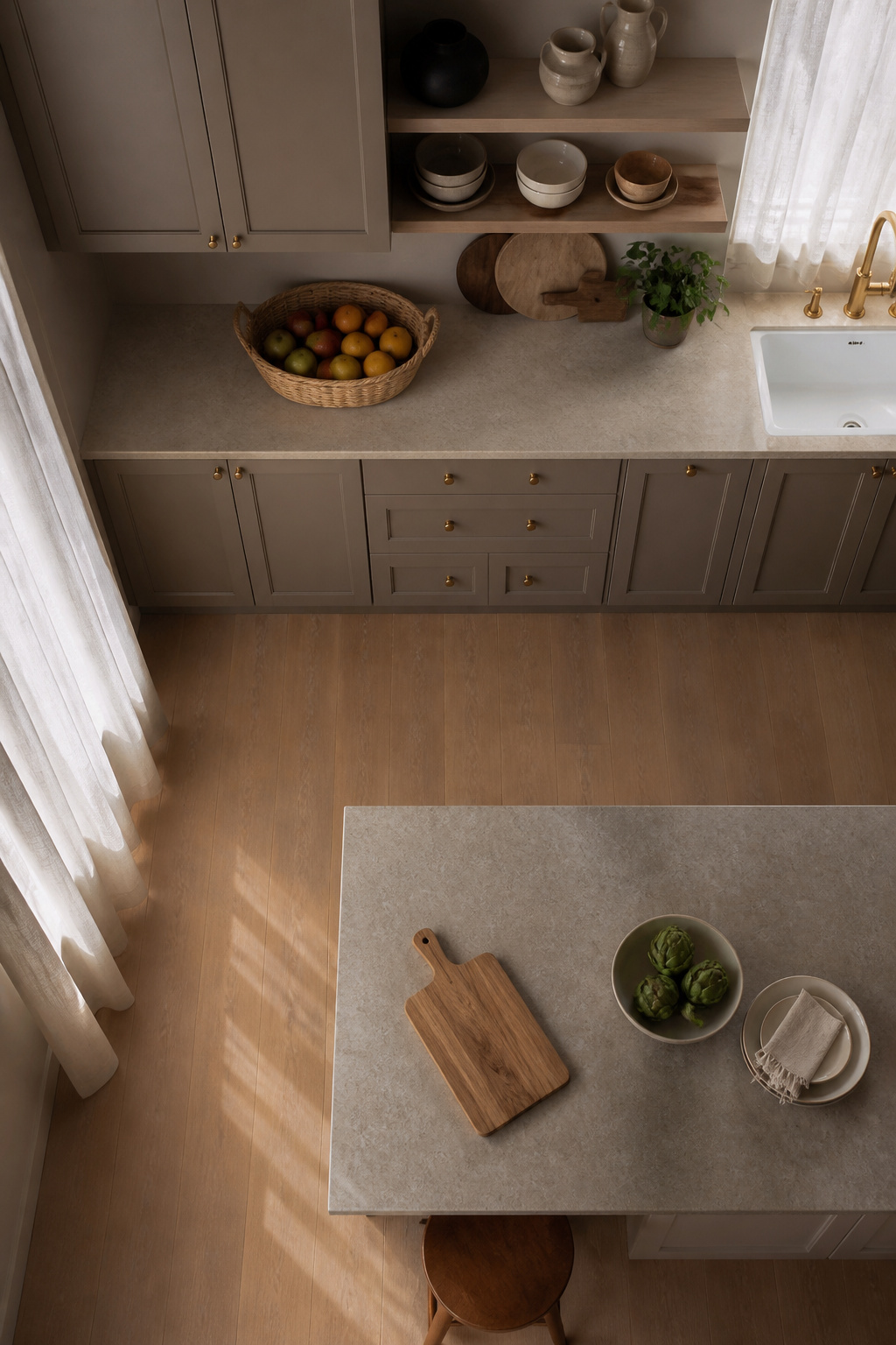
Taupe cabinets run the risk of reading as builder-grade beige if everything around them stays smooth and quiet.
Texture matters more than color for keeping the space from feeling sterile, which is why I keep a large woven basket on the counter for fruit.
The rough weave catches light differently than the flat cabinet faces, and the natural material feels right in a way plastic or metal accessories simply would not.
Linen curtains do similar work at the windows. A sheer or textured weave filters daylight and adds softness without blocking it, which matters in a kitchen where you still need to see what you are chopping.
Ceramic vases or bowls on open shelving add another layer, the slight irregularity of hand-formed glaze against the cabinet’s consistent finish.
The move is to group these pieces in odd numbers, three or five, and to rotate them seasonally. Nothing here requires a drill or a contractor.
A wooden cutting board leaned against the backsplash, a ceramic bowl for garlic, the basket for produce: the taupe becomes the calm backdrop and the textures become the personality.
Taupe and Green Accents
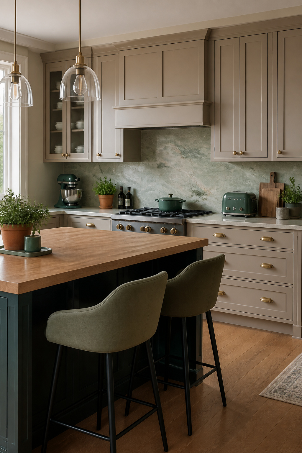
Sage green gets the most press with taupe cabinets, but olive, emerald, and muted forest tones hit a different register entirely. Where sage reads soft and farmhouse, these deeper greens bring in weight and shadow.
A neighbor of mine swapped her sage bar stools for olive ones against her taupe cabinets and said the room finally felt finished rather than just pleasant.
The before-and-after she described was the difference between a space that apologizes and one that settles in.
Plants are the safest entry point. A pothos or snake plant in a forest-green pot gives you the tone without commitment.
Small appliances in olive or emerald, or a tile backsplash with muted green veining, let you test whether your kitchen can handle the saturation.
The sources point to green-toned marble or quartzite for counters or backsplashes, which locks the palette in permanently and works best when the green reads earthy rather than bright.
Lime and kelly green fight taupe’s gray-brown undertone; olive and forest harmonize with it.
Textiles follow the same rule. A runner or towels in deep green warm the room seasonally, and if the color starts feeling heavy, the textiles rotate out.
The permanent elements, the stone and the cabinets, stay neutral. That balance is what keeps bolder green from overwhelming a kitchen you still have to cook in every morning.
Taupe and Artwork
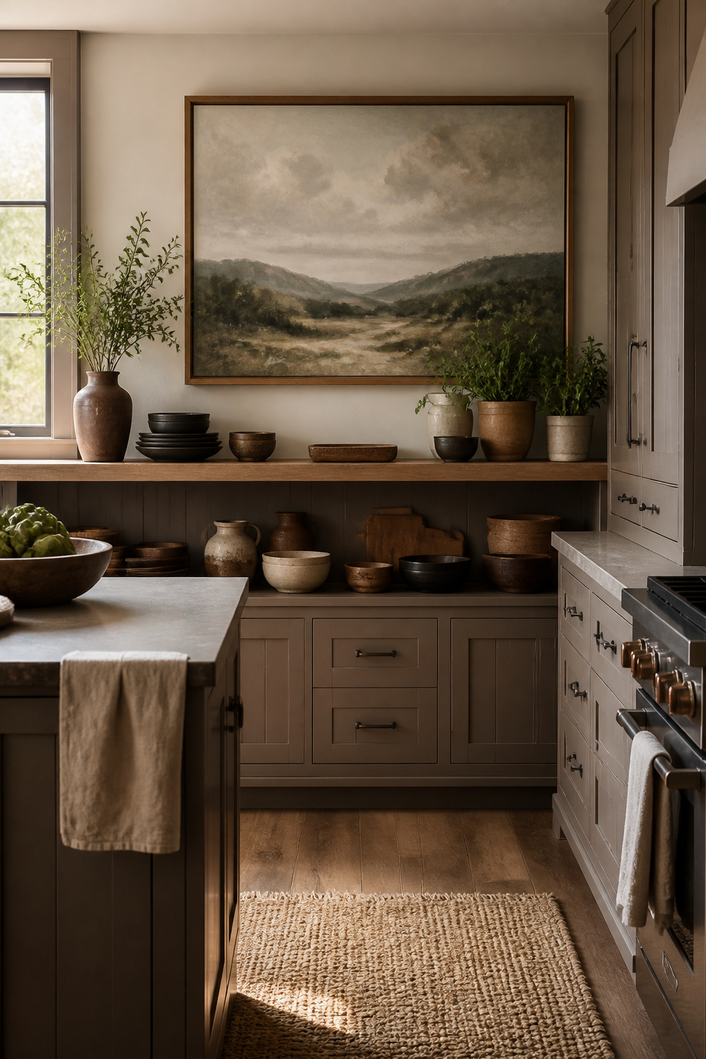
A taupe kitchen left to itself reads like a rental unit, clean and forgettable. Artwork is what keeps it from feeling like a staged photograph.
The cabinets already do the work of stepping back; they do not compete for attention, which means a framed print or a leaning canvas actually gets seen.
Scale matters more than content. A single large piece over a breakfast nook or open shelving carries more weight than a scatter of small frames that read as clutter against the flat cabinet fronts.
Wood or brass framing picks up the warm undertones in most taupes better than black or silver, which can turn the whole wall cool and flat.
What hangs inside the frame should be something that already lives in the house. A photograph from a trip, a print that sat in the last apartment, a ceramic piece made by a friend.
The sources that looked best to me were the ones where the taupe became the background for a collection that was already personal, not a new purchase chosen to match the cabinets.
Picture ledges make rotation easy, which matters in a kitchen where grease and steam take a toll. Swap a piece out when the season changes or when the wall starts to feel invisible again.
The ledge itself, in wood or brass, becomes part of the warmth.
A woven basket on the counter for fruit, a ceramic bowl that actually gets used: these do the same work as the frame, adding texture the cabinets do not provide on their own.
The rule I kept seeing was natural materials over synthetic, and it holds for both the art and the objects around it. Plastic or metal accessories fight the warmth that makes taupe livable.
Taupe and Monochrome Palette
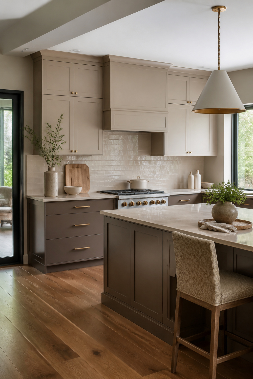
A monochrome taupe kitchen lives or dies by whether you build in enough variation to keep the eye moving. Three distinct taupe values, minimum, are what separate a layered room from a flat box.
Lighter taupe on the walls, medium on the cabinets, and a darker taupe on the island or lower cabinets gives you that depth without introducing a competing color.
Texture does the rest of the work. Matte cabinets against a glossy backsplash catch light differently at morning and evening, so the same palette reads warmer or cooler depending on the hour.
Wood cutting boards and natural fiber accessories add warmth that taupe alone can drain away if you let it.
Taupe-toned porcelain tile on the floor keeps the monochrome line going with textural interest built in. Oak, walnut, or hickory flooring also works, echoing taupe’s warmth rather than breaking it.
The risk with a single-tone kitchen is not boredom, exactly, but a kind of visual white noise where nothing anchors the gaze. Vary the finish as much as the shade, and the room stays calm without going mute.
Taupe and Open Shelving
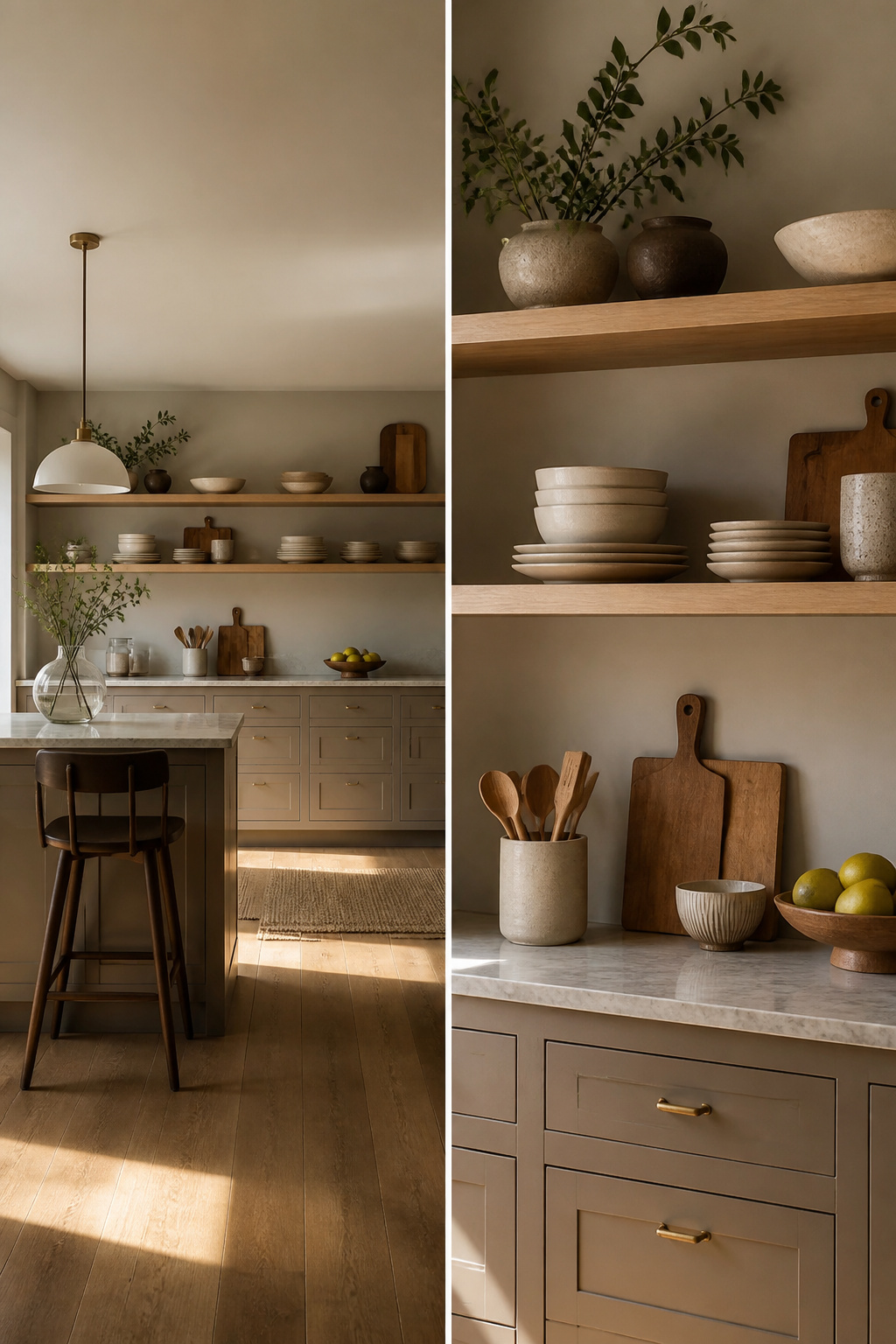
Replacing a run of upper cabinets with open shelving against taupe paint changes the whole rhythm of a kitchen.
The taupe still reads as warm and grounded, but the wall behind the shelves gets to breathe, and the room feels wider by a few feet without the cost of knocking anything down. The trade is storage you cannot hide.
Dishes, glasses, and the three cookbooks you actually open will look fine. The blender, the mail pile, and the mismatched storage containers will not, so the cabinets below need to swallow what the shelves cannot.
Wood tone matters more than I expected. Reclaimed wood with some age on it, or a floating slab matched to the floor or island, keeps the look intentional rather than leftover.
Metal brackets can work, but they read colder against taupe than wood does, and this is already a quiet color. Brass or black hardware on the cabinets helps bridge that if you are set on metal.
Limit the open run to one wall, or to the short stretches flanking a window or range hood. Two walls of exposed shelving turns into a dusting job and a styling pressure most people do not need from their kitchen.
I have seen it go wrong in rentals where the landlord installed floating shelves everywhere to look current, and the tenant ended up buying a curtain to hide the chaos.
Keep the display to things you reach for daily, and the shelves stay useful instead of becoming a museum of dishes you never use.
Taupe and Rustic Elements
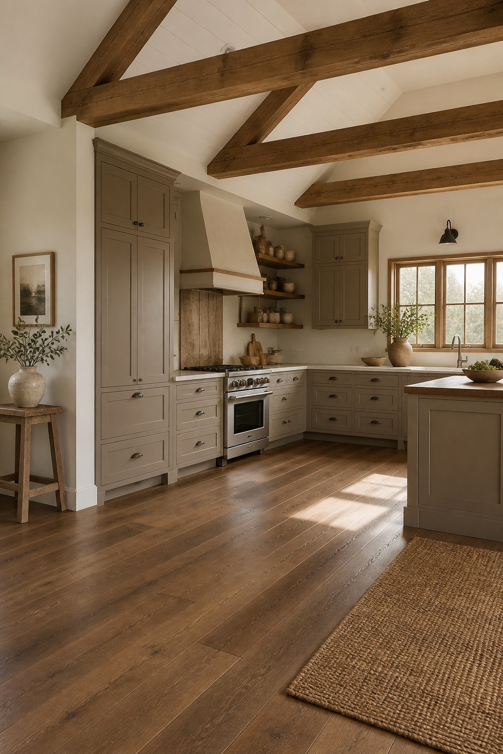
Exposed beams overhead give taupe cabinets something to push against. The color already sits between warm and cool, so raw or lightly finished wood overhead keeps the kitchen from feeling like a paint swatch come to life.
A friend with a cottage kitchen kept her beams in natural oak while running her cabinets a shade cooler in tone, and the mismatch reads as intentional rather than off.
Reclaimed wood works the same way, but it needs restraint. A single reclaimed beam or a patch of salvaged siding behind open shelves does the job; wrap the room in it and the cabinets disappear into the background.
The same risk runs through vintage hardware. Bin pulls and cup hinges in aged brass or iron suit shaker-style taupe doors beautifully, yet they fight cleaner, slab-front cabinets where the whole point is the uninterrupted surface.
Farmhouse and cottage kitchens have the architecture to carry this weight. Vaulted ceilings, beadboard walls, or barn-style lighting give rustic elements a context that makes sense.
In a transitional or Scandinavian space, one rustic touch usually reads as a mistake rather than character, and the cleaner the lines elsewhere, the more that single distressed edge or reclaimed accent looks like a repair that never got finished.
Balance means pairing those beams with modern appliances, not pretending the refrigerator is from 1920.
What Taupe Actually Is
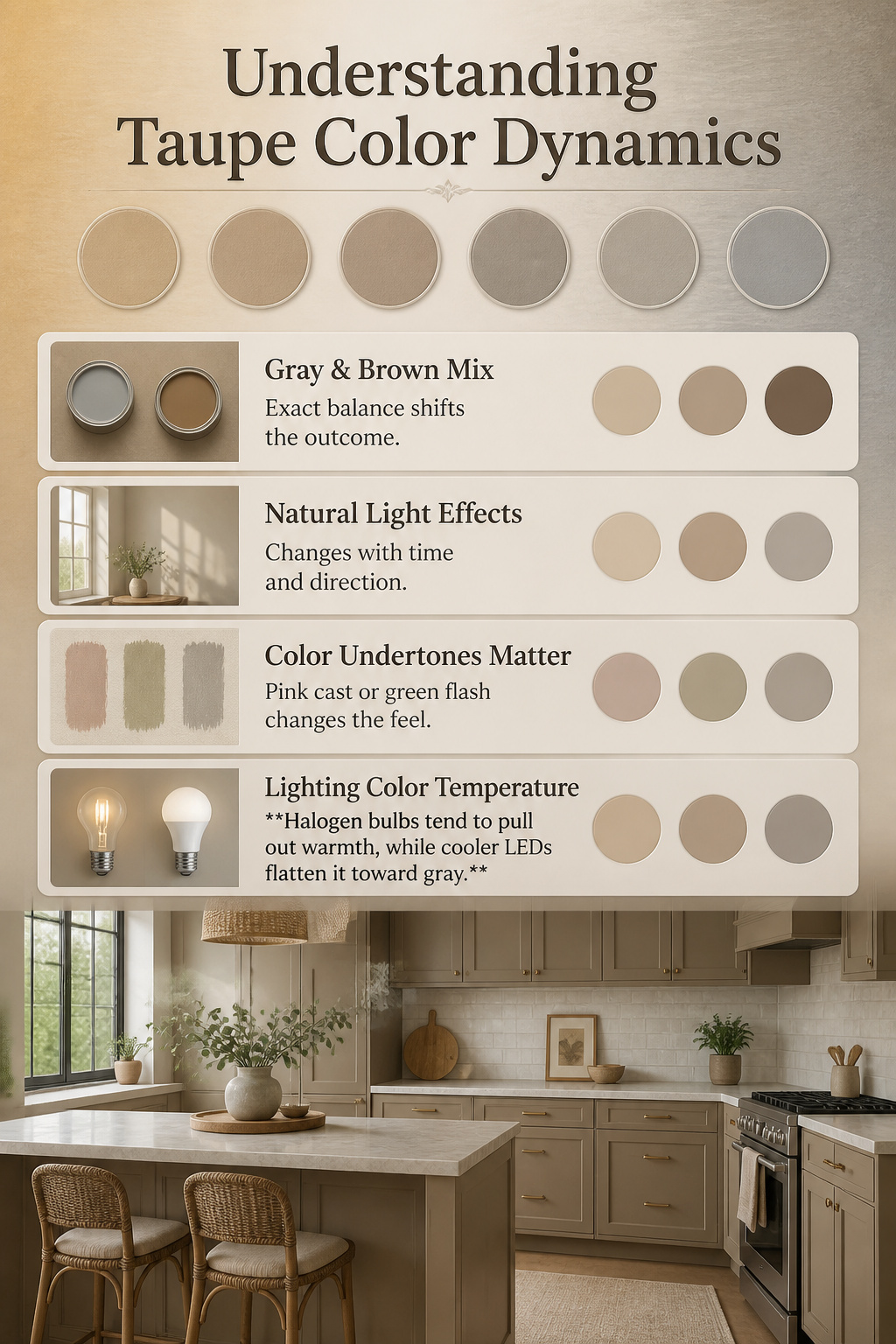
Taupe is what happens when gray and brown share a can of paint, and the exact balance decides whether a kitchen reads as warm and grounded or cool and restrained.
The paint industry has never settled on a single formula, so one company’s taupe can sit almost sandy with more beige than gray, while another balances the two so evenly it earns the nickname greige.
Darker taupes drift toward mushroom or even chocolate territory.
The undertone matters more than the name on the chip. Some taupes carry a pink cast; others flash green under certain light.
That same sample can look brownish in morning sun and grayish once the LED cans take over after dark. Halogen bulbs tend to pull out warmth, while cooler LEDs flatten it toward gray.
Natural light shifts with the time of day and the window’s direction, which is why a chip that looked perfect at two in the afternoon can feel off at seven in the morning when you’re standing there half-asleep with the coffee maker running.
Paint stores hand out chips for free because they know the only reliable test is living with the color in your actual space for a couple of days.
Tape samples next to the countertop you already chose, the flooring that will sit beneath them, and the backsplash you are still arguing about. Take phone pictures at different hours; the camera catches shifts your eyes start to ignore.
Design Styles That Fit Taupe
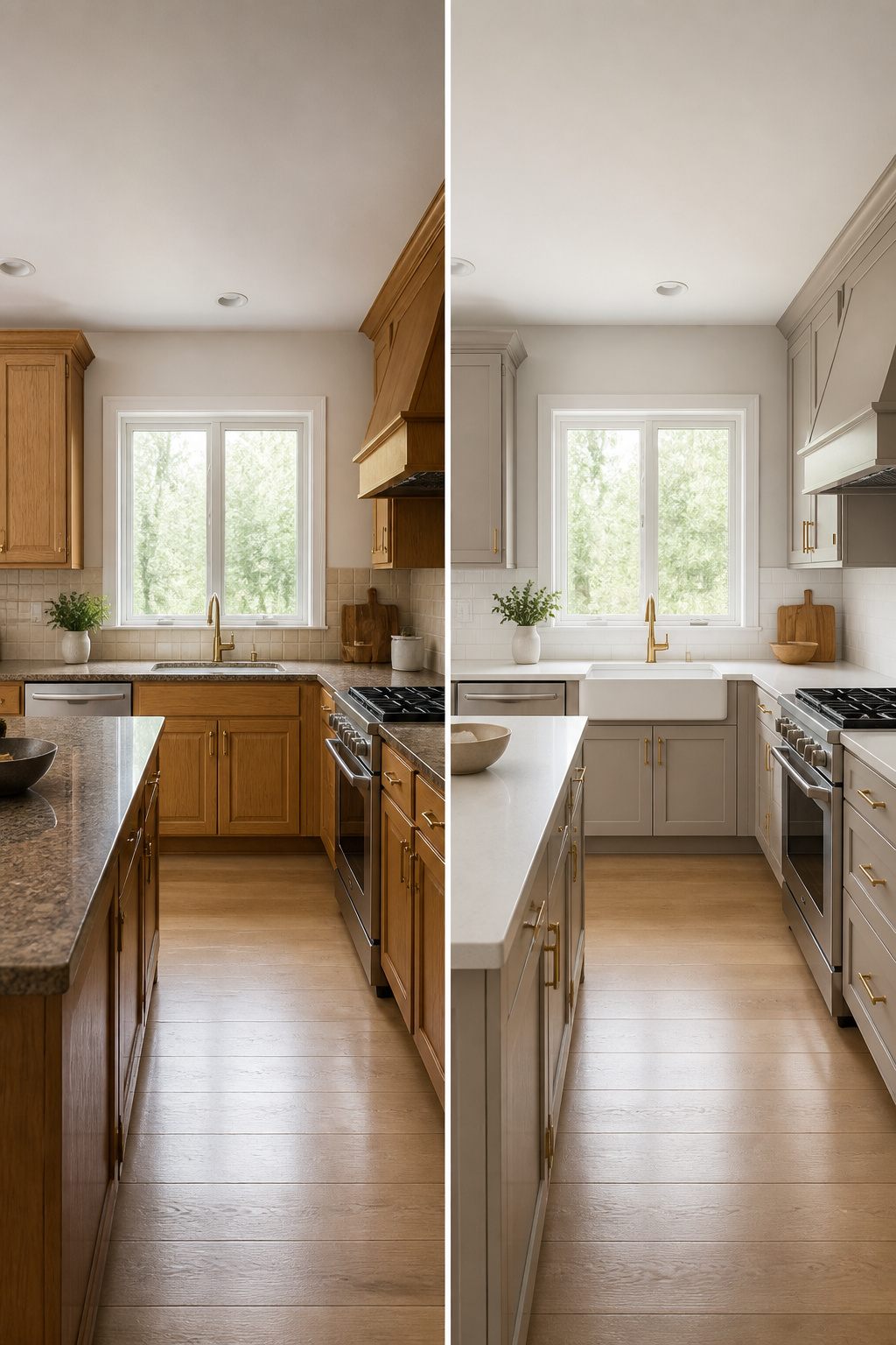
Taupe lands differently depending on what you build around it.
In a modern kitchen, flat-panel taupe cabinets read as intentional warmth against sharp lines; brass or brushed nickel hardware keeps the look from going cold, and a taupe island against white perimeter cabinets turns that island into furniture rather than more cabinetry.
The same color in farmhouse style needs the right sink to feel authentic: a white fireclay apron sink against taupe Shaker cabinets hits the mark, but oil-rubbed bronze or brass fixtures are what keep it from looking too country.
Transitional kitchens have been where I’ve seen taupe work hardest, bridging dark flooring and white walls without the starkness of gray. Scandinavian applications stay quieter, letting the color do the softening while materials stay pale and hardware minimal.
Traditional kitchens can take taupe deeper and richer, though here is where it risks feeling forced: too much ornament with taupe starts to look like beige trying to be something it is not.
The hardware finish matters more than people expect — bronze, nickel, and brass all work with taupe painted cabinetry, but mixing them without intention is where the style drifts.
Paint Colors That Work
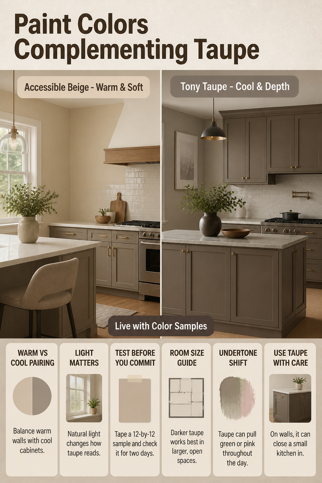
Sherwin-Williams Accessible Beige sits on the warm side of the spectrum, closer to traditional beige with enough gray mixed in to keep it from going yellow.
It works best on walls when you want the room to feel soft and open, especially if your taupe cabinets already carry a cooler, more grayed undertone.
Pairing warm walls with cooler cabinets, or the reverse, keeps the kitchen from flattening into one muddy note.
Tony Taupe runs noticeably cooler and deeper, a true gray-brown that can read almost mushroom in low light. On cabinets, it gives that grounded, transitional look that feels more designed than default.
On walls, it can close a small kitchen in, so reserve it for spaces with decent natural light or use it as an accent on an island while keeping the perimeter lighter.
The undertone shift between morning sun and evening LED matters more than the chip name. Tape a 12-by-12 sample to the cabinet face or wall and live with it for two full days before deciding.
What reads taupe at 2 PM can pull green or pink at 7 AM, and that is not a mistake in the paint, just the light doing its job.
Light and Dark Taupe
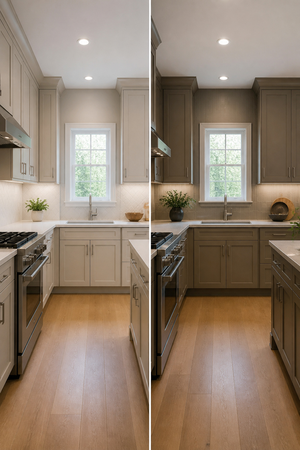
Light taupe shades do the heavy lifting in tight kitchens where every inch of visual breathing room counts.
Pale taupe reflects light without the sterile edge of pure white, adding just enough warmth to keep a small galley or apartment kitchen from feeling cramped.
Paint the walls a shade lighter than the cabinets and the space pushes outward; swap a few upper doors for glass and you create depth where there is none.
Dark taupe plays a different game entirely. In a larger kitchen with decent ceiling height and natural light, rich, deep taupe builds drama and an unexpected coziness that white or gray never quite reach.
The risk is heaviness, so the adjacent rooms matter: if the kitchen flows into a pale living area, the contrast can feel intentional rather than boxed-in.
Balance dark base cabinets with a light countertop or backsplash, and add pendants or under-cabinet lighting so your work surfaces stay bright. Still hesitant?
A dark taupe island against lighter perimeter cabinets gives you the mood without the weight of a full commitment.
Frequently Asked Questions
Which kitchen design styles work best with taupe cabinets?
u003cpu003eTaupe adapts to modern, farmhouse, transitional, Scandinavian, and traditional kitchens. The color’s gray-brown neutrality lets it read sleek with flat-panel doors or rustic with shaker profiles, and it shifts warmer or cooler depending on what you pair it with.u003c/pu003e
What wall colors complement taupe kitchen cabinets?
u003cpu003eSoft whites, warm beige, sage green, dusty blue, and deep charcoal all work.u003c/pu003e u003cpu003eWhite keeps the space bright and bounces light around; navy or charcoal anchors it with weight; sage green settles in quietly because both colors share that grayed-down, nature-drawn quality.u003c/pu003e
What are the best countertop options for taupe cabinets?
u003cpu003eDark granite like Absolute Black or Ubatuba grounds the cabinets, white quartz with subtle veining keeps things bright and hides daily wear, beige or cream marble with active veining adds luxury without showiness, and butcher block brings in warmth that makes the kitchen feel lived-in from day one.u003c/pu003e u003cpu003eEach option hits a different mood: stone reads finished and clean, wood reads tactile and forgiving.u003c/pu003e